Wirra Wirra 150th anniversary book
An atypical and award winning wine history book.

A new brand for a young family winery.
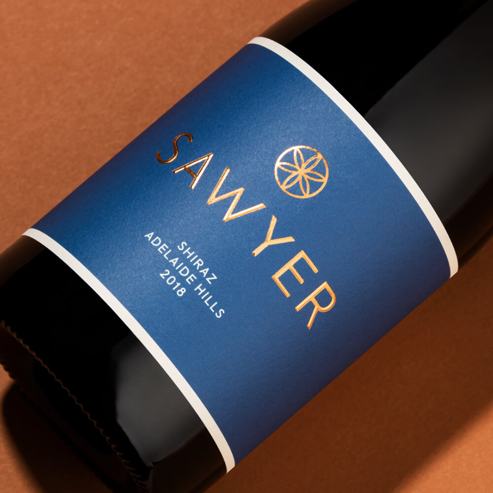

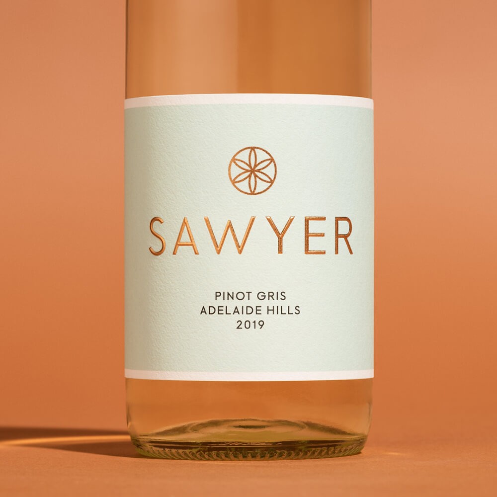
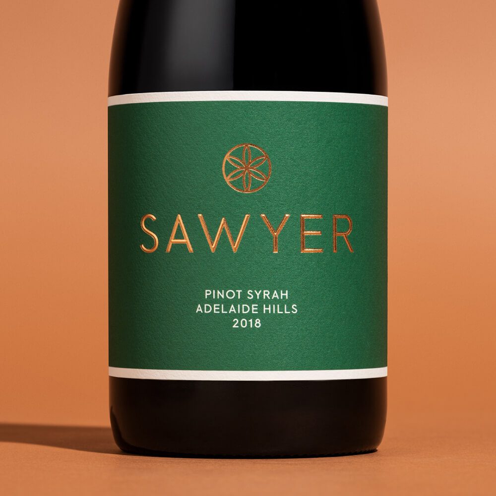
The colour palate selected for the range was inspired by the flavour of the wine, not the type – a modern approach that broke tradition, and pre-conceived ideas like 'blue wine labels don’t sell'.
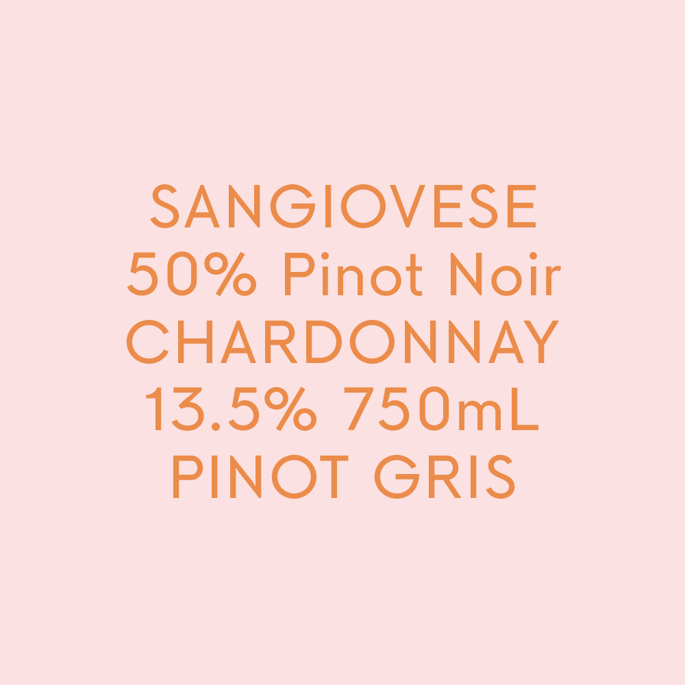
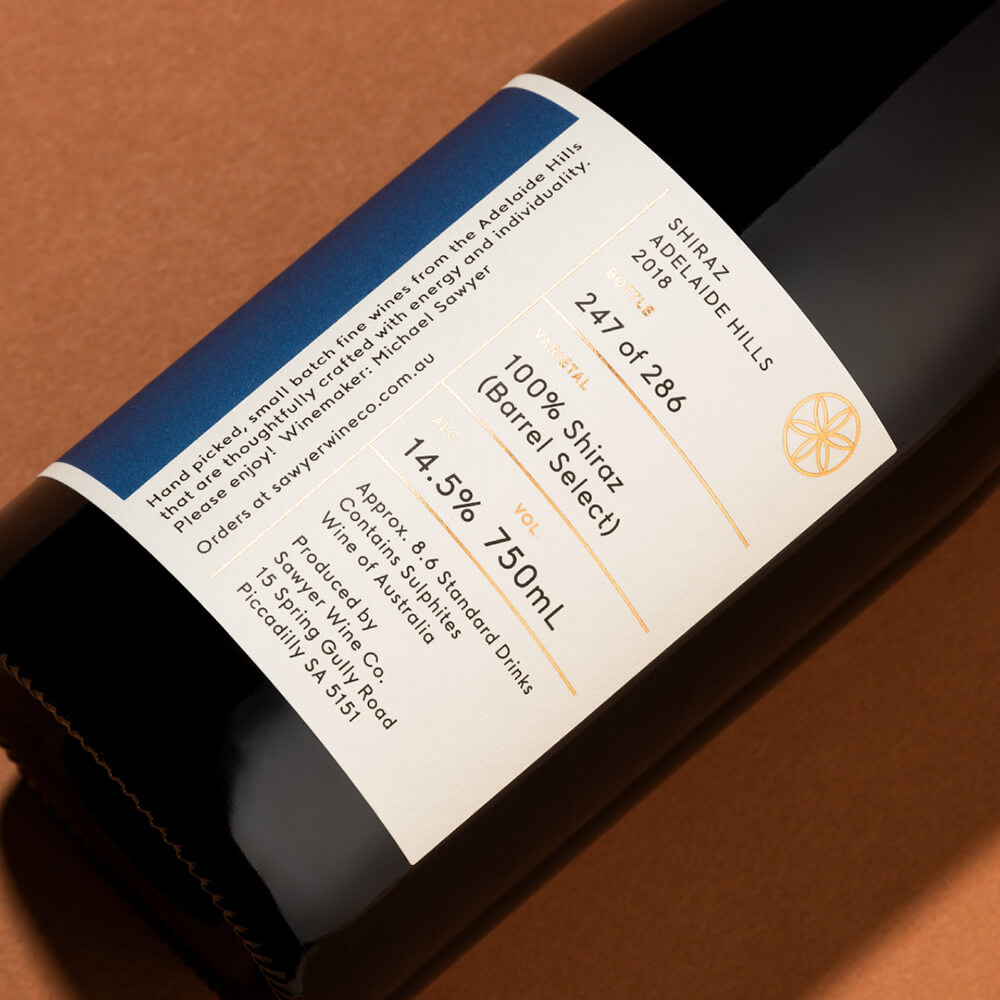
Inspired by Scandi-style typography, the custom font developed for Sawyer Wine Co. featured small, subtle details, showcasing just the right sense of playfulness and seriousness.
An atypical and award winning wine history book.
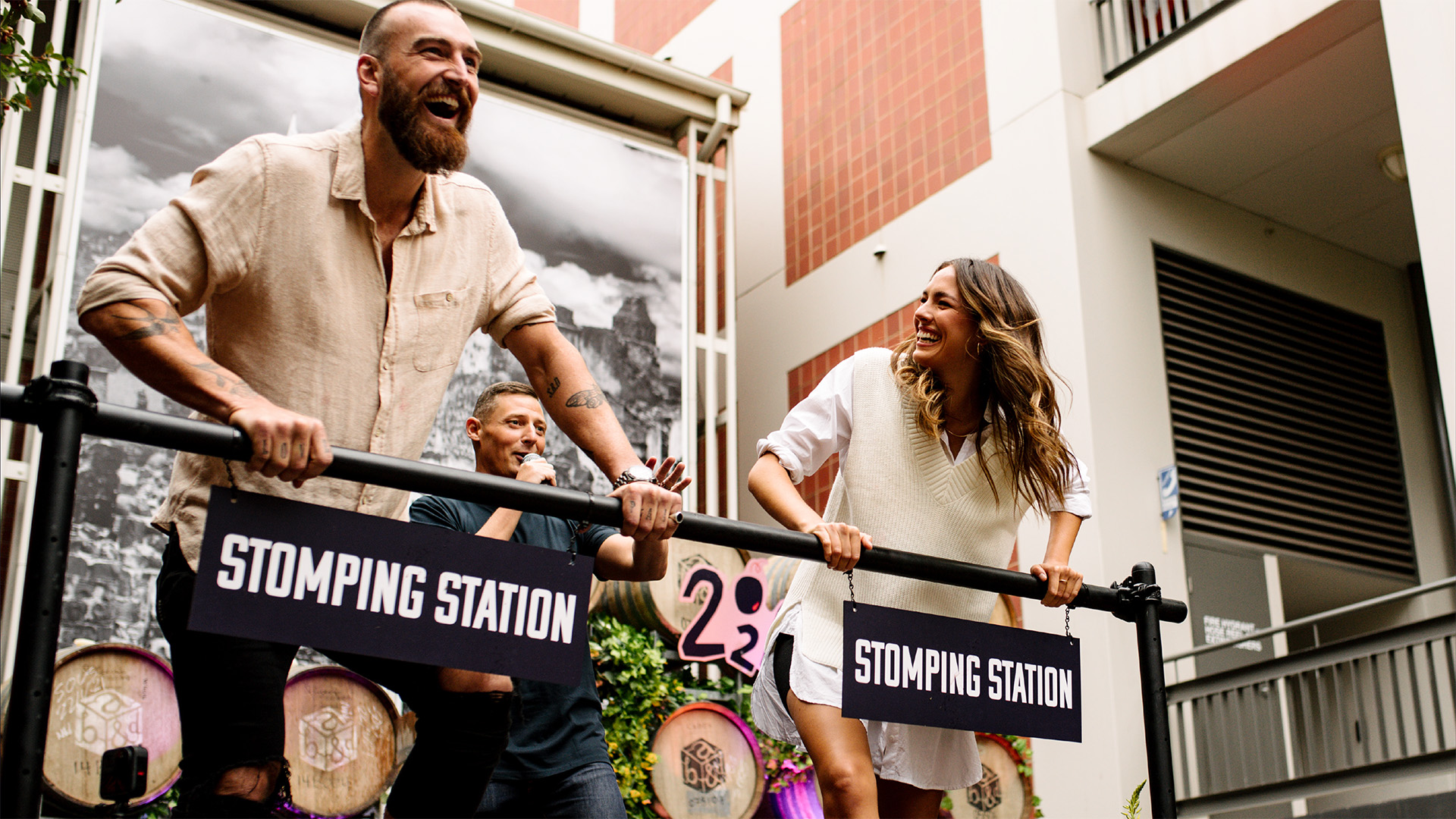
A high profile event to support the SATC's Year of South Australian Wine campaign.
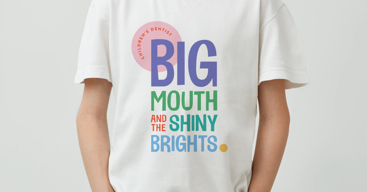
New brand gives teeth to a fun-loving children’s dentist.
An evolutionary new brand identity for a socially conscious yoga studio.

Rebranding an iconic outback tourism destination.

Evolving an iconic South Australian real estate brand.