Brand SA
Redefining South Australia’s State Brand.
Evolving South Australia’s State Brand to present a stronger, more unified identity to the world.
Brand South Australia is the state’s badge of passion and pride, amplifying who we are and what we stand for.
First introduced in 2013, it is a unified endeavour to promote South Australia as the premier place to live, work, study, visit and do business.
As South Australia continues to grow and evolve, the timing was right to evolve the State Brand into something that can steer the state into the future without losing the South Australian-ness that defines us.
Grounded in insight
In 2023, research commenced to better understand what makes South Australia unique, with a view to building greater depth and meaning for the State Brand.
Over two years, researchers spoke with hundreds of people from diverse industries, regions and backgrounds about what makes the state special. They uncovered a core tension: a desire to grow without losing the essence of who we are.
This insight informed a central narrative built on our desire to live ‘the good life’, where we continue to pursue progress, but we do it purposefully. This sentiment became the foundation of the state’s values, characteristics and a clearly defined state story.
Building the foundation
Our process began with deep discovery and consultation, including an assessment of South Australia’s place brand research, extensive stakeholder engagement and a global review of place branding at state and national levels.
One of the key findings was that despite a well-established brand mark, South Australia continues to present a diverse and fragmented identity across key sectors.
It was also clear there were gaps in the tools available to support uptake by businesses and government agencies, with users calling for more practical resources to help them apply the brand.
One of the key outcomes of discovery was establishing how key sectors - trade, invest, study, live and visit - could be unified through the State Brand.
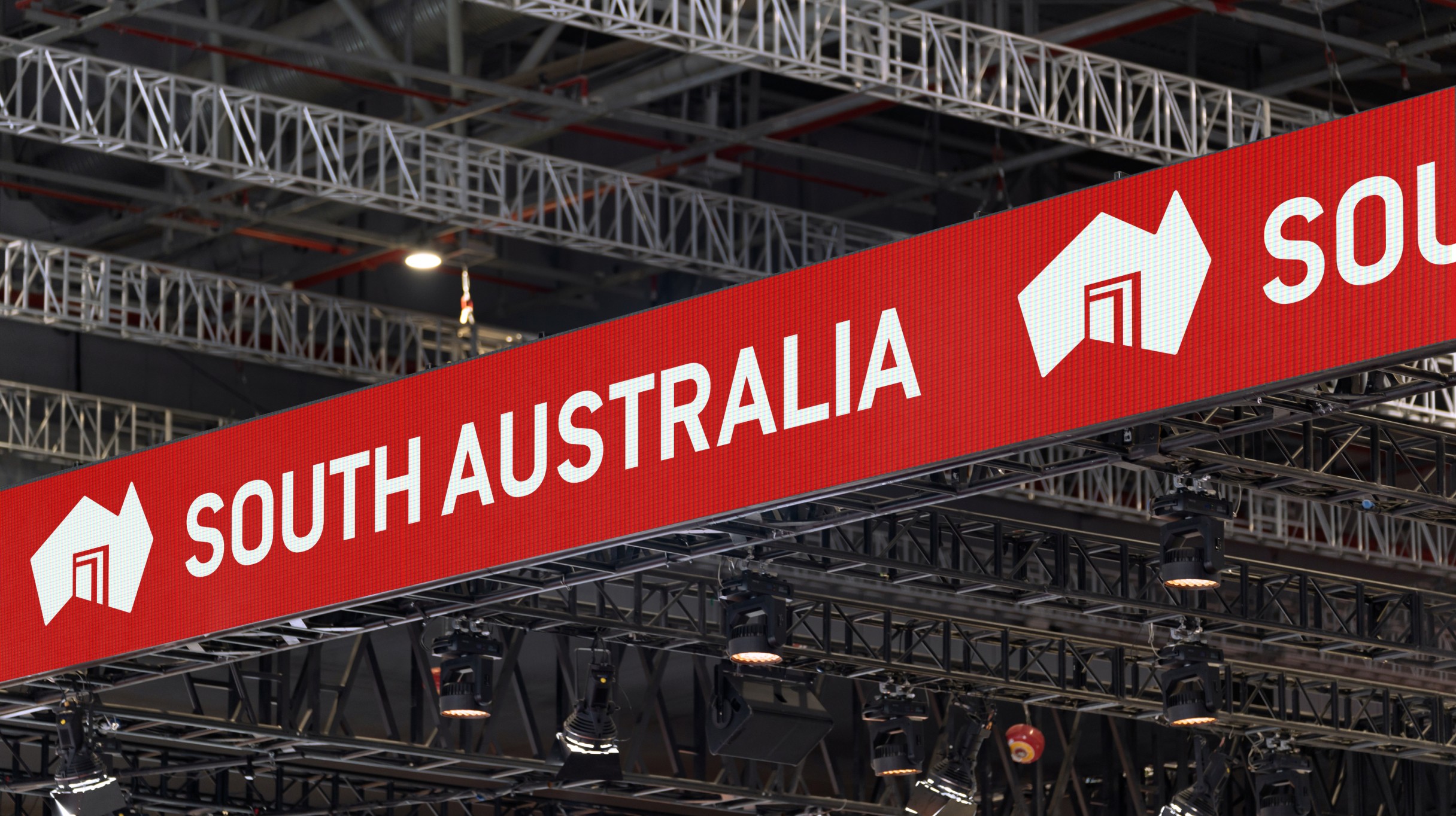
Through many conversations, a consistent theme emerged: the state’s ‘superpower’ is connection. Defined by collaboration, ease, accessibility, friendliness and fewer layers of bureaucracy, South Australia offers a level of closeness that builds trust, accelerates outcomes and makes it a great place to live, work, study and do business.
The roadmap for action
With a well-established understanding of the challenges and opportunities, we set-about crafting the solutions.
To address fragmented use of the State Brand, our first step was to create clearer structure around who should use it, when to use it, which logo to use, and how and when it should be co-branded.
An easy-to-use decision tree was developed to support these decisions, along with refinement of the State Brand suite of logos.
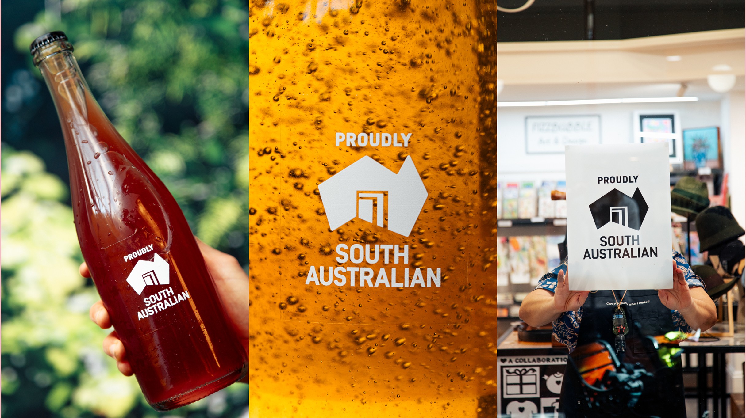
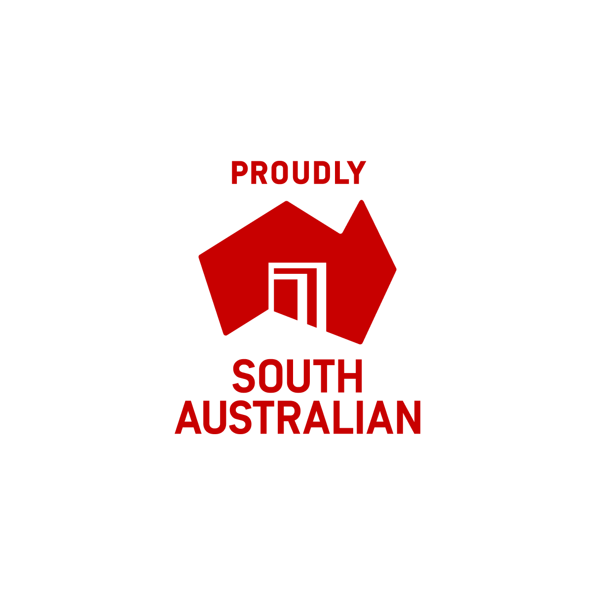
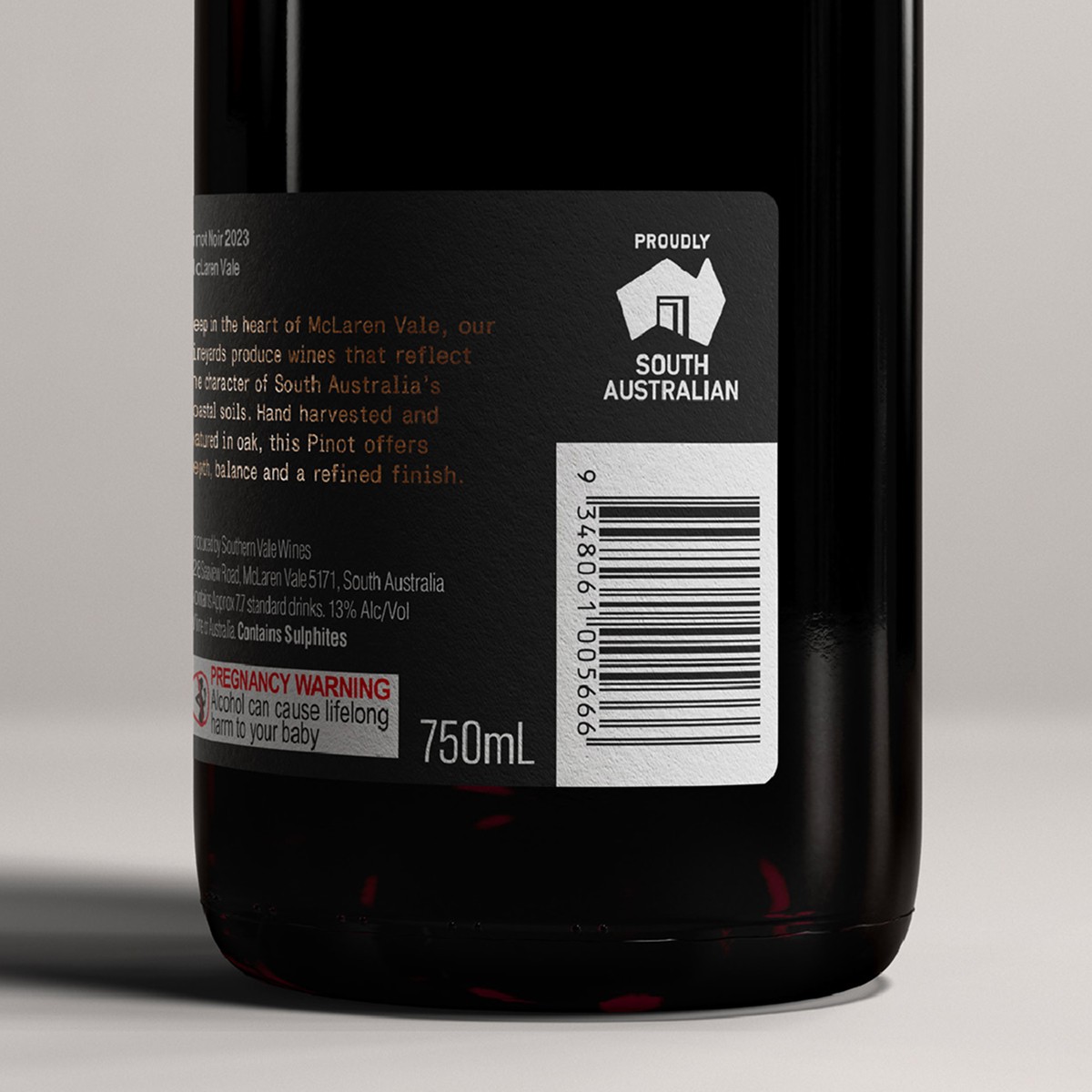
Another key addition was the introduction of a ‘Proudly South Australian’ logo, providing businesses with a dedicated mark to signal quality and pride.
Increasing flexibility was another focus of our process, and we sought the flexibility to use the logo independently of the Government of South Australia logo where appropriate, which was approved. This change was intended to encourage broader uptake and reduce perceptions of the mark as solely a government device.
A visual evolution
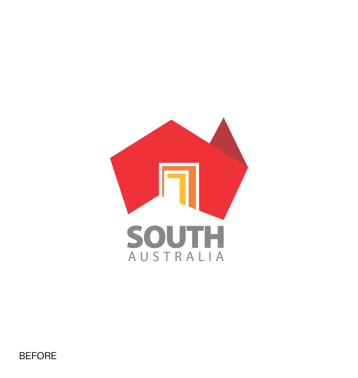
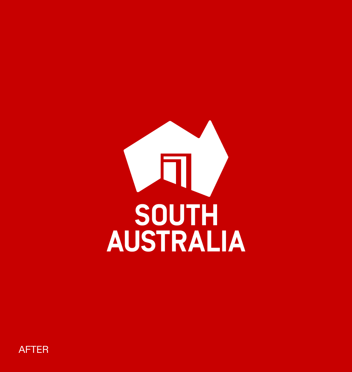
Our process identified an opportunity to evolve the existing logo and visual identity into a more modern, flexible and contemporary system.
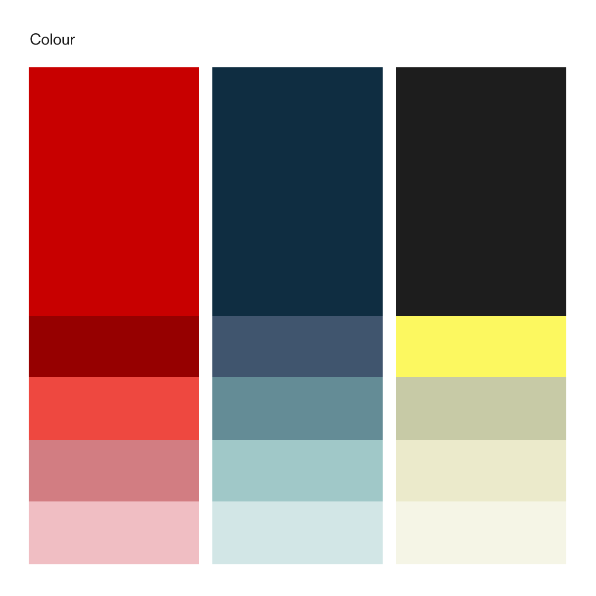
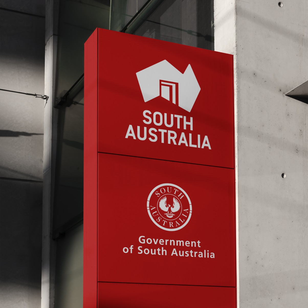
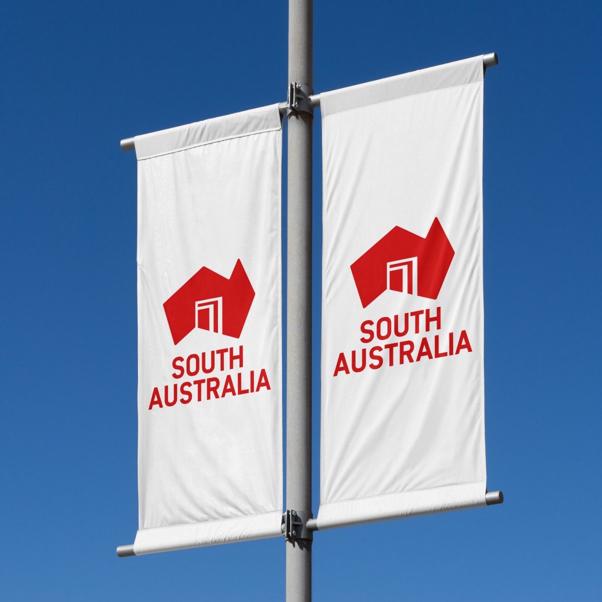
This was achieved by replacing the contrasting colours with a richer, more unified red, creating a cleaner and more versatile look. A complementary palette of secondary colours, inspired by South Australia’s landscape, was also introduced to add depth to the visual identity.
Subtle updates improved flexibility in application and scaling, while the typography was modernised to create a more cohesive and contemporary identity for South Australia.
The custom typeface - ‘Simple but Special’ - bridges existing brand elements already in use with the need for greater cross-sector unity, reducing barriers to adoption.

Aligning our voice
Using the newly developed state story, we set about developing closely aligned narratives for key sectors: trade, invest, study, live and visit.
These narratives form the foundation for a newly developed toolkit designed to provide a consistent ‘hymn sheet’ for anyone communicating on behalf of these sectors, enabling government and businesses to confidently align communications with the State Brand and reflect South Australia’s core values, characteristics and story.
Based on discovery findings, we identified key attributes across each sector that align with the state’s values and characteristics, creating the basis for unified and compelling messaging.
The unifying guidelines
Unlike most brands, where a small group of marketers manage implementation, users of the State Brand are many and varied.
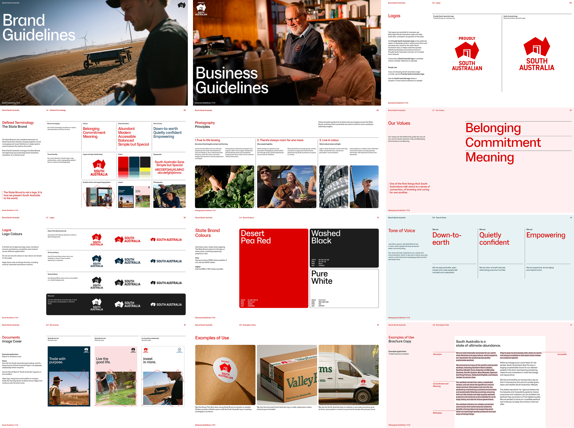
For that reason, we created three sets of brand guidelines, each targeting a different audience with a clear purpose.
This included a master version primarily for government users, a business-specific version for organisations using the State Brand, and messaging guidelines providing clarity on how to incorporate the new narrative into communications.
A new public touchpoint
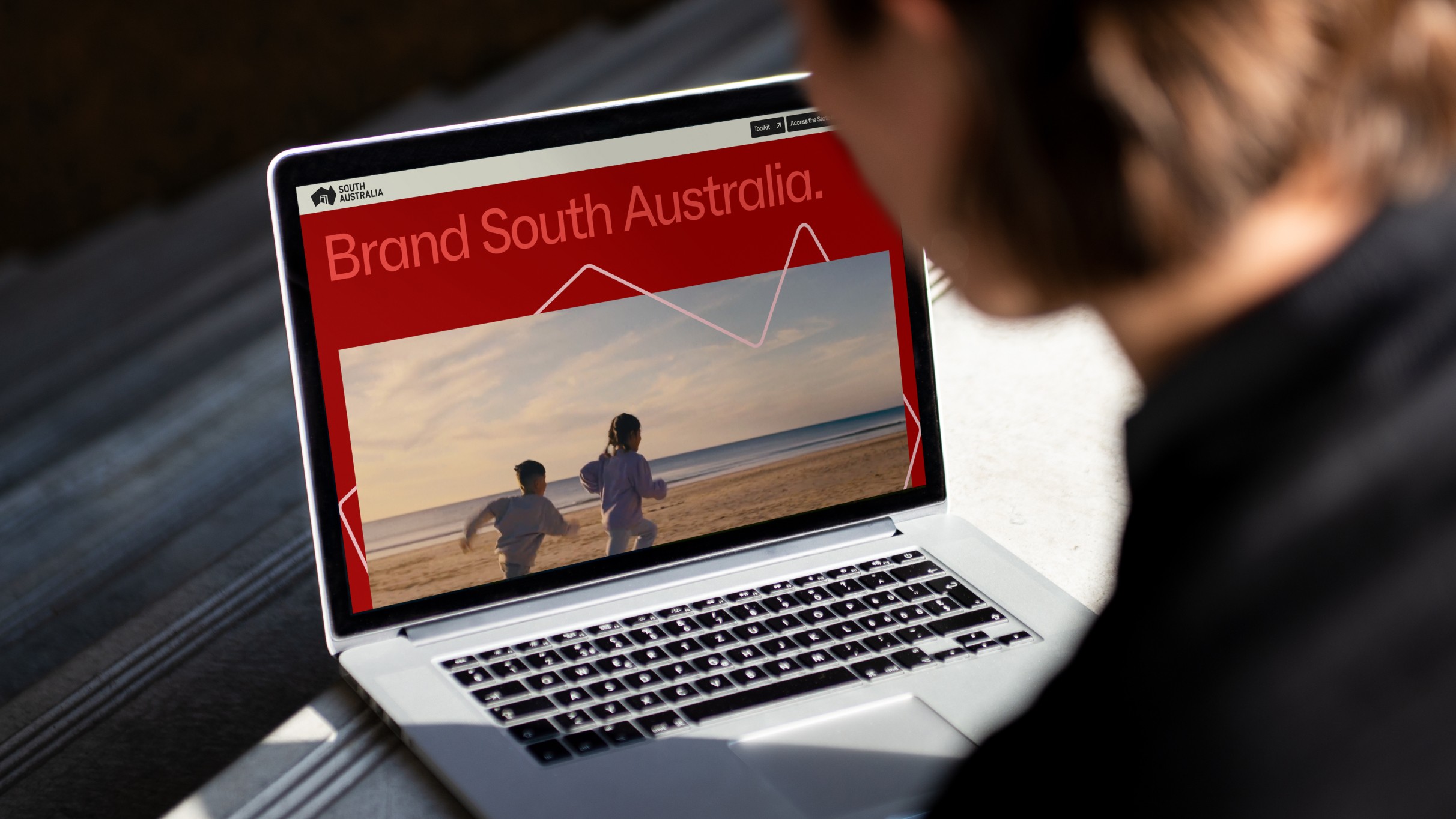
A new website was developed to showcase the refreshed brand, feature South Australian stories, and provide access to tools and guidance for implementation.
The site delivers a seamless experience for users and administrators, featuring simplified onboarding, intuitive segmented navigation and full mobile optimisation.
It celebrates the best of South Australia through photography, storytelling and case studies, while supporting businesses with a streamlined process to check eligibility, apply for brand use, and access the Brand Toolkit, events and workshops.
Bringing the brand to life
Following the refresh, a significant body of work was undertaken to bring the new identity to life and support adoption across government, industry and business.
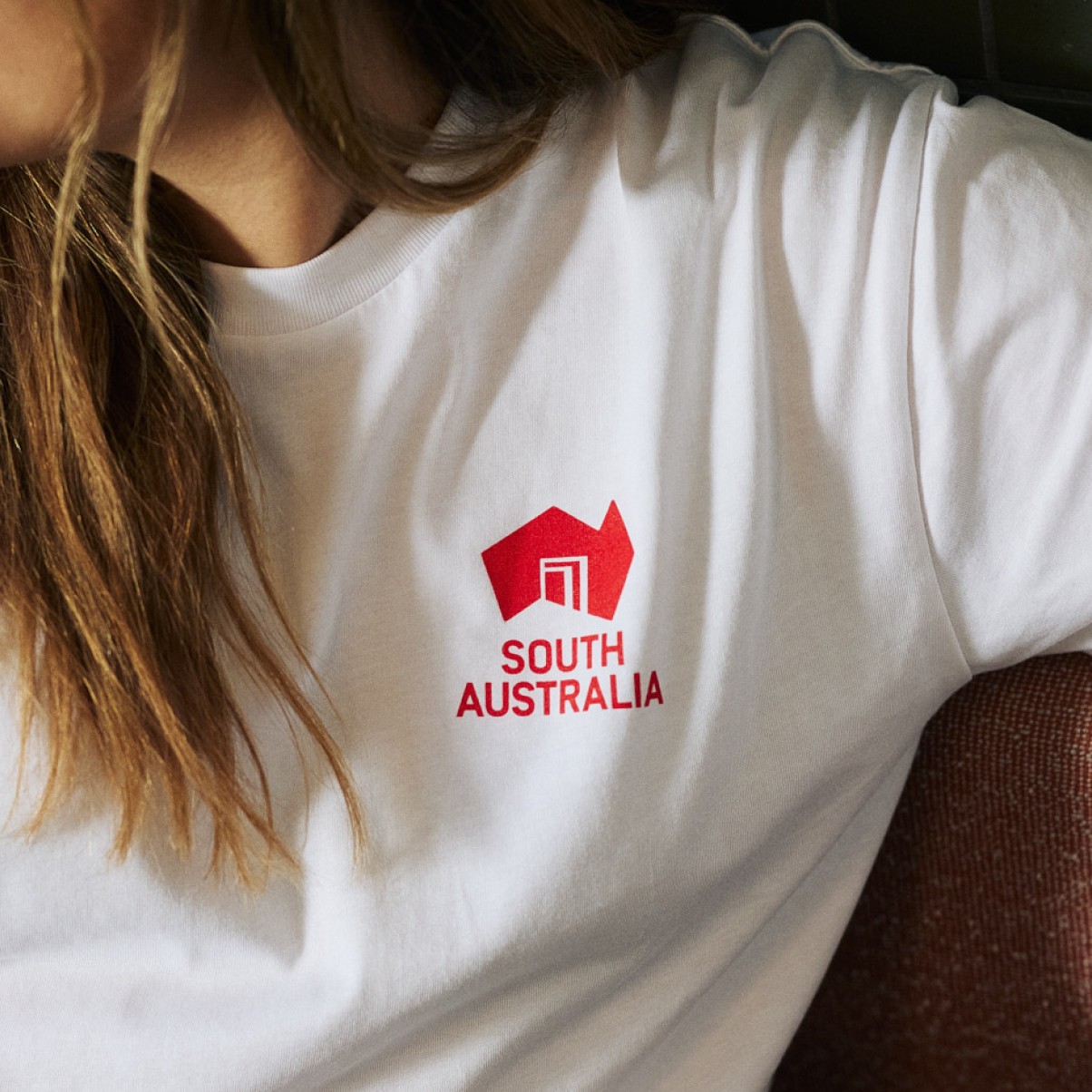
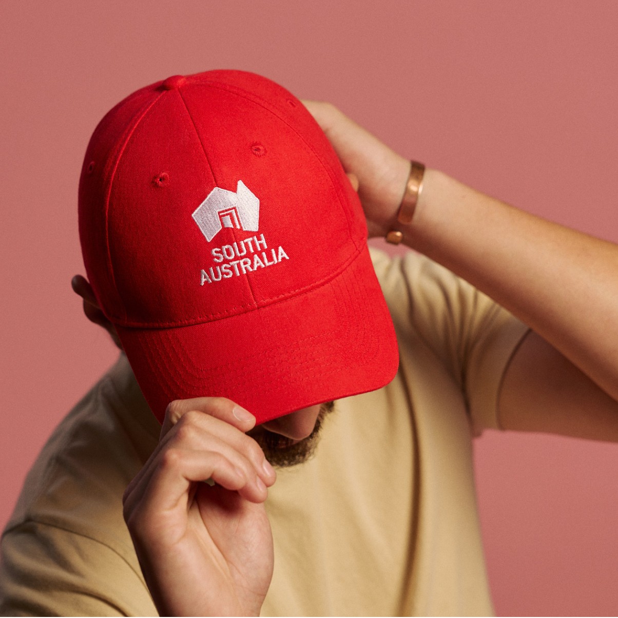
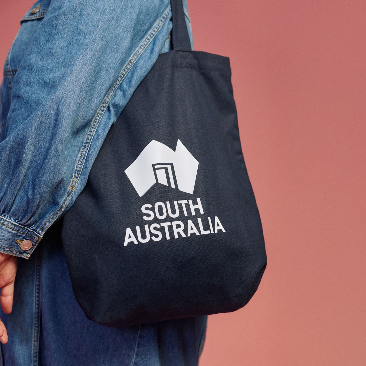
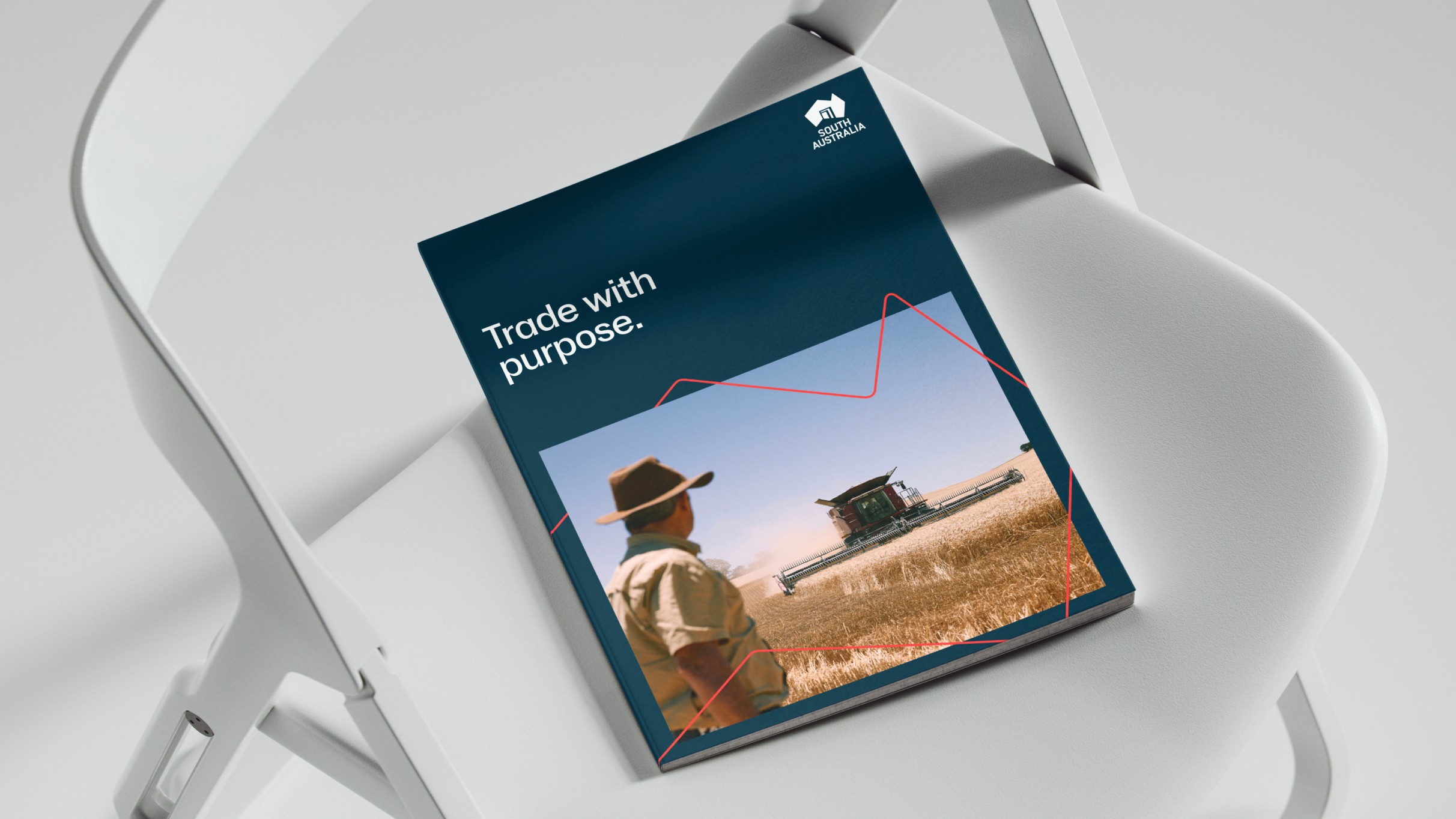
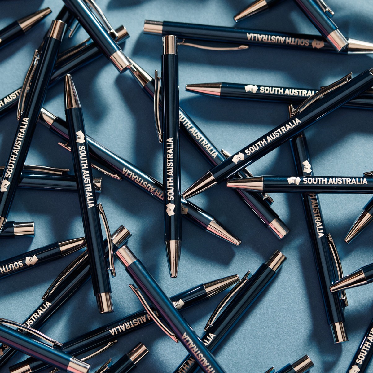
This included a comprehensive suite of templates, communications materials, digital assets, event collateral, signage, merchandise and activation resources, ensuring consistent application across channels and touchpoints.
To further enable uptake, a suite of practical support tools and campaigns was delivered, including ‘how-to’ videos demonstrating correct brand application - from logo usage to incorporating key messaging into communications.
brand together
A registration campaign, Brand Together, was also developed to encourage uptake of the State Brand, featuring film and photography repurposed into tailored content for organic and paid channels.
Alongside these implementation assets, practical tools and resources were created to make the brand easier to understand and use. This included sector-specific resources, fact sheets and proof-point documents translating the State Brand strategy into accessible, actionable content for businesses and partners.
Together, this work establishes a strong foundation for the rollout of the refreshed brand, equipping stakeholders with the tools, resources and support needed to confidently represent and promote South Australia in a consistent and compelling way, ensuring we present a strong and united image to the world.


Contributors
Senior Brand Designer / Custom Font – Sean Kane • DP – Jarrod Knoblauch • Art Director /Photographer – Emmaline Zanelli • DP / Editor – Liam Somerville • Music – Damon Satanek • Photographer – Henry Trumble • Photographer – Josh Geelen