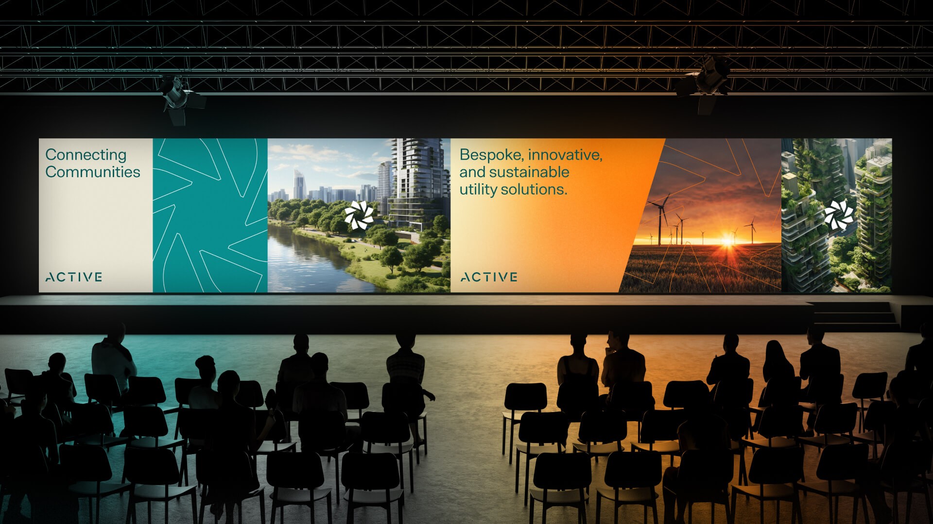
Active Utilities
A renewed energy for Active.
With new ownership, strong growth and an ambitious vision, leading Australian utility provider, Active, was ready to take its brand into a new era.
Active provides tailored, fair, sustainable and cost-effective utility solutions for multi-tenant residential and commercial buildings, including electricity, water and air. But through discovery, Fuller uncovered something bigger at the heart of the business. While Active’s services are fundamental and practical, the relationships it builds – and the role its services play in the communities they support – are what makes the business truly exceptional.
Fuller was engaged to refresh Active’s brand identity and create a platform for its next phase of growth.
Challenge
Active needed a brand identity that reflected its growth and ambition, while capturing what made the business different.
The challenge was to move beyond the functional nature of utilities and communicate Active’s broader role in the places people live, work and socialise.
Our discovery process revealed that relationships were a key ingredient in Active’s success, alongside its tailored approach, fairness, sustainability and cost-effective solutions.
Approach
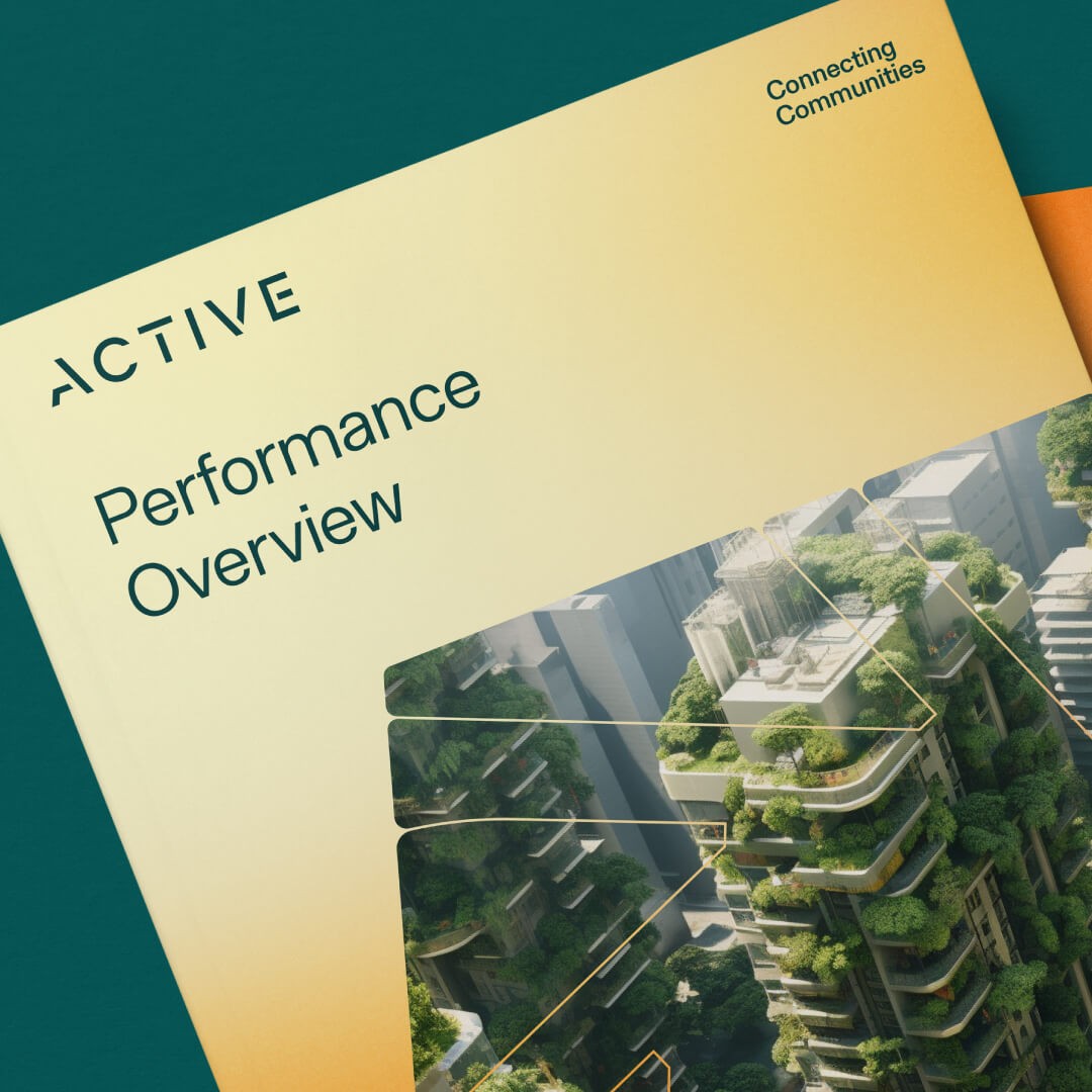
These insights led to a new brand platform centred around a simple but powerful idea: Connecting Communities.
The idea speaks to both sides of Active’s business.
On one level, Active connects communities to the essential utilities they need every day. On the other, its services help facilitate the relationships and experiences that bring people together.
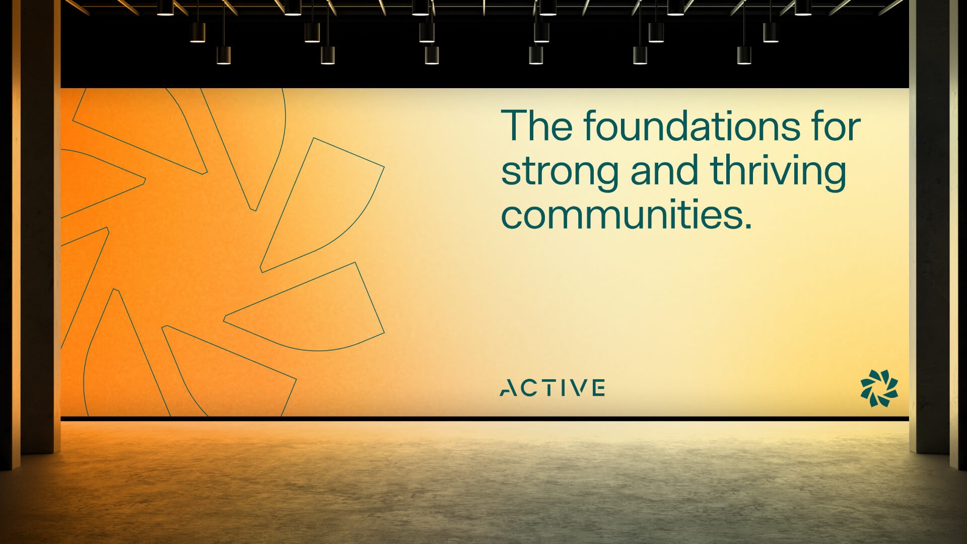
This provided a clear strategic foundation for the refreshed identity and a more human way for Active to communicate its value.
Visual Identity
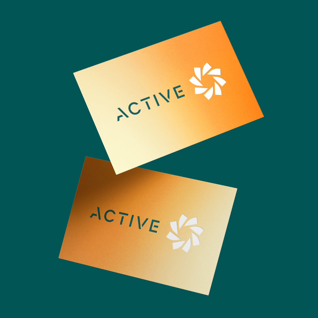
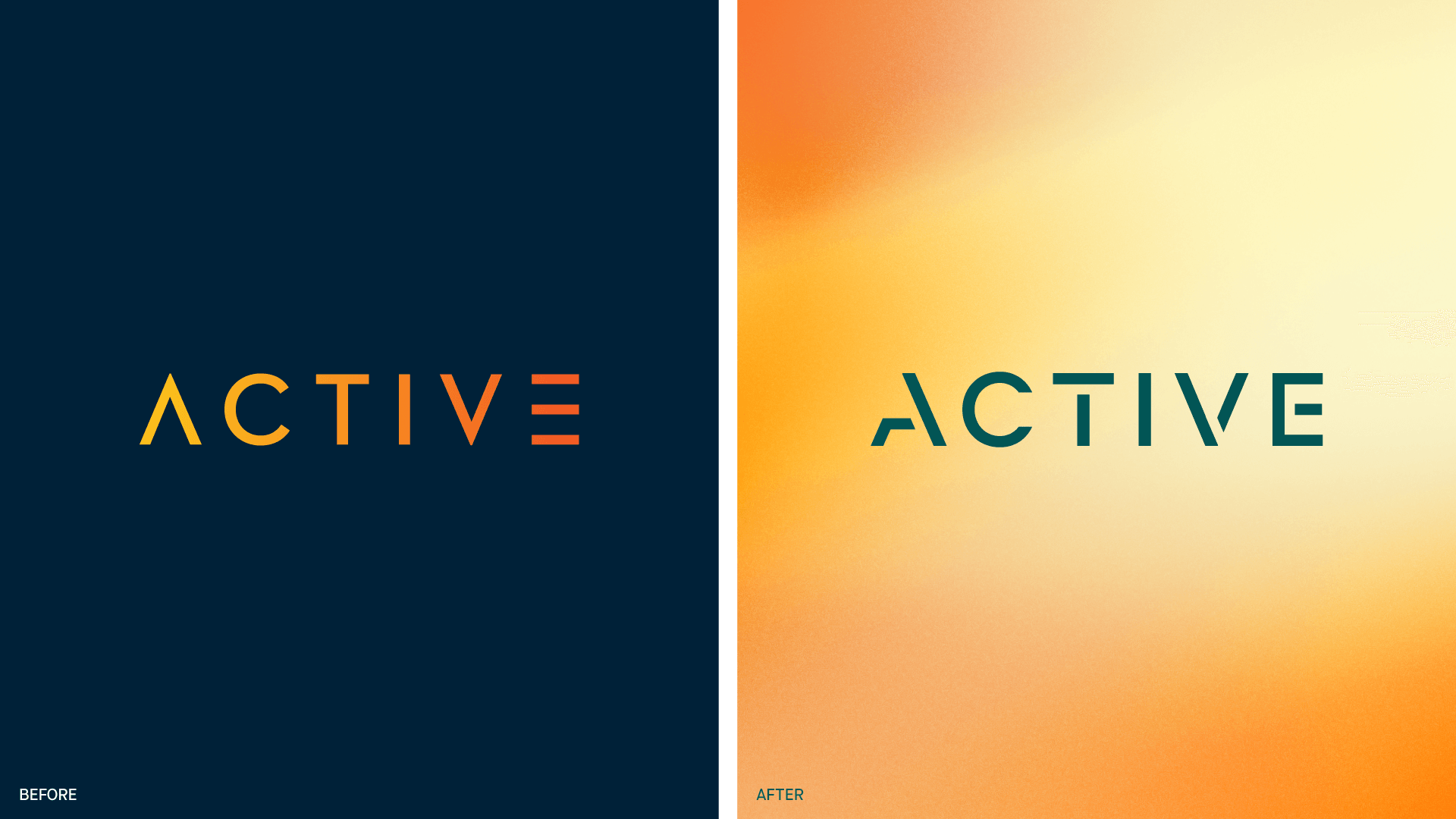
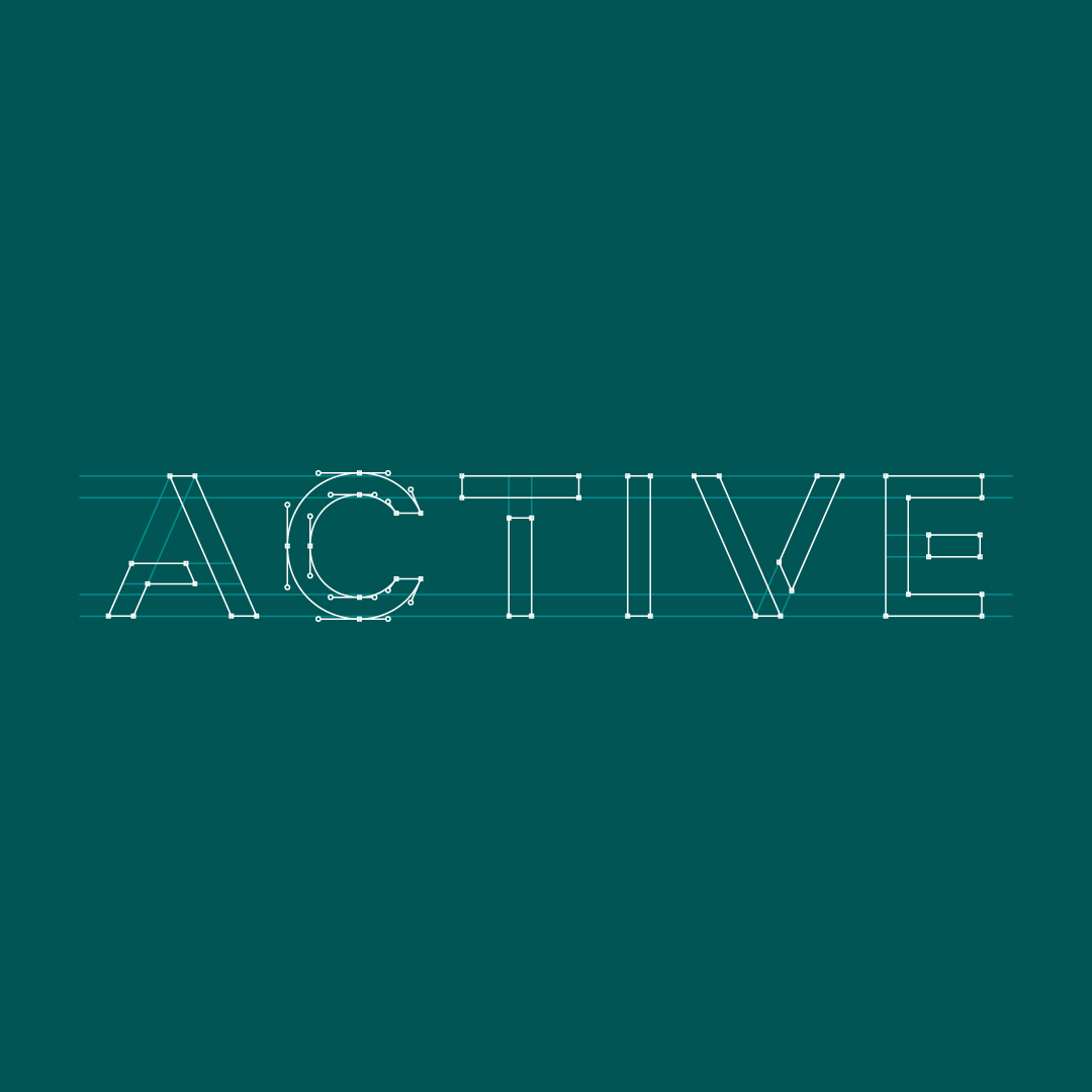
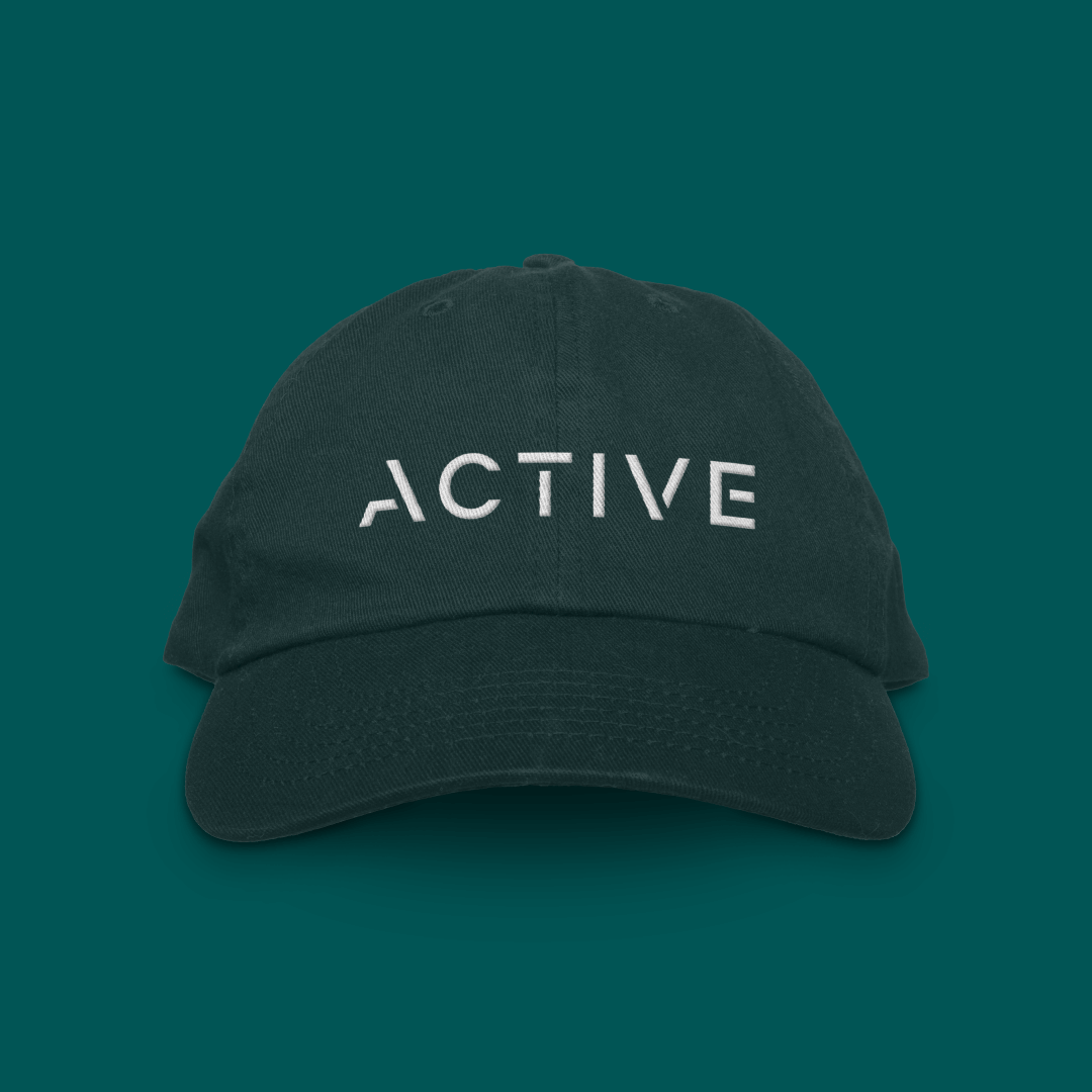
The refreshed Active logotype evolves the previous logo through custom-drawn lettering, softened to create a more modern and forward-looking identity.
Geometric forms evoke movement, while bold shapes convey confidence. Refined negative space adds sophistication, creating a dynamic identity that reflects Active’s connected approach.
The Active Symbol
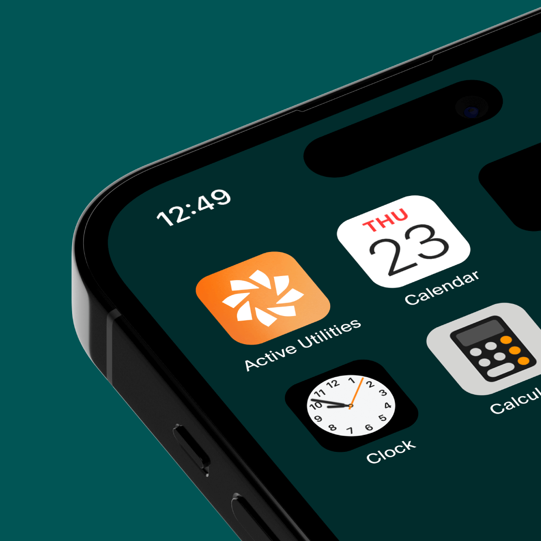
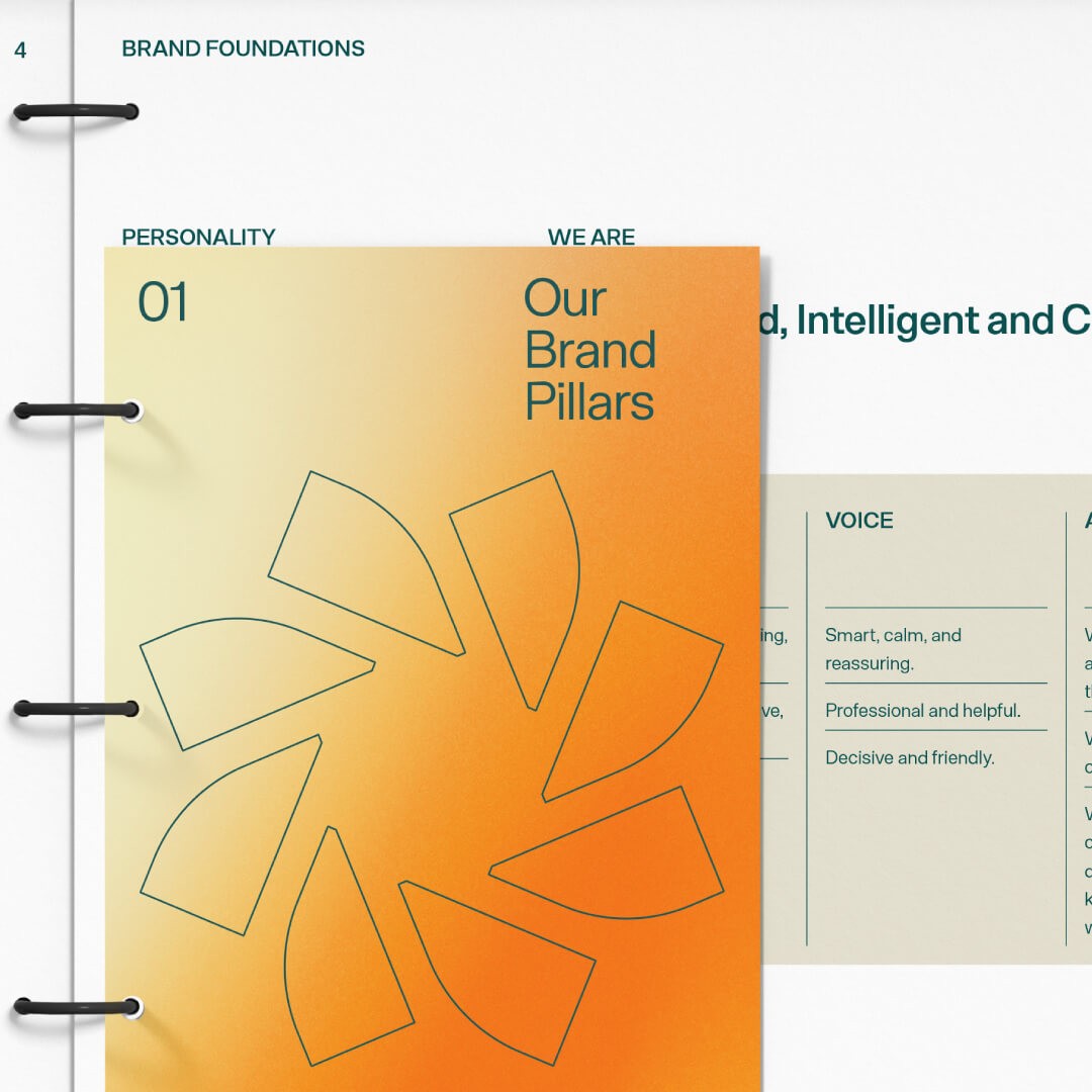
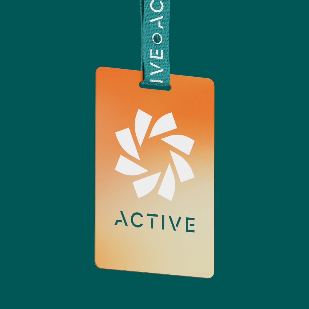
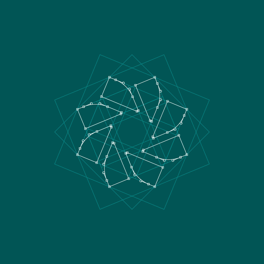
A new symbol was introduced alongside the refreshed logotype as a dynamic visual device.
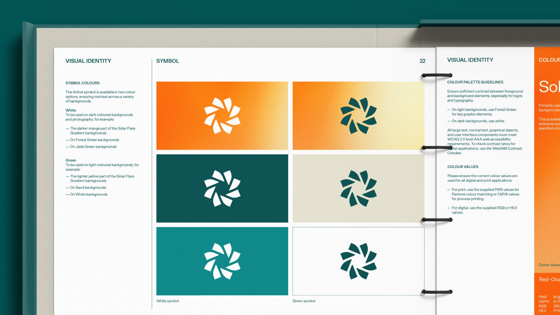
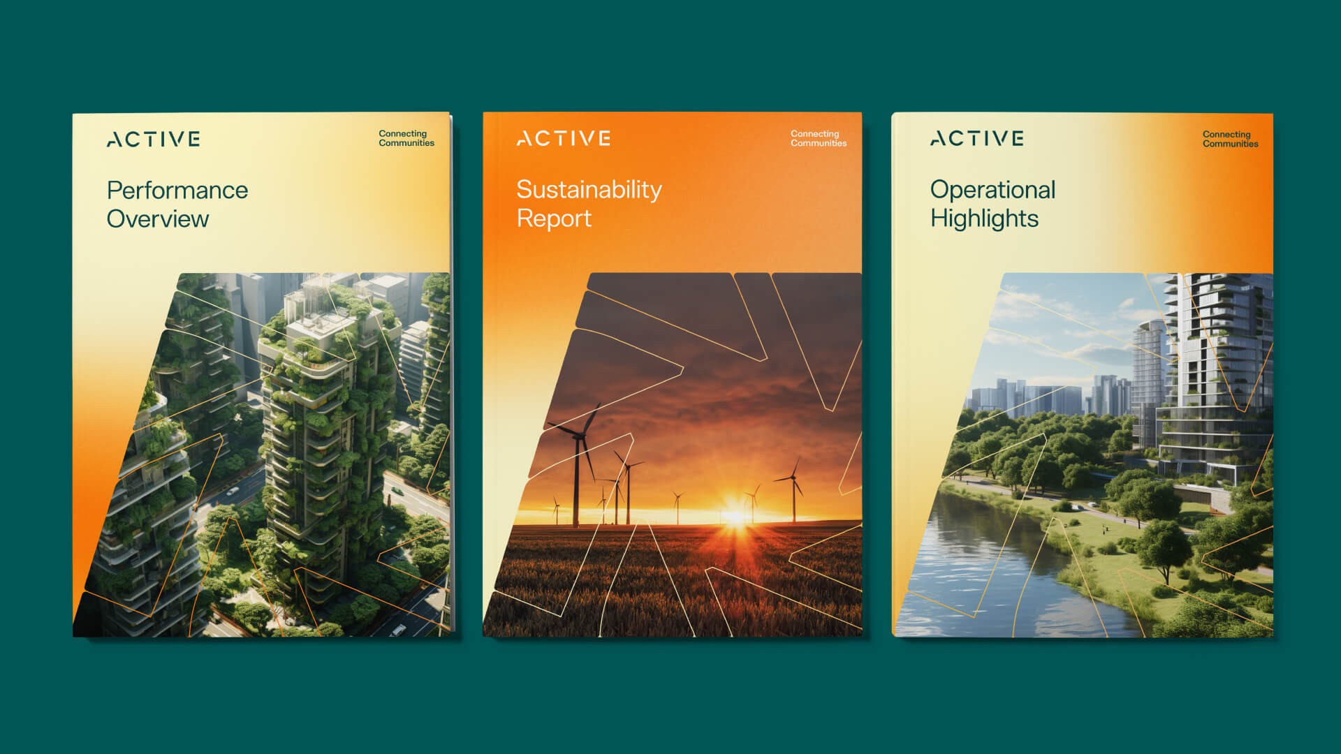
Its flowing form evokes movement, energy and continuous progress, while subtle references to sustainability and the harmony between technology and nature reflect Active’s vision for a greener, more connected future.
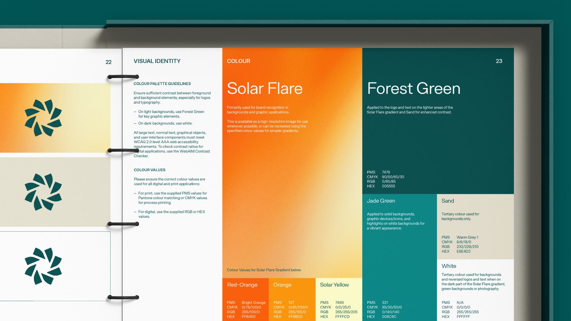
Colour
The original orange gradient was evolved into a vibrant, organic expression inspired by the energy of the sun.
A bold Forest Green replaced the previous navy, bringing associations of growth, confidence and sustainability. Fresh greens and calming neutrals complete the palette, creating greater balance and versatility across the brand.
A new era for Active
The refreshed Active identity brings together the practical importance of its utility services with the strong human relationships at the heart of the business.
With its refreshed positioning, and a more distinctive and contemporary visual identity Active’s ambitious vision for the future is now matched by its brand.