The Brief
Redefine the Adelaide Football Club brand to ignite passion and pride.
The Adelaide Football Club (the Adelaide Crows) is one of two South Australian based clubs competing in the Australian Football League (AFL and AFLW).
Founded in 1990, and playing its first season in 1991, the Club was born to represent the proud heritage of South Australian football on the national stage - making it different to the majority of clubs in the competition, who grew from suburban roots.
While this unique heritage had always been a strong point of pride - with the Club entering an exciting new era under a fresh strategic vision and a new home at Thebarton on the horizon - it was time to reimagine the Club’s identity for future generations.
The Game Plan
Redefining a brand that ignites such passion and pride in its community, and means so much to so many people, required an approach that was inclusive, thoughtful and rigorous.
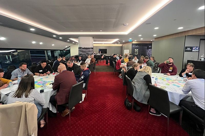
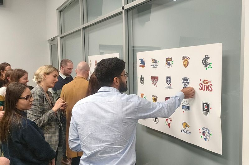
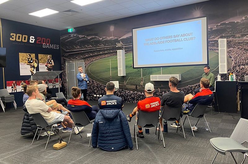
Our work began in July 2023 with an extensive discovery phase that included engagement with representatives from across the Club, including the playing group, the football department, employees, former staff and players, as well as South Australian and interstate members and fans.
The Process
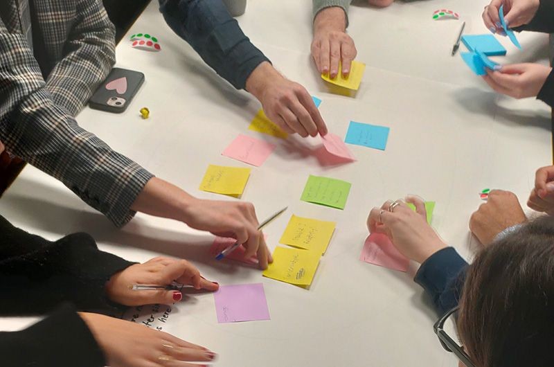
The consultation process engaged with thousands of stakeholders through brand workshops and presentations, focus groups and member surveys.
Extensive research of the global sporting landscape was also undertaken, as well as a literature review of trends in fan motivation and engagement, to ensure the outcome was future-focussed and flexible, and would deliver a brand identity that would support the Club to achieve its plans.
A story of people and community
Central to the development of the new brand was the creation of a deep and emotive narrative that captured the past, present and future of the Adelaide Football Club. This story acted as the primary building block from which to construct the brand, identifying the special characteristics that make the Club so loved by members, fans and supporters.
Made from South Australia
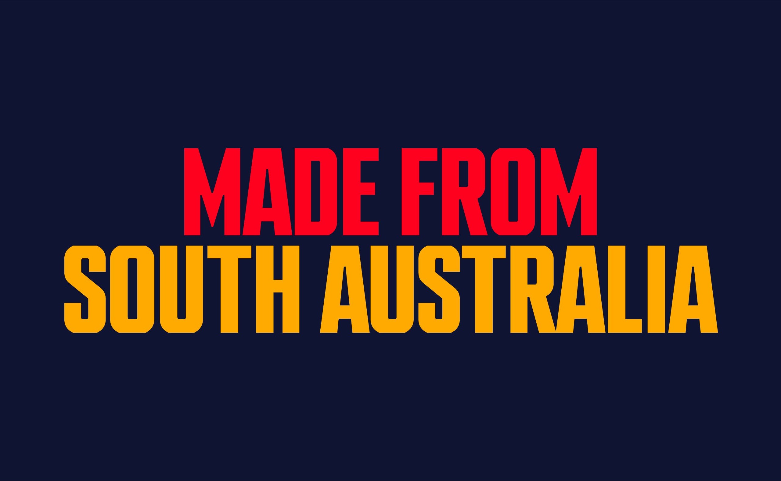
The positioning statement ‘Made from South Australia’ is the concise and public facing expression of the brand narrative. It is a simple but powerful expression of the deep connection between the state and the Club, and speaks to the many elements that the Club’s identity shares with the state and its football history – its name, its colours and its symbols – to name a few.
The new visual identity was guided by the future, but inspired by the past.
Logo
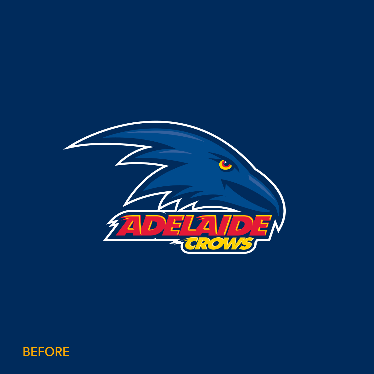
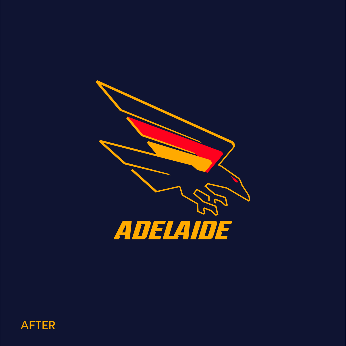
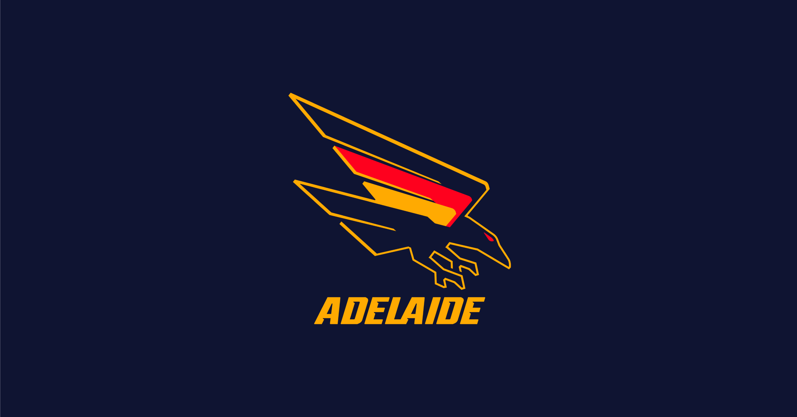
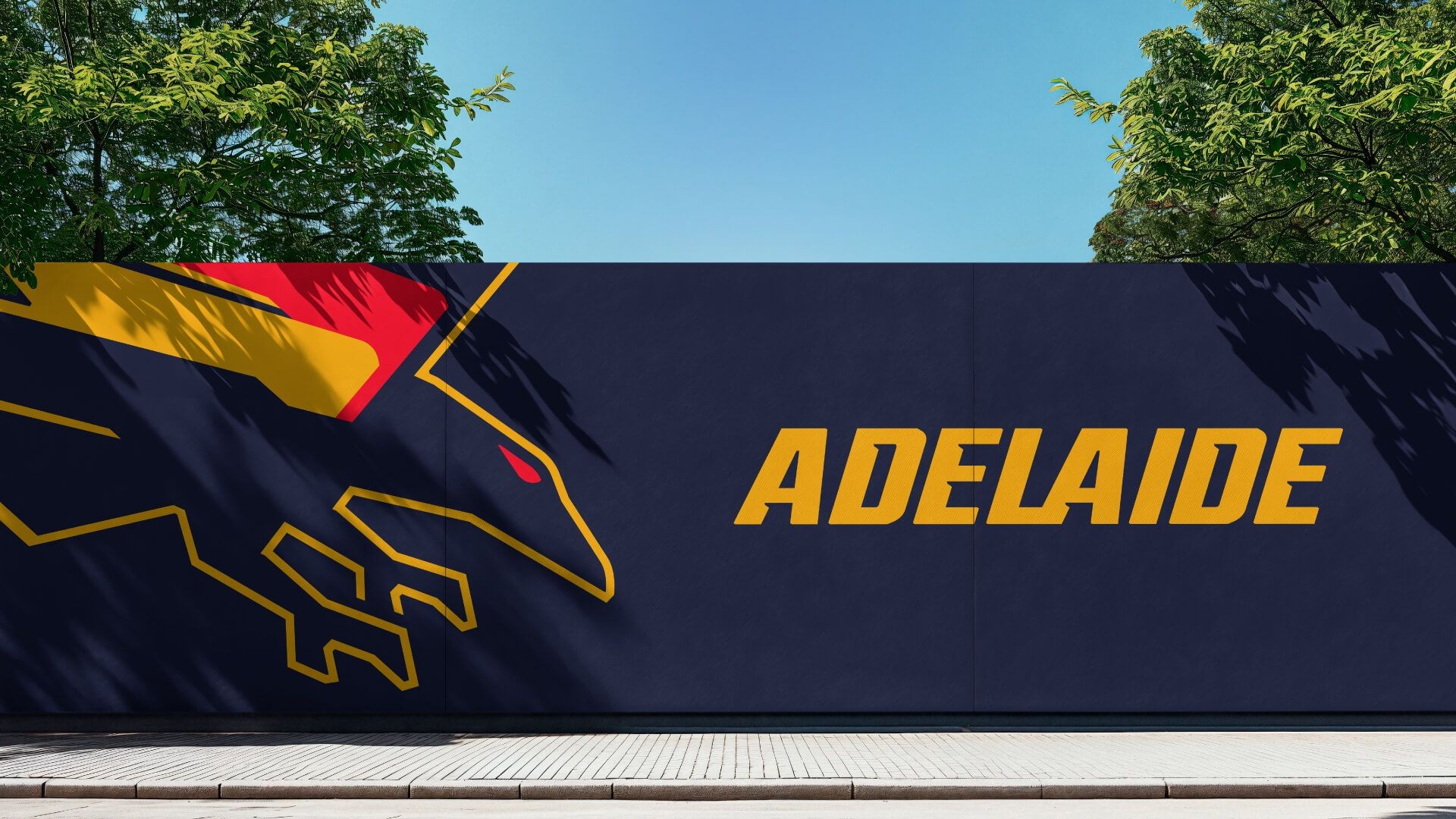
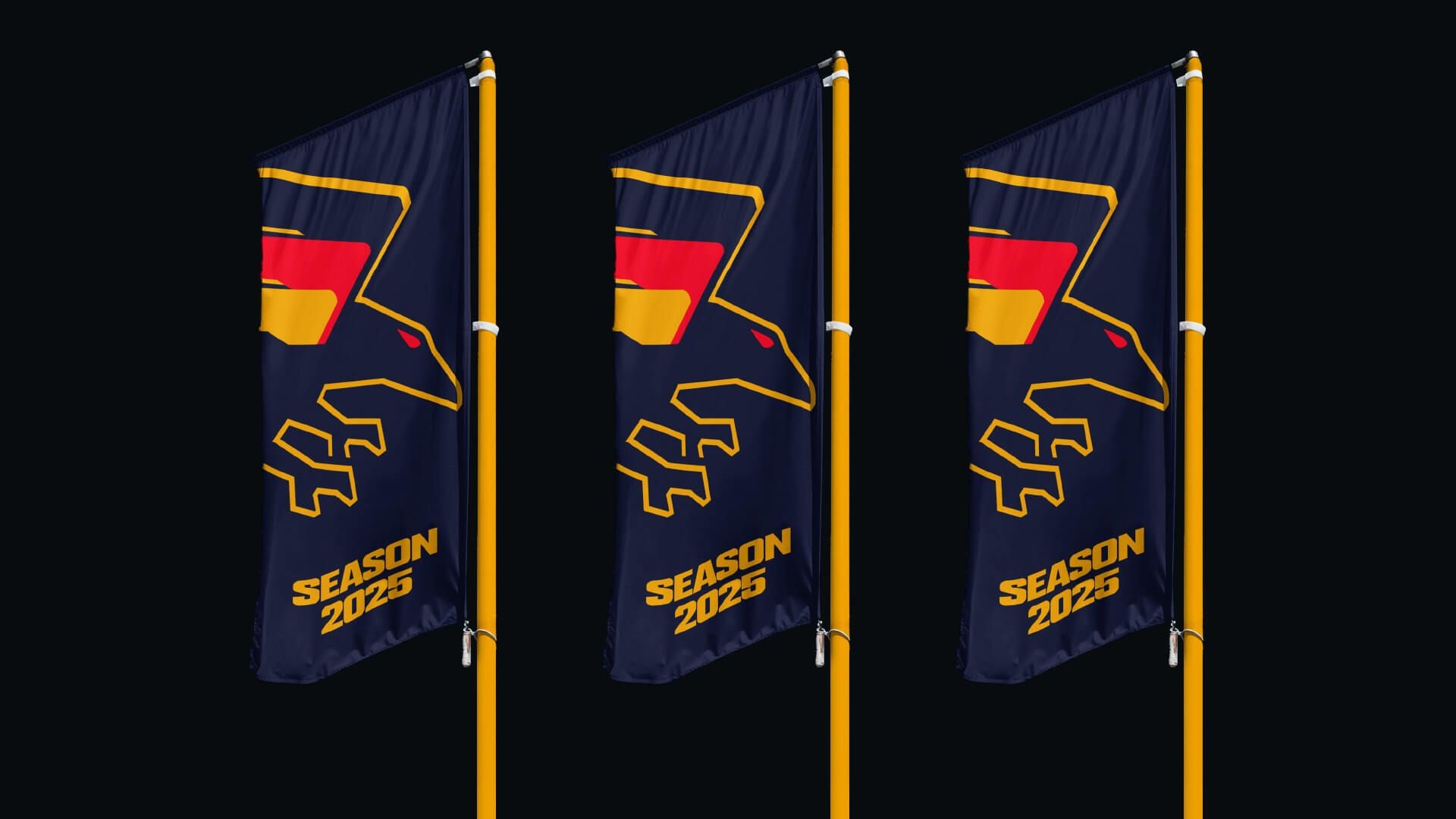
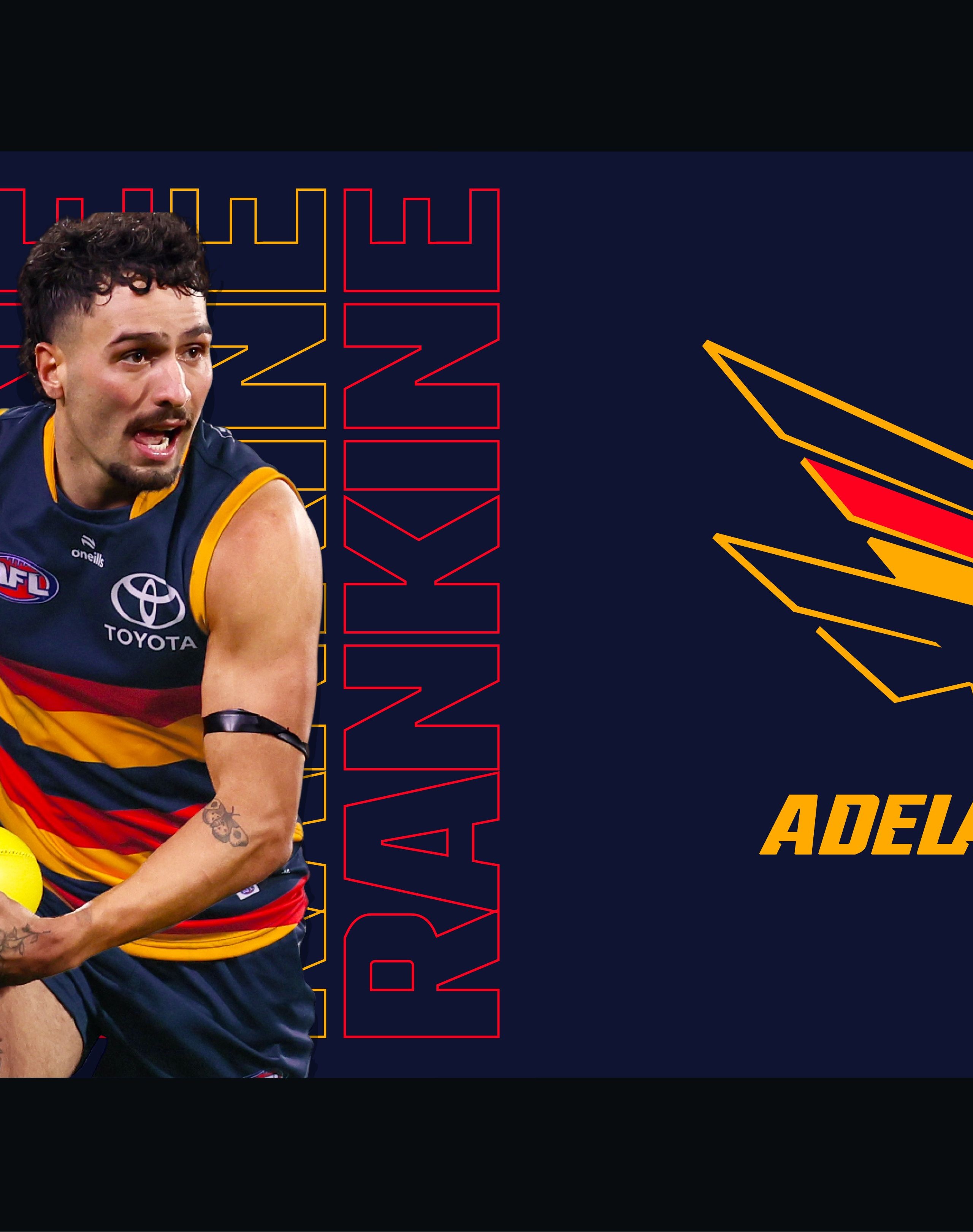
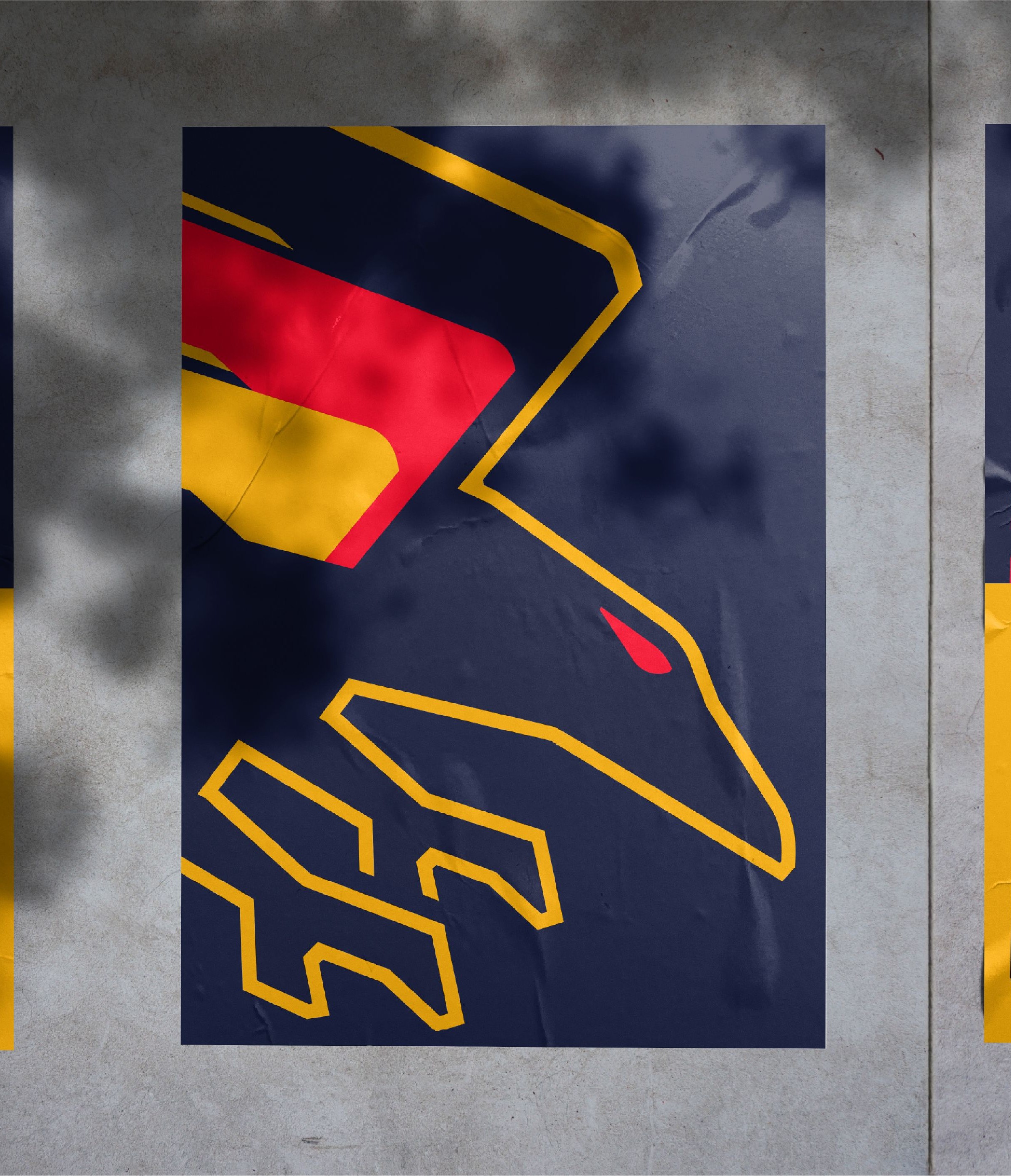
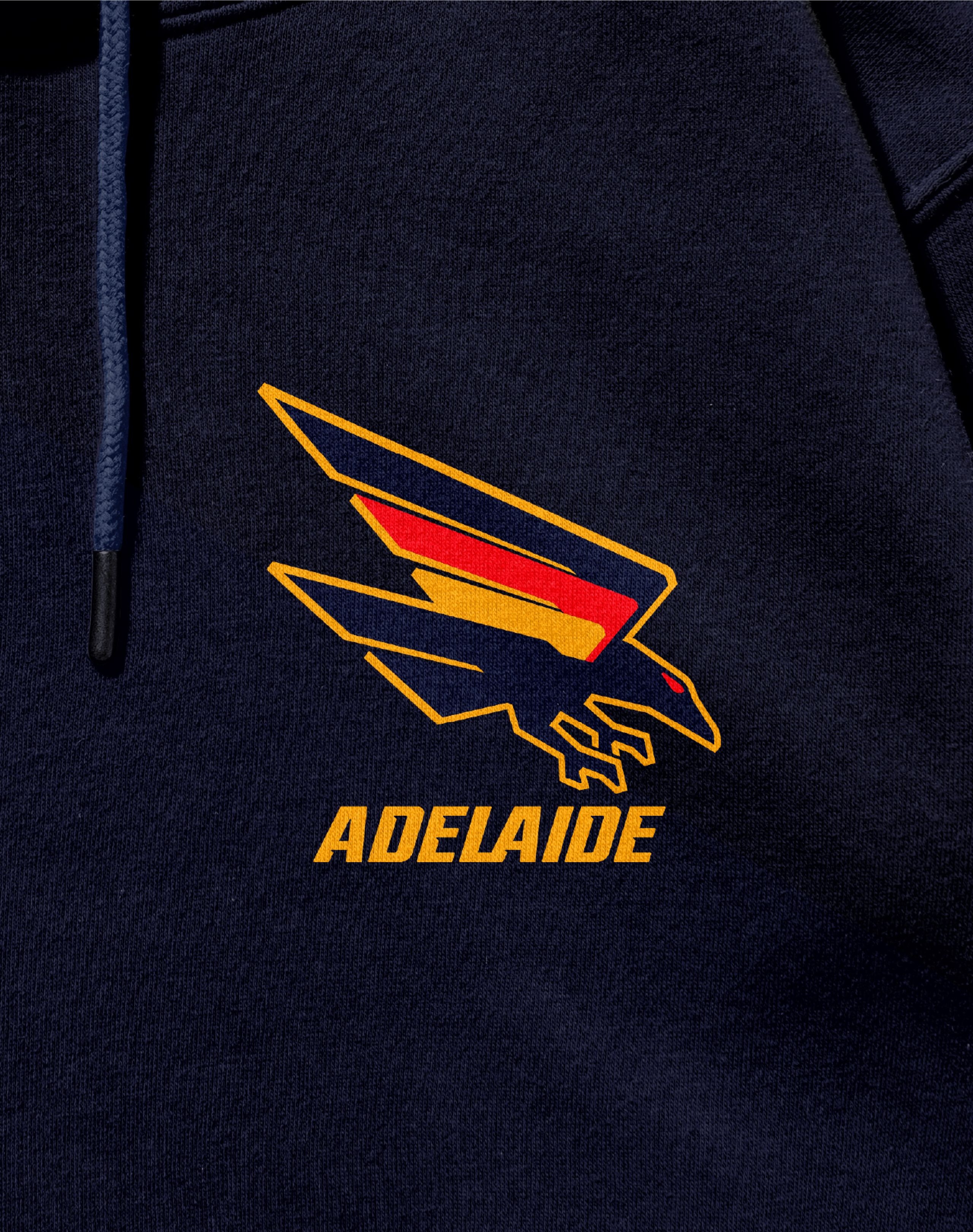
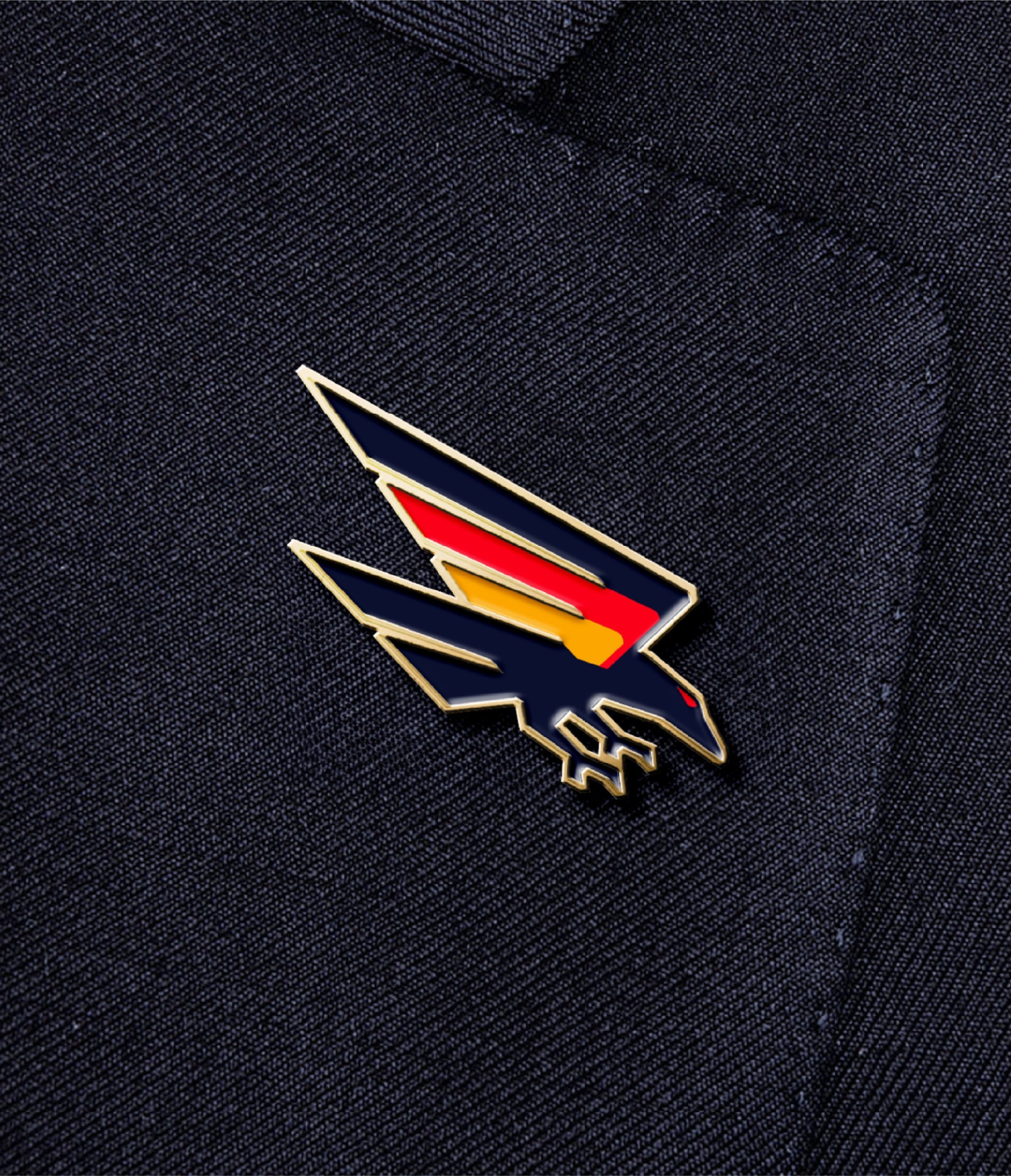
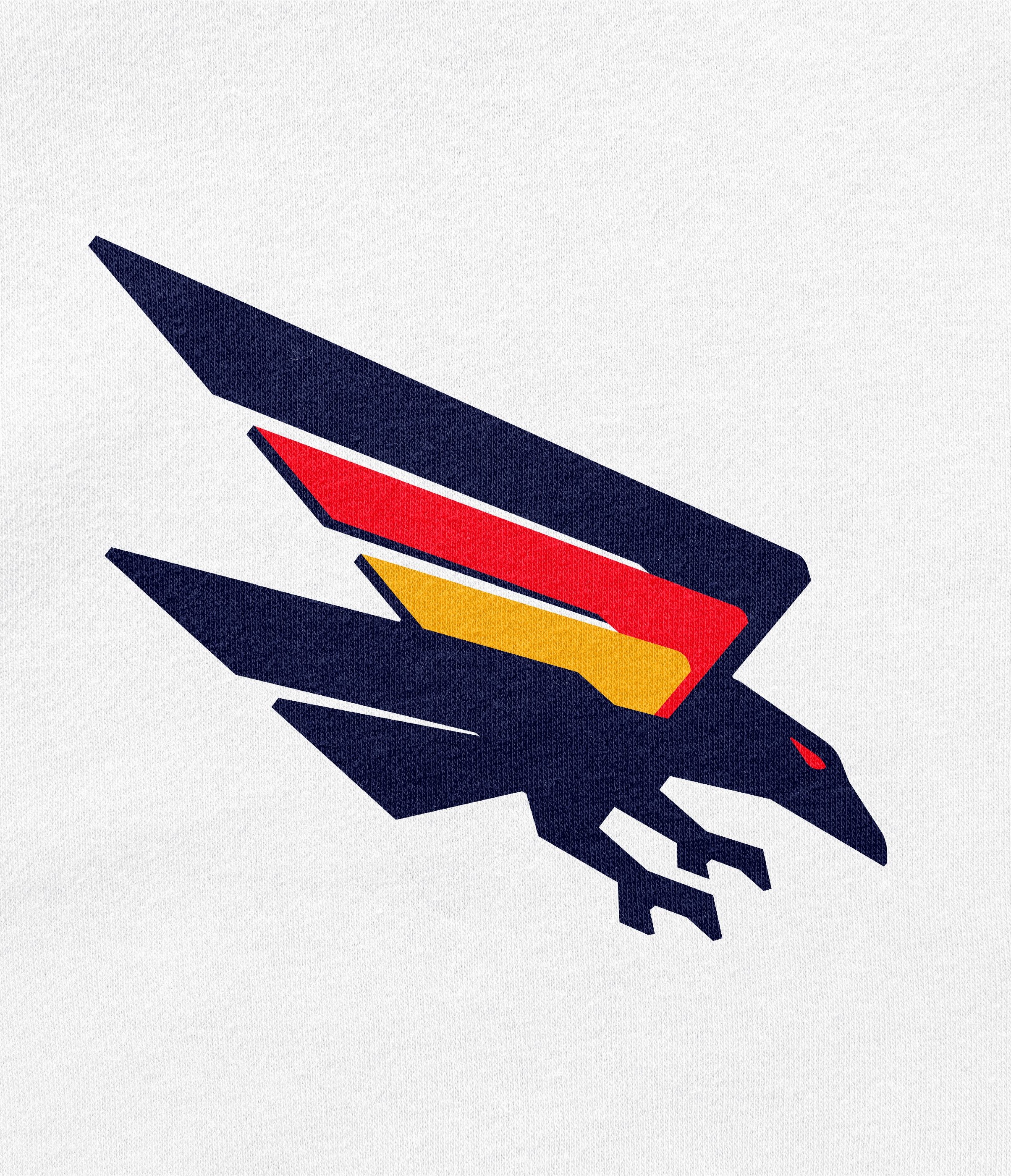
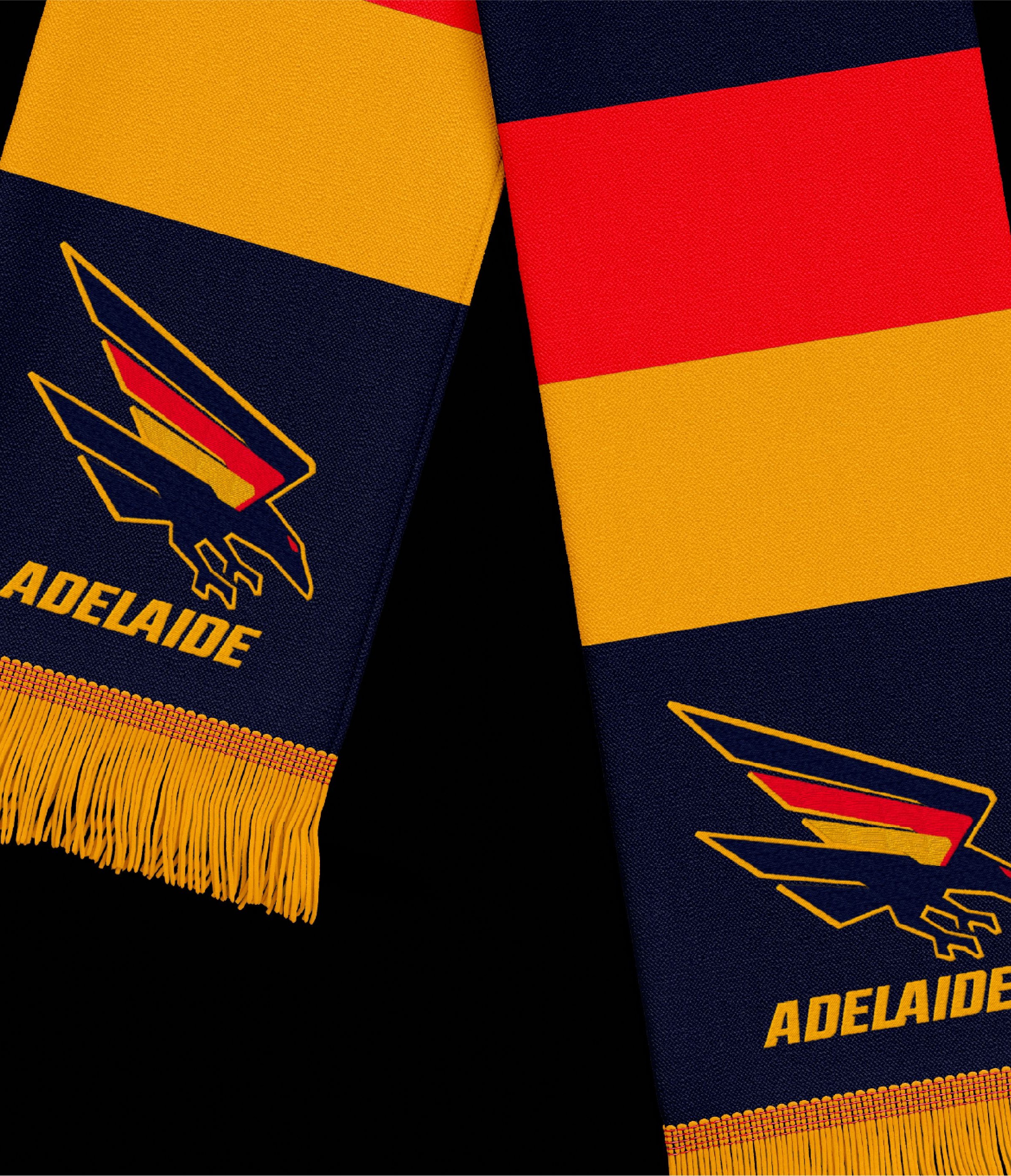
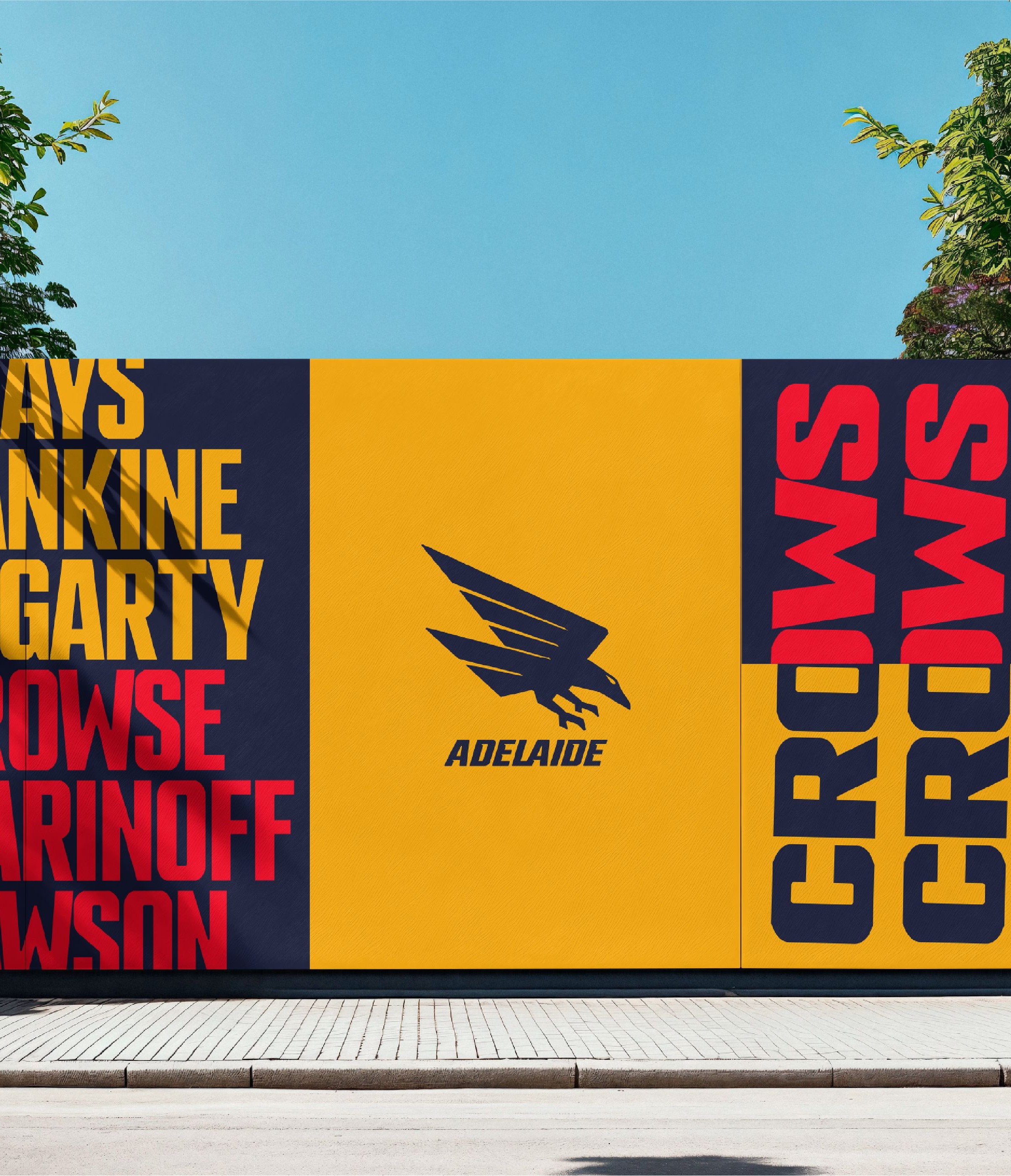
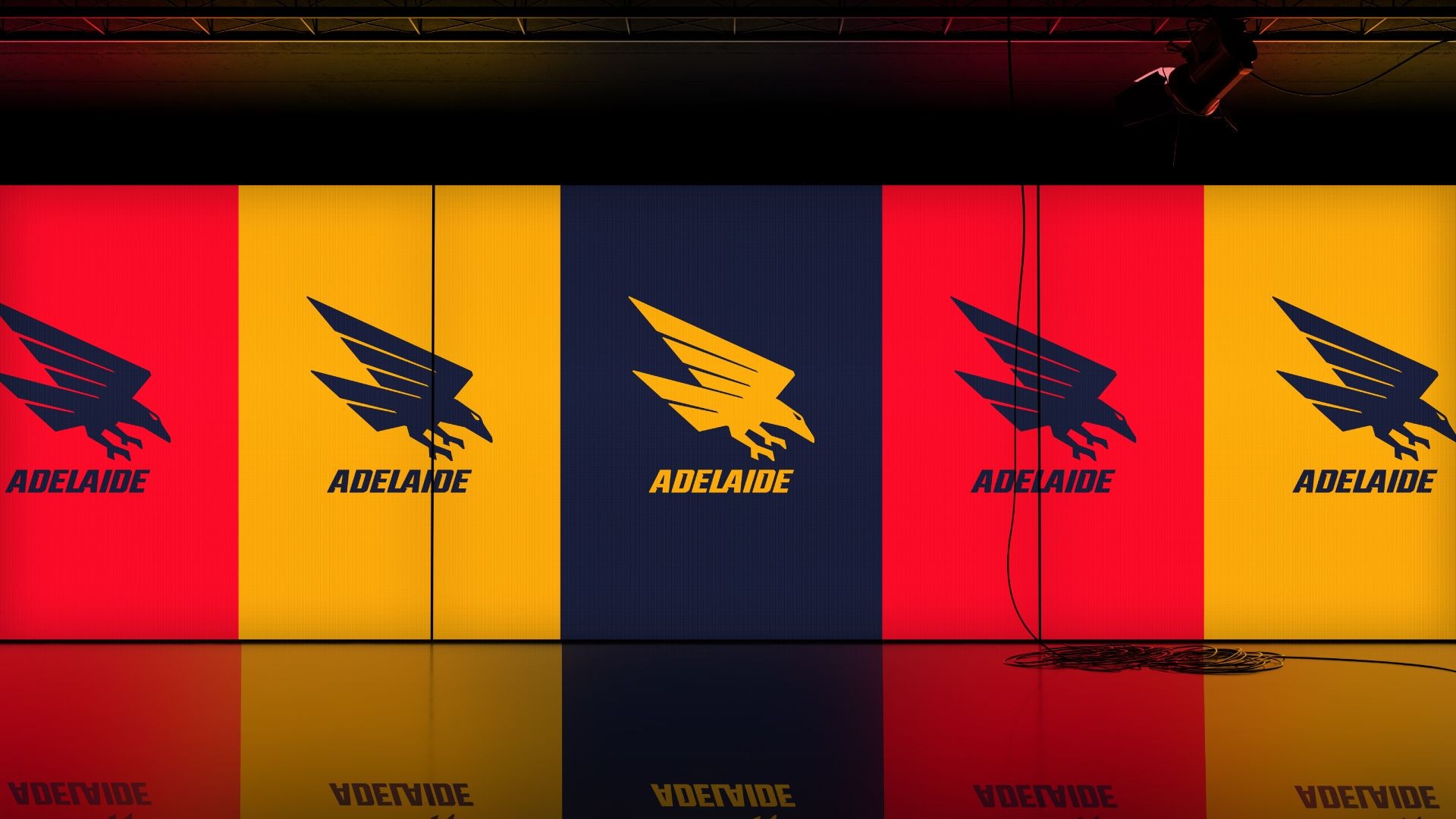
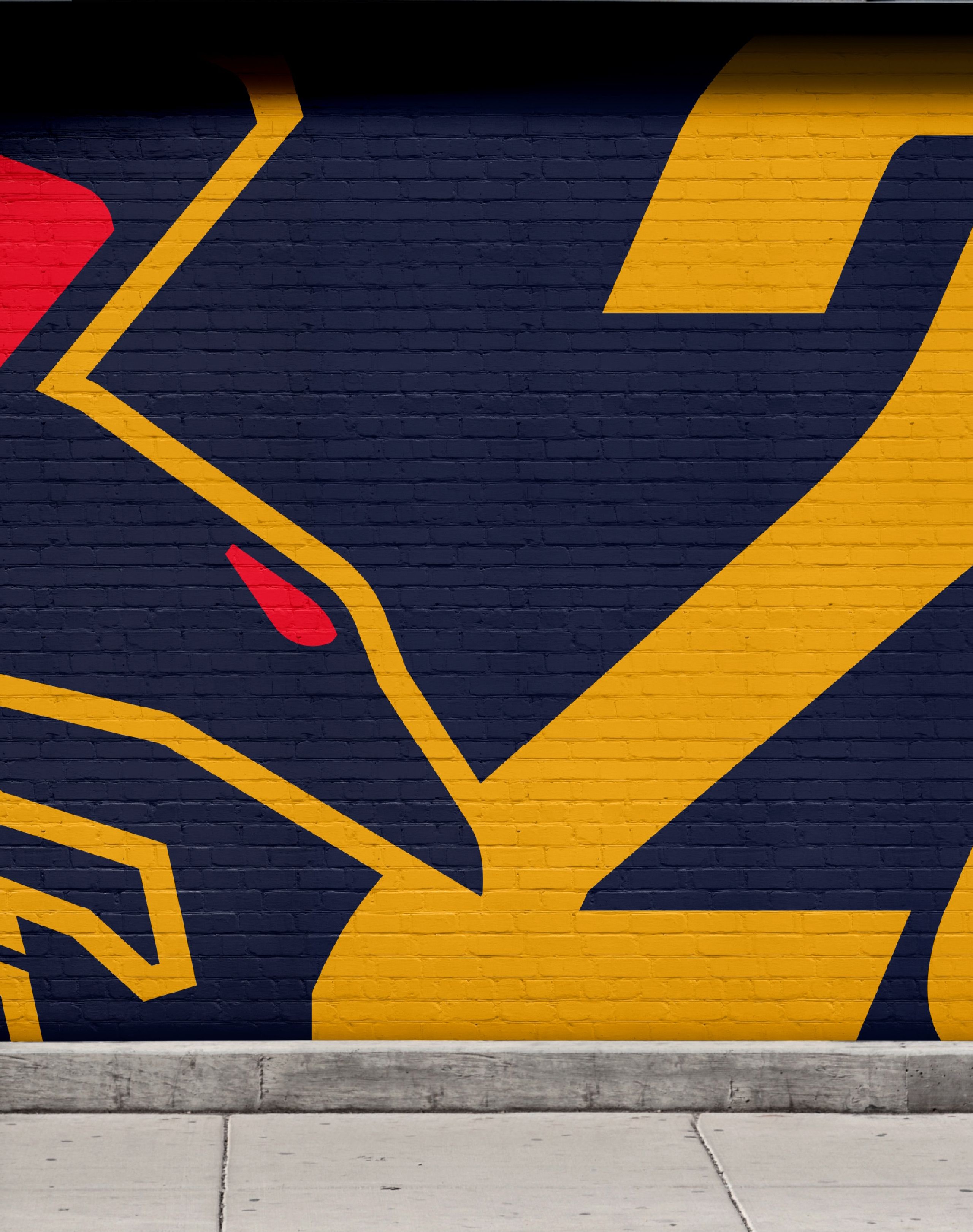
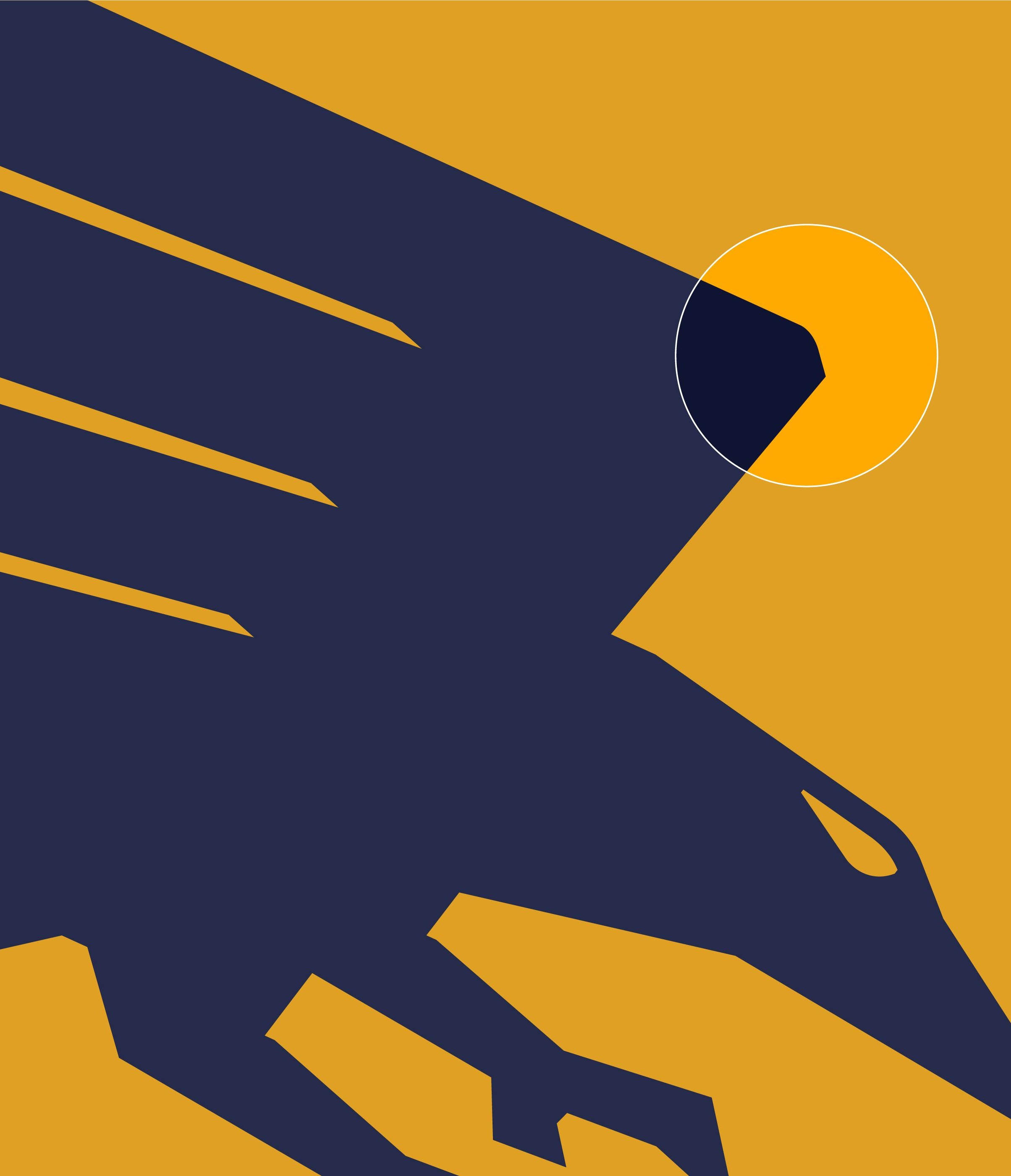
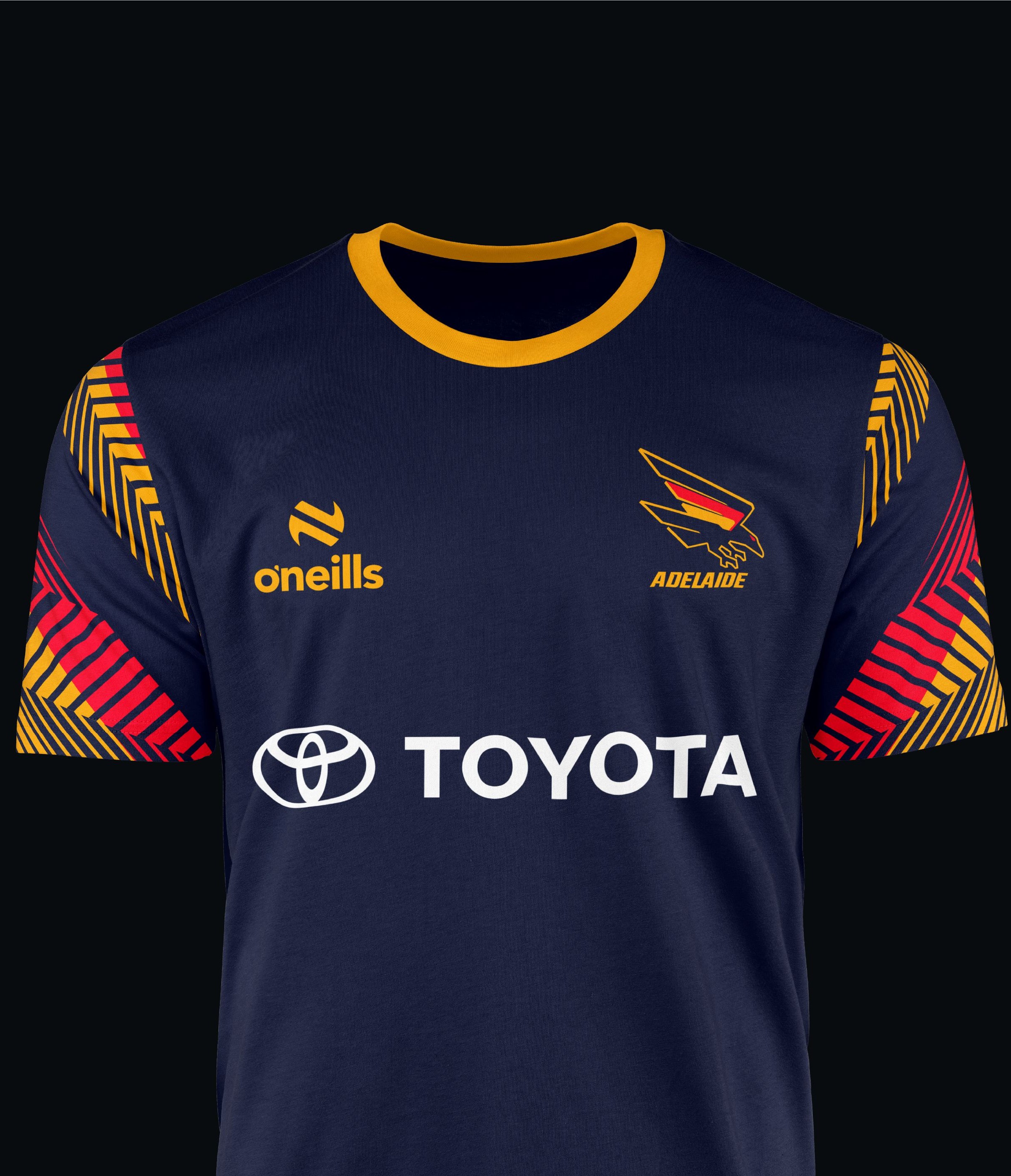
A focal point of the redesign was revitalising the much-loved ‘swooping crow’ logo, a symbol cherished by members and fans. The tricolour wing, inspired by the shape of South Australia, anchors the Club’s origins, along with the sharpened claws reinterpreted into a fresh, aggressive, ultra-modern and minimalist design.
Positioning the Club name as simply “Adelaide” beneath the crow reinforces its connection to both the city and the state.
Colours
The Club’s iconic tricolours - navy, gold, and red - form the cornerstone of the refreshed identity. These richer, bolder colours are more closely aligned to the state’s colours, honouring the club’s heritage while creating a striking visual impact. The deeper navy and brighter red modernise the original guernsey, establishing a strong foundation for the future.
Typography
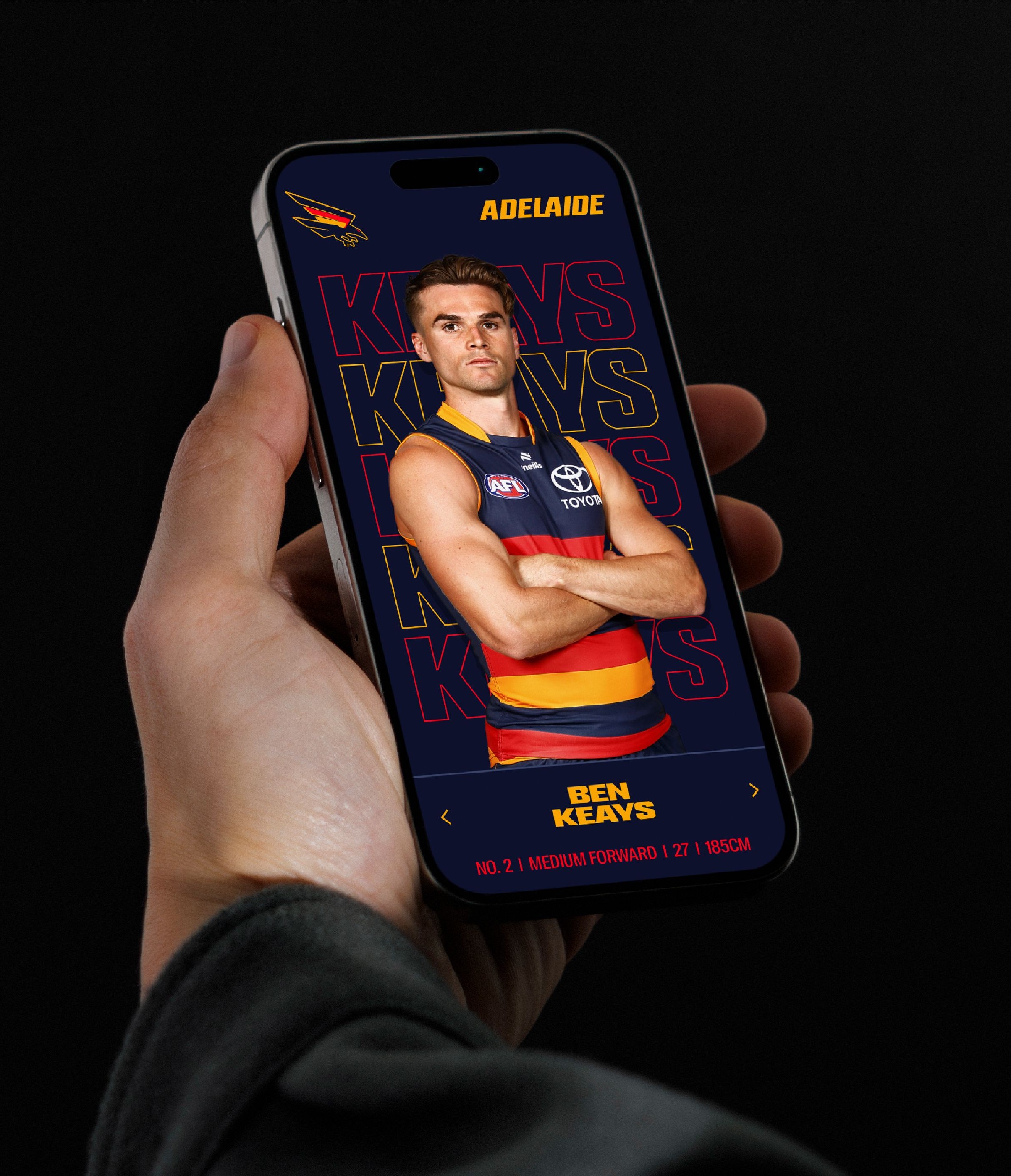
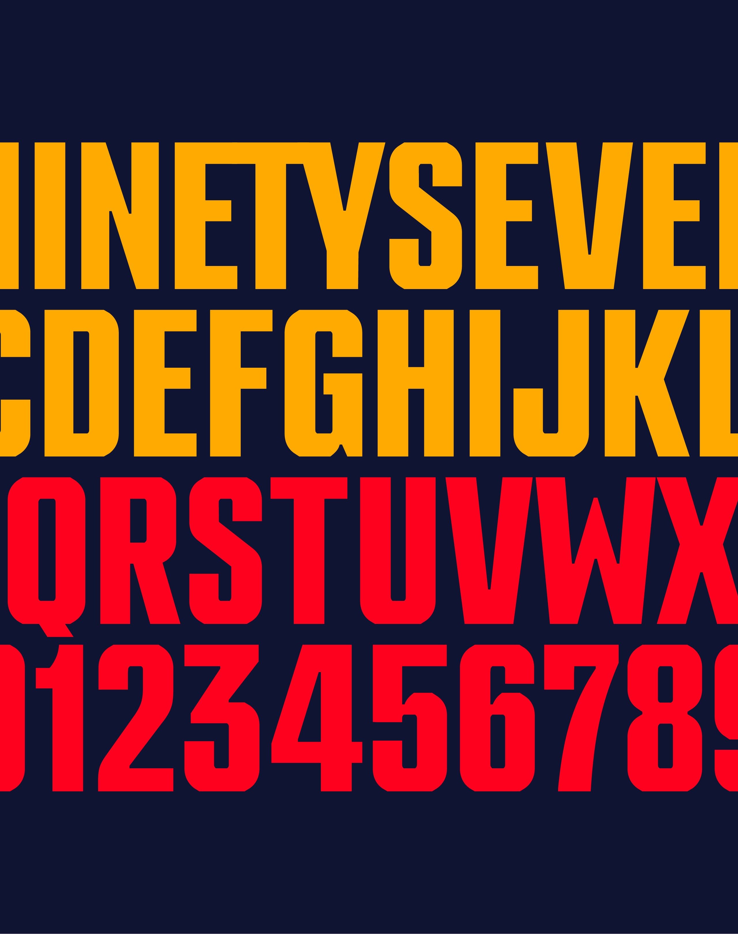
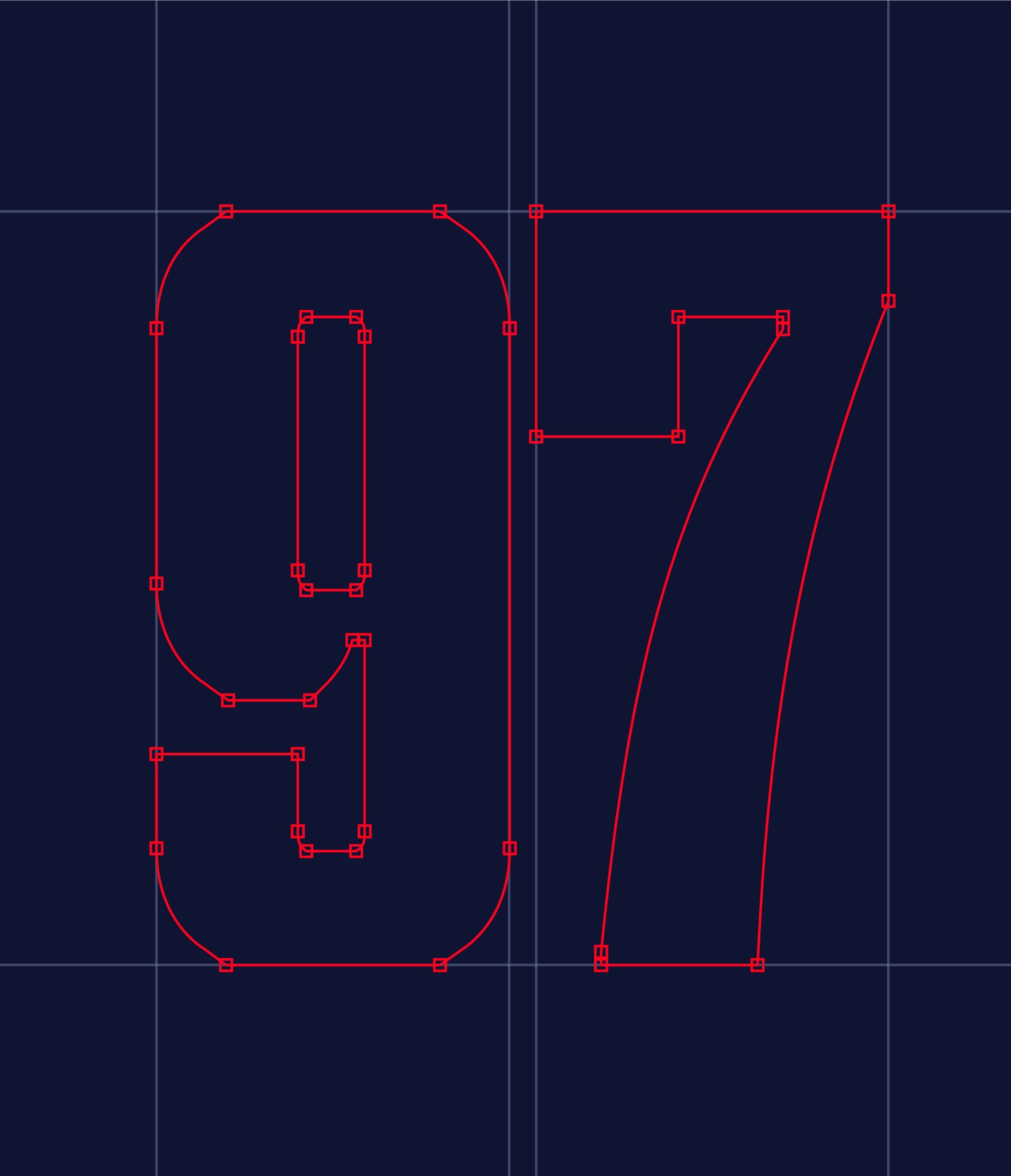
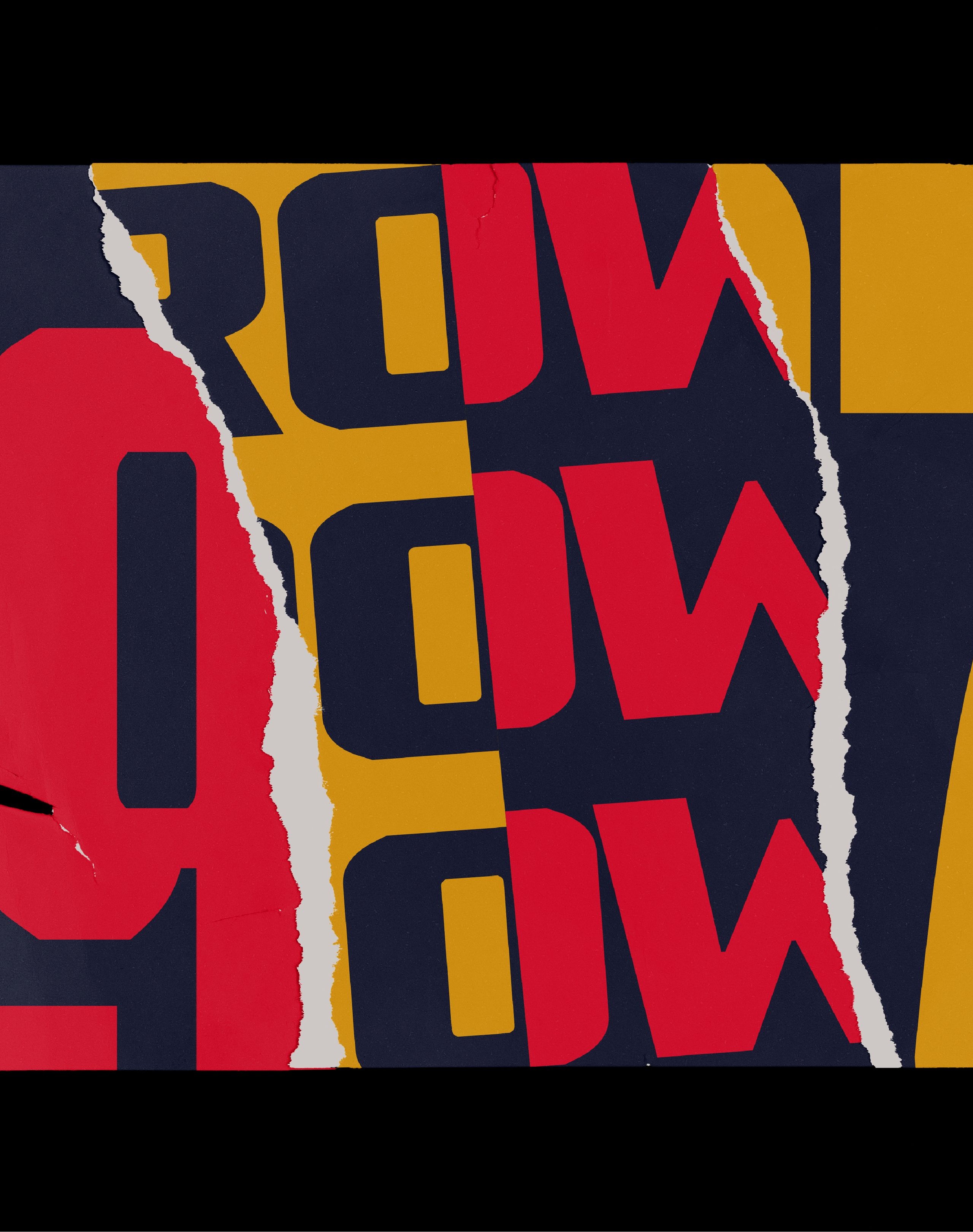
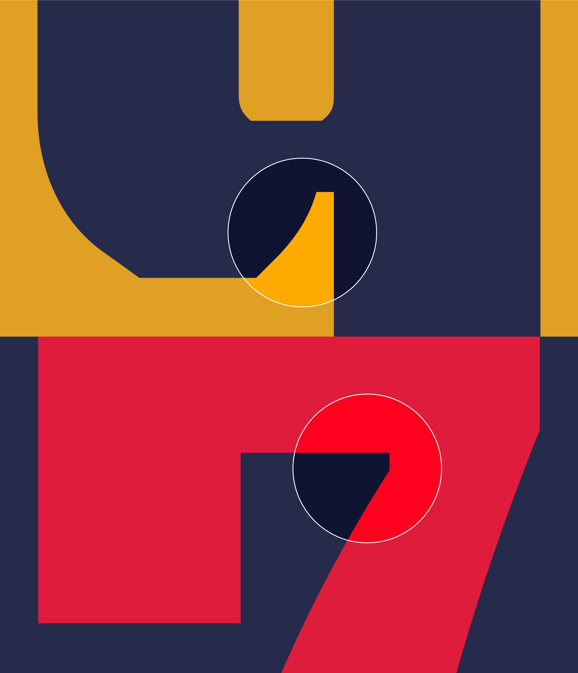
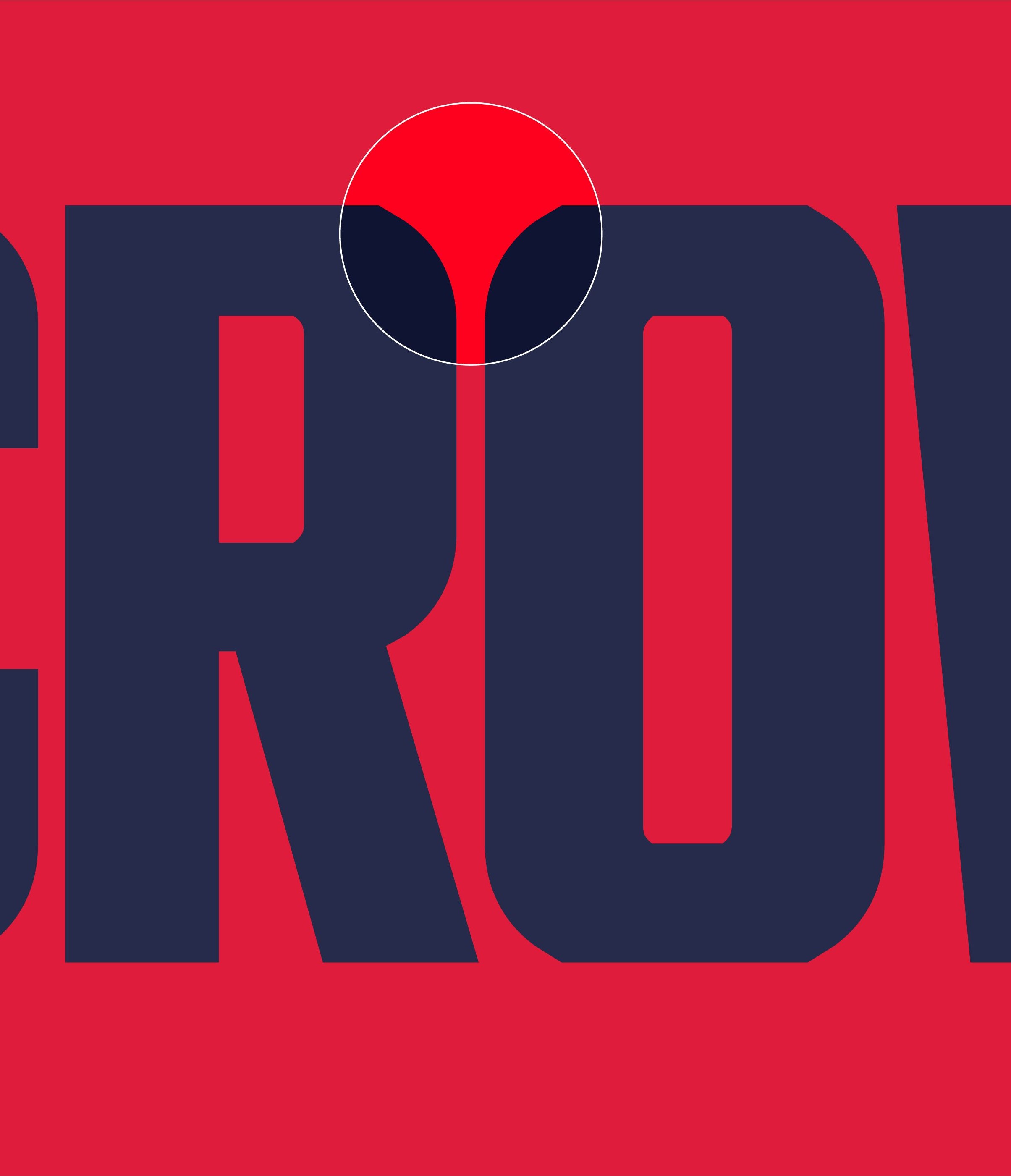
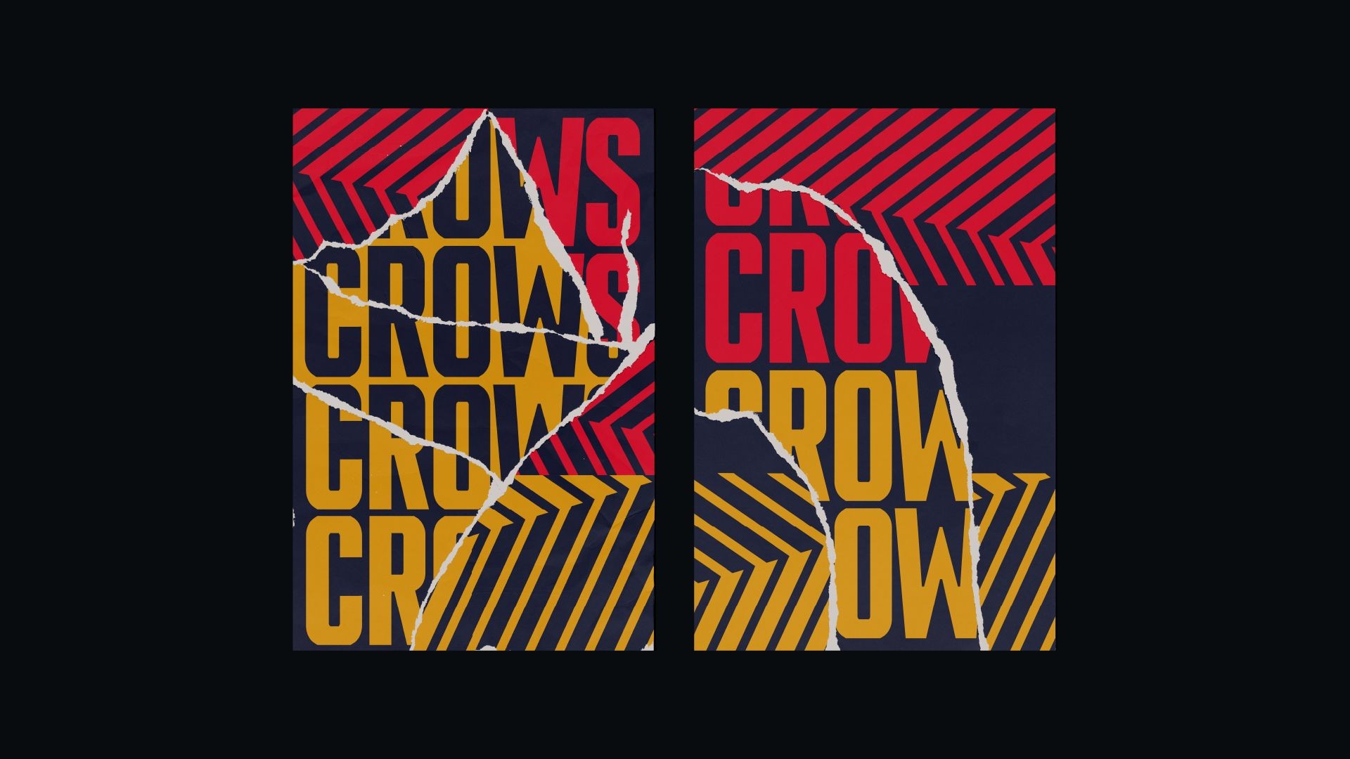
The custom NinetySeven typeface, a tribute to the Club’s 1997 premiership, combines traditional hand-painted Australian Rules Football lettering with sharp, angular forms that reflect the crow’s aggressive aesthetic. Designed for scalability and versatility, the font maintains consistency across all media. Paired with the clean, modern Suisse sans-serif, the typography strikes a balance between boldness and clarity, ensuring cohesive communication across every touchpoint.
Pattern
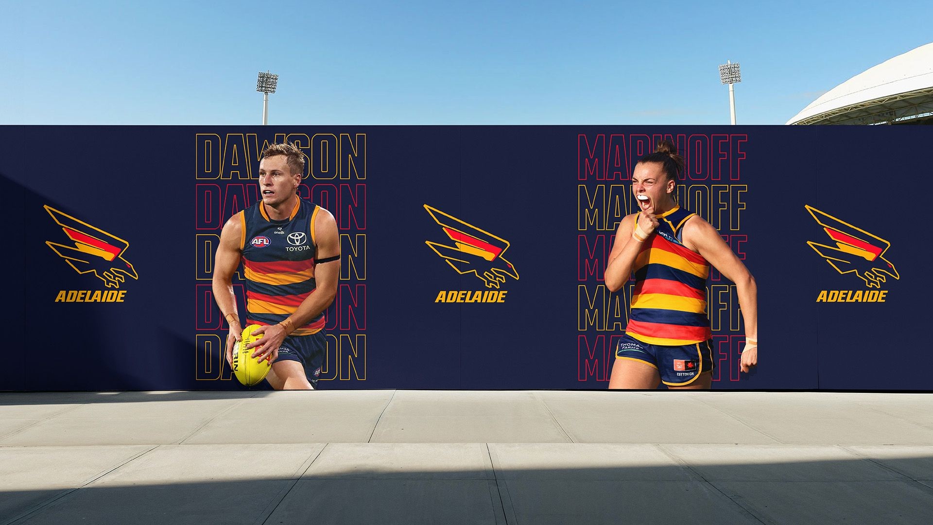
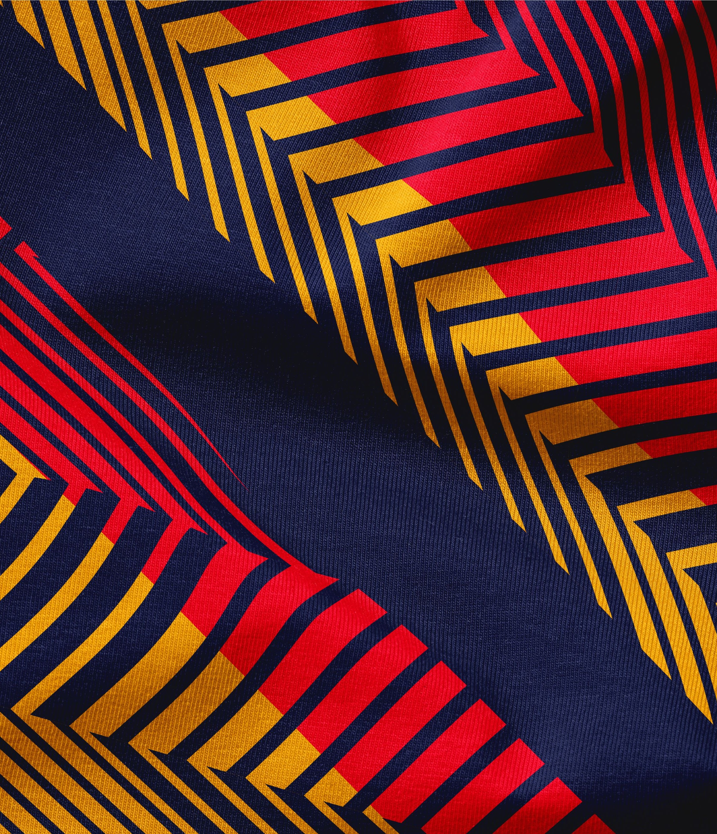
A distinctive feather pattern, integrating the tricolour hoops with angular textures, became a defining feature of the new identity. This bold, versatile pattern enhances consistency and cohesion across all formats, blending the Club’s heritage with its modern design vision.

Launching the new era
To launch this exciting new chapter in the proud history of the Crows, we were tasked with creating a set of brand films that would capture the rich heritage of the Club, while showing the important meaning and connection it has with the South Australian community.
Films
Our creative team developed a series of film concepts that included a studio shoot featuring a three-metre-high South Australian flag as a striking background for superstar AFL and AFLW players modelling new kit and merchandise. Our crew then shot footage on-location across South Australia to capture Crows fans showing their true colours – from the front bar of a country pub and South coast surf spots, to a dairy farmer’s shed, city laneway bars, and finally to the Adelaide Oval itself on game day.
A set of five 15 second films were released across the AFC social platforms first, revealing the new identity, brand statement, metallic animated logo, new season guernseys and merchandise. These were followed by a 60 second brand film that told the new Club story, celebrated the history and featured the true believers, all set to a custom soundtrack designed to excite and inspire members and fans. The film was imagined, designed, shot and edited by Fuller’s creative and production team.
In their words
The client perspective.
It’s always a little more meaningful when you hear it from the people we’ve had the pleasure of working with.