
See Differently
How do you make the 138-year-old Royal Society for the Blind relevant for a new generation of customers?
While the Royal Society for the Blind (RSB) boasted a rich history of providing South Australians with vision services, it recognised that it needed to connect more strongly with younger audiences.
The organisation was perceived as a ‘traditional’ brand. Moreover, its name suggested an exclusivity to services designed for people who had complete loss of sight, and didn’t speak to its wide range of vision impairment offerings.
RSB challenged Fuller to modernise the organisation to reflect and attract today’s audiences seeking support with complete or partial vision loss.
Losing your sight is a unique experience filled with personal challenges. While it may seem like the end of life as you know it, it’s not. With the right people supporting you at every step, it can be the start of a new journey. Through its diverse range of services, the Royal Society for the Blind empowered people with the vision to imagine what’s possible.
With that core insight, See Differently was born.
Strategy
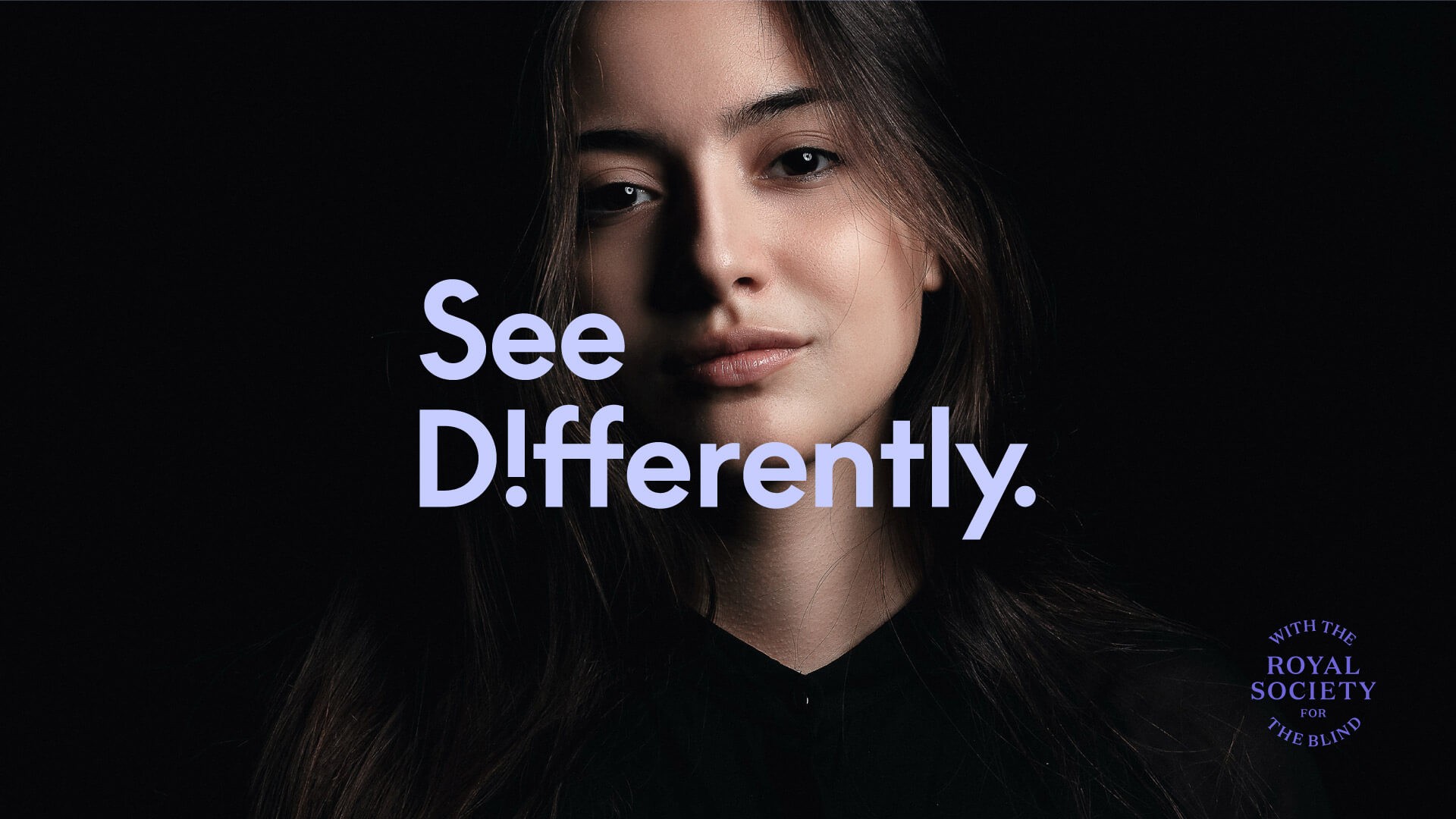
We rebranded the Royal Society for the Blind to ‘See Differently’ with a new identity and strategy.
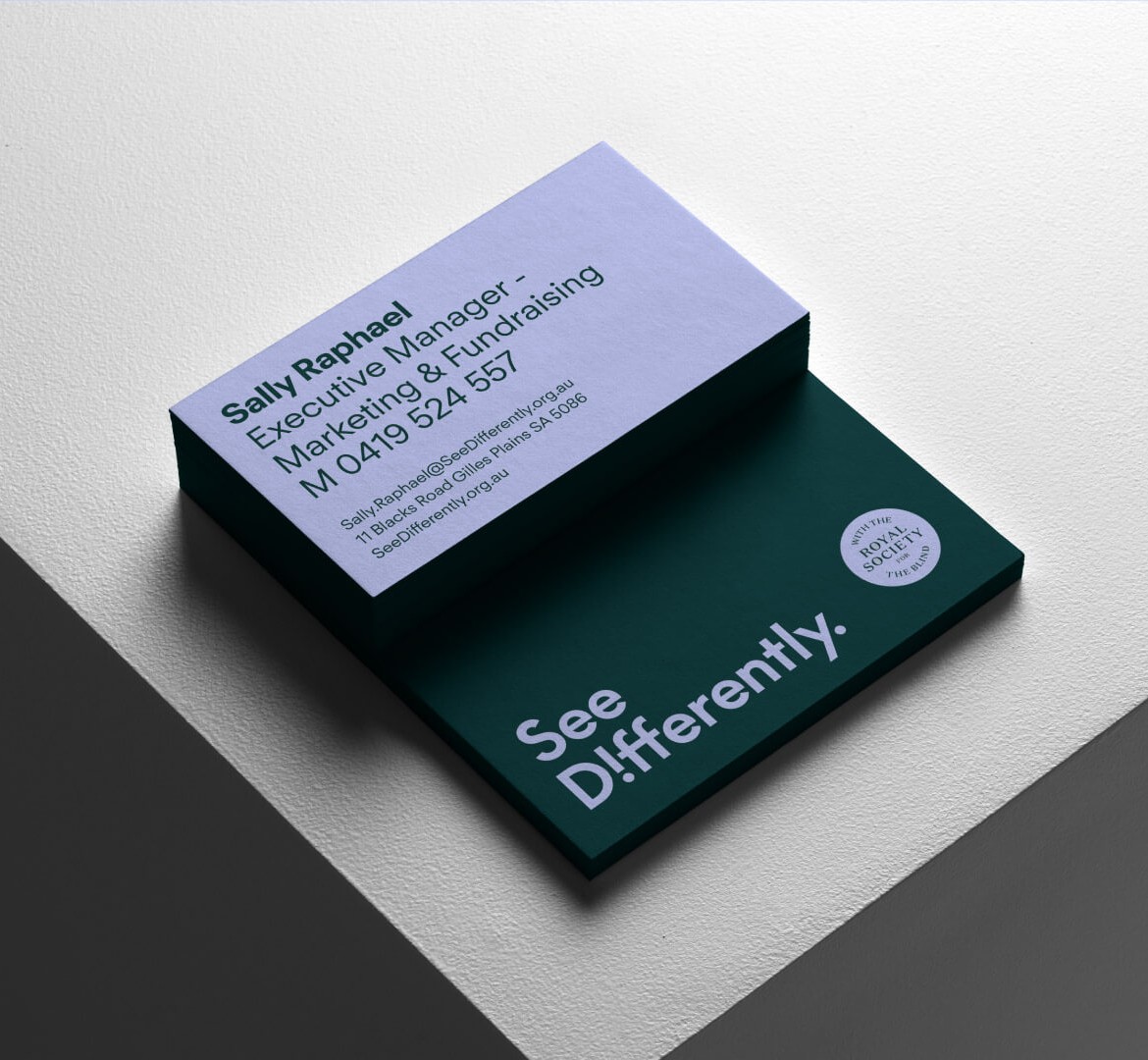
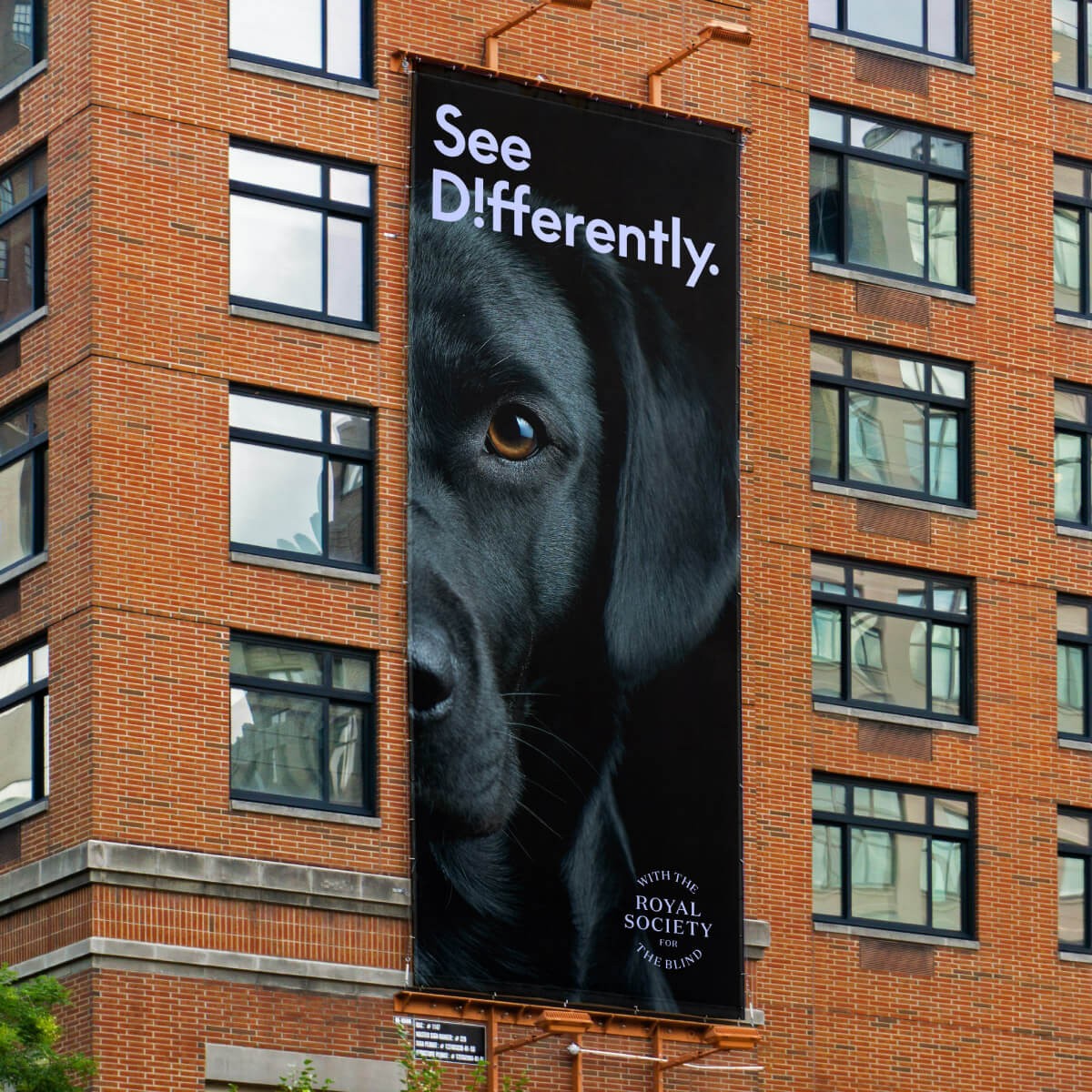
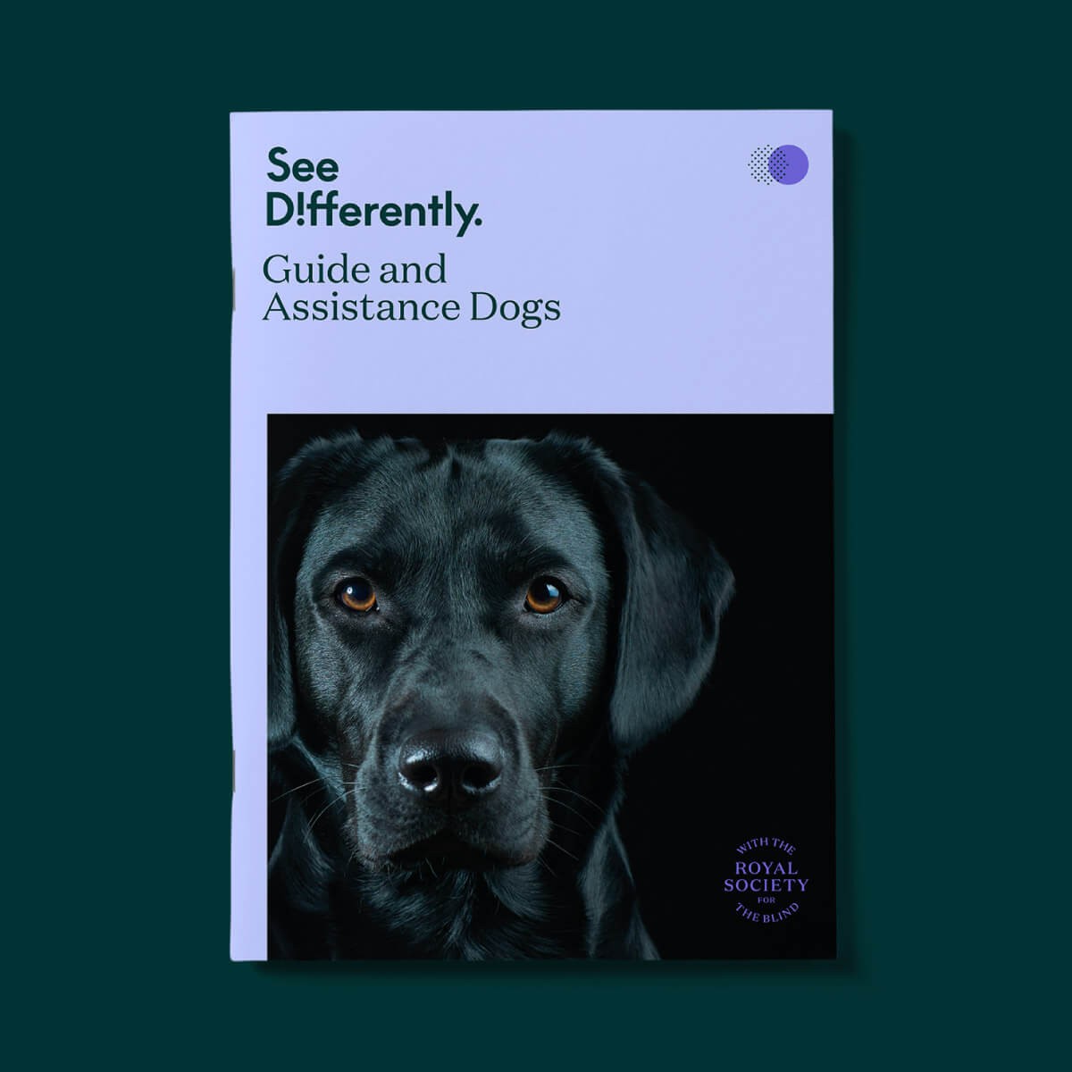
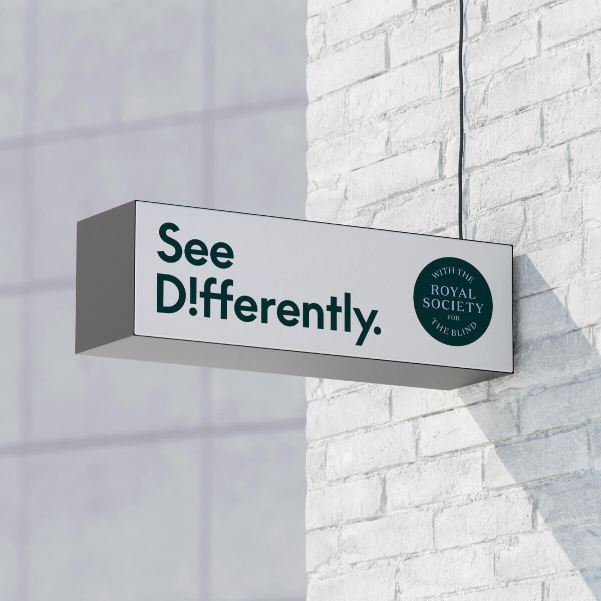
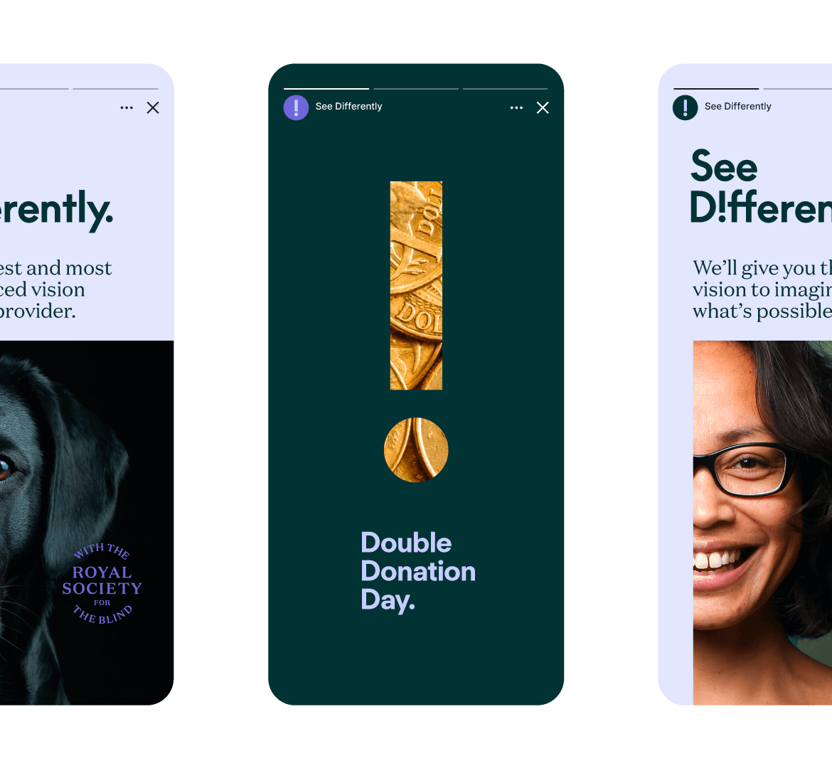
To retain brand familiarity, heritage and credibility, a lock up utilising ‘Royal Society for the Blind’ clearly stated See Differently’s roots. The brand design brought together contemporary colours, fonts, graphics and a bold, real life photography style to create an approachable, modern brand that today’s customers could relate to.
Identity
Blind and visually impaired people see the world differently, through touch, sound, smell and other heightened senses. We wanted the design to reflect that.
Everything from the FT Regola Neue and Domaine Text typefaces, to the captivating colour palette, was carefully considered with accessibility and legibility in mind.
Application
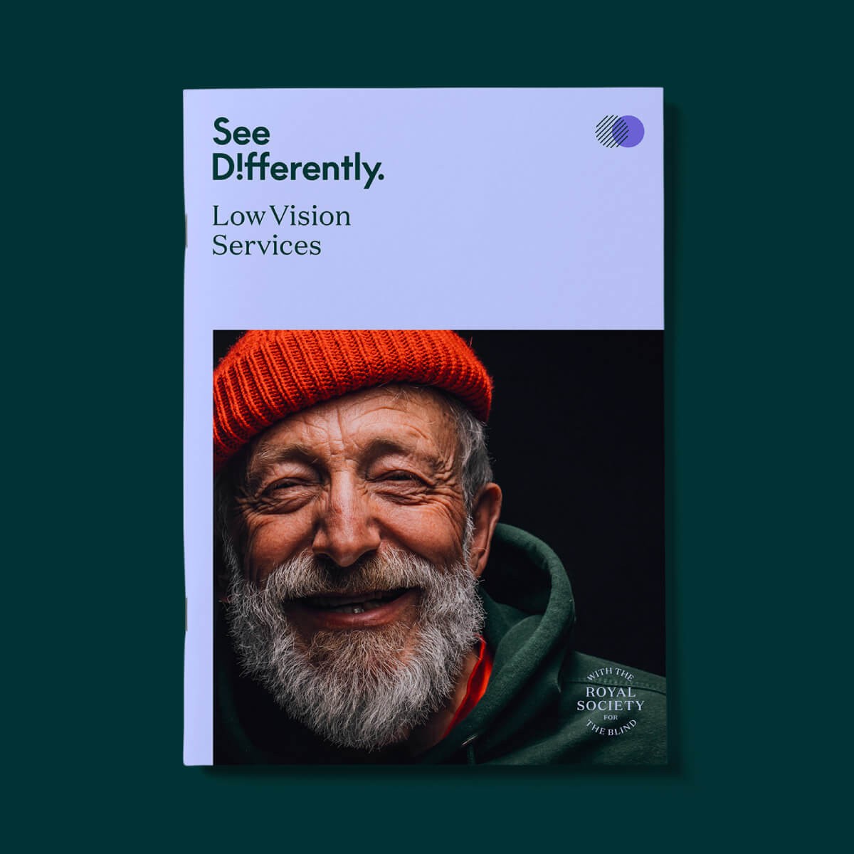
Each sub-branded service was assigned a unique pattern designed to visually mimic tactile surfaces, and communicate its offering clearly.
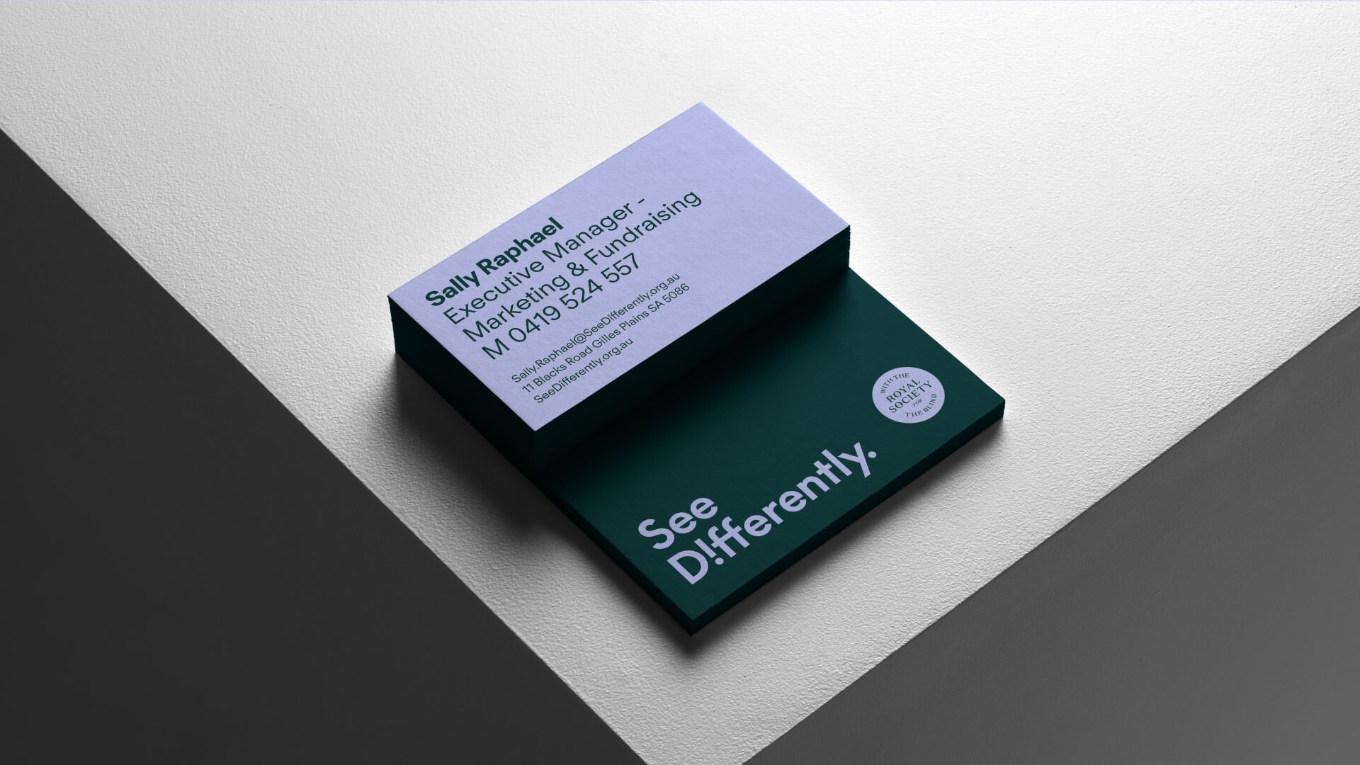
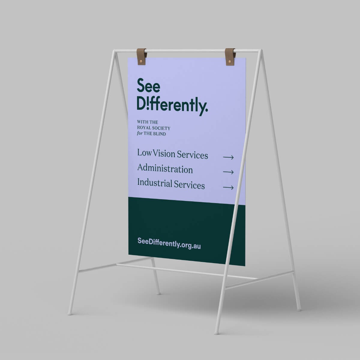
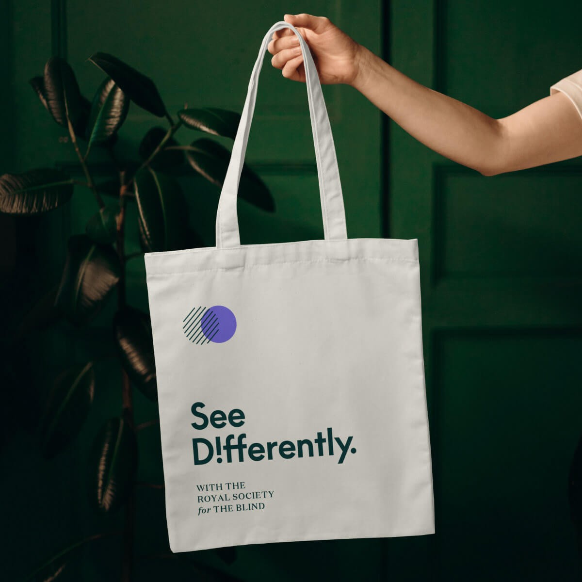
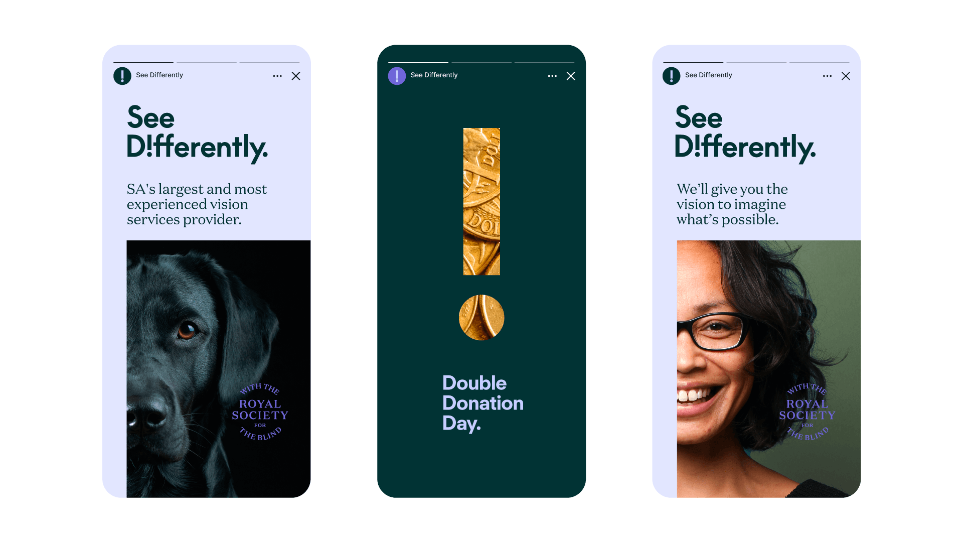
Customers got to experience the new brand through engaging signage, printed material, employee apparel, vehicle branding and digital marketing.
Impact
The See Differently brand revitalised the Royal Society for the Blind for the current market and helped the organisation communicate its offering simply and clearly. More importantly, the new brand name gave blind and vision impaired individuals a call to action—one of hope, positivity and confidence.
In their words
The client perspective.