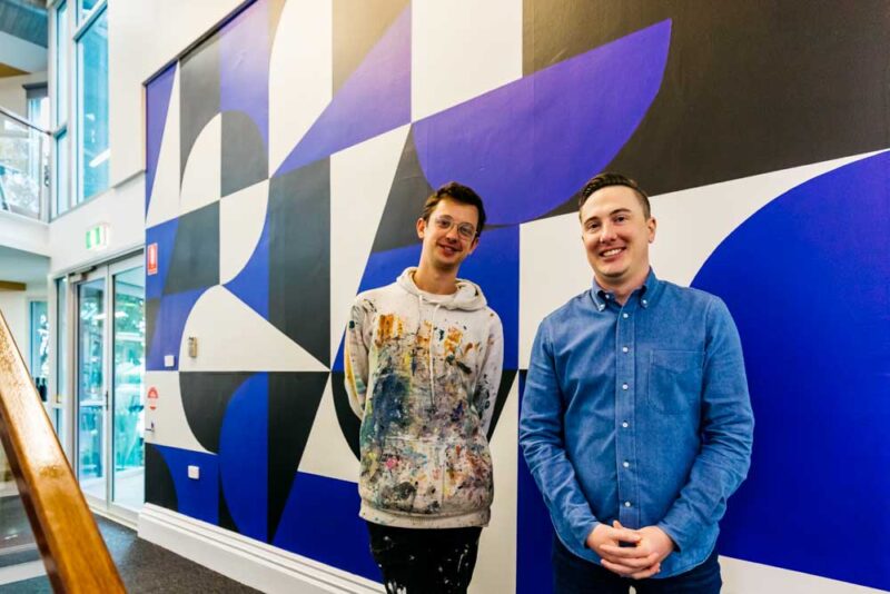
You might’ve noticed that Fuller has a new look.
We’ve retired the Fuller fluro, and today have welcomed the start of a new era for our brand.

Every day, we create memorable, captivating brands for our clients, and advise them of the importance of ensuring their messaging and visual identity is a true representation of who they are.
So, eight years after our last rebrand, it was time for us to practice what we preach.
We’ve never been ones to beat our own drum, but I’m pretty damn proud and excited to share our brand journey with you, some of the valuable lessons we learnt along the way, and pearls of wisdom when it comes to managing your own rebrand.
Embracing a challenge
As a branding agency, redeveloping brands is our bread and butter.
You’d think – just like us – that working on our own brand would be a walk in the park…but the first lesson we learnt was that it wasn’t going to be easy.
The idea of rebranding and focusing on our own identity was confronting, challenging and very personal (literally – our name rides on it!).
So, to all those clients we’ve taken through this process – I want to start this blog by letting you know I have renewed respect for you and what it takes to make a decision!
Rewriting our brand story
We approached our rebrand just as we would with a client – first holding a brand workshop to identify our unique purpose, position and promise, which then shaped our story.
As part of the workshop, we drilled down to the core of our brand, and arrived at a quote from Ancient Greek philosopher, Aristotle:
“The whole is more than the sum of its parts.”
We realised that our brand’s strength was in the parts that made us whole: our history, family, staff and diverse range of clients.
Our new brand had to reflect our history, as well as our contemporary offering.
And that’s where Fuller’s Head of Design, Sean Kane, stepped in.
Out with the old, in with the new
As a specialist brand designer, Sean has a knack for creating brands with depth and thought, and when he joined Fuller 12 months ago, we knew he’d be up to the challenge of a rebrand.
Because we’d already developed our brand story, when it came to the visuals we knew instantaneously what would work – and we couldn’t be more pleased with the end result.
Obviously, the black and white focus of our new brand is a departure from fluro – but not without reason.
This new colour palate reflects Fuller’s origins in print and writing, while the blue accent is reminiscent of a blue biro.

Arches, triangles and geometric shapes form the letters in the logo, as well as the incredible mural painted by Dave Court in our office. These shapes represent the parts of a puzzle, circling back to the theme of the sum of us.
But once the visual component was finalised, the hard work really began: brand application.
Aside from updating our digital and print assets, we wanted our office space to reflect our new identity, and to foster collaboration and creative thinking.
Our aptly named ‘white room’ – complete with a whiteboard wall, touch screen and FULL:TIME bar – is ideal for client planning and brainstorming sessions. Our library – housing an impressive book collection and archive of client work – is conducive to deep thinking, and allows us to reflect on our company’s history.
Artwork sourced from local artists Matthew Fortrose and Tom Borgas and our mural spark creativity, and our upstairs open-plan ‘engine room’ with plenty of natural light, fosters collaboration amongst staff.
Staff and environmental wellbeing were also top of our priority list, so we’ve introduced new waste management systems and more than 50(!) indoor plants throughout the office.

How do you know its time to rebrand?
Knowing when to rebrand is an incredibly personal decision, and depends on a variety of factors.
Generally, we recommend rebranding when you want to reenergise your brand’s perception in the market, or when your brand or company story has changed or evolved. It’s a great way to reintroduce your brand to your customers – existing and potential – and inject new energy and focus in your team.
These days, where your brand and its assets live in a digital space, we have a lot of clients coming to us to make their brand digitally flexible.
When it comes to design, if you find yourself paring back your brand, that’s when you know its time to rebrand.
Design is similar to trends: the more character or ‘flourish’ you put into the design – such as bold colours or typeface – the more it will date. A restrained, timeless look can last decades.
Once you’ve decided you’re ready to rebrand, its natural to get carried away with ideas for your new look and logo.
But if there’s one thing I can’t stress enough, it’s the importance of working through a strategic brand communications process. Trust us – it’ll make your life a lot easier down the track!
Use an independent facilitator to help you get to the core of your brand and what you stand for – because your brand is far more than a logo.
Once all the brand messages are agreed upon, then you can move onto the visuals. Our biggest piece of advice at this stage is to engage a true brand designer – brand design is a different art form to standard graphic design.
As hard as it is, it’s also important to put your own personal taste aside and look at things objectively, focusing on brand strategy and story, which will help direct your design decisions.
When it comes to design decisions, be strategic with who within your company gets to call the shots. It’s always best to avoid ‘design by committee’ – when too many people are involved in the decision making process, the design integrity and effectiveness of a brand can get lost, as well as slowing down the process.
Our final piece of advice is to not underestimate the cost, time and process involved with applying a new brand.
Be realistic about your budget and applications – think about everything from signage and uniforms to social media and interior fit out – to make sure your brand is consistent across all touch points, and shines.