It’s Friday night, Netflix is blaring on the widescreen TV and once you’ve finished your UberEat’s Thai-takeaway you pick up your phone and start scrolling.
You flick from Facebook (for the news), to Instagram (for some stalking), to YouTube for that hilarious clip your mate at work showed you, adjusting your phone to the side so you can see it in all its full-screen glory.
It’s a scene we’re all familiar with, but did you know that the video viewing specifications on your favourite social media platforms are not created equal? This is why social platforms – and the people who are creating video content for them – have started dreaming up all kinds of new and intriguing ways for you to view videos in different orientations, shapes and sizes.
Recently Instagram launched IGTV, a new video viewing channel embracing the vertical video trend – a move that has prompted a collective groan from purist filmmakers. Meanwhile, YouTube has changed its settings to allow for various aspect ratios, skinny and fat.
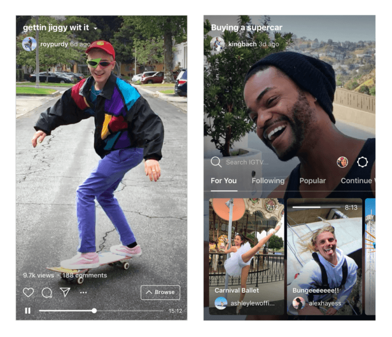
So, what does the future hold for brands and marketers who are creating video content and advertising for social platforms? Does size really matter, or is it just about how you use it?
Fat TV and skinny cinema
Since the advent of digital marketing the term ‘video aspect ratio’ has become daily vernacular among the marketing masses.
Put simply, an aspect ratio is the width and height of an image, either written as a ratio (16:9), decimal (1.78, as in 1.78:1), or given in pixels (1920 x 1080).
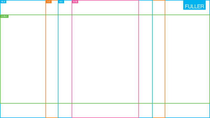
Aspect ratios aren’t anything new to video. Thanks to the work of William Dickson – a Scottish inventor who devised the motion picture camera in the 1800s – the aspect ratio 4:3 was the standard for motion pictures for many years – think square-ish looking, old-school, retro style videos.
For those keen to explore some Aussie vintage classics, various examples of aspect ratio are on show at the National Film and Sound archive.
4:3 aspect ratio music video for local SA band Wing Defence directed by Lewis Brideson and Dave Court.
4:3 also became the standard for TV, prompting cinema screens to grow to eye-engulfing lengths to attract audiences out of their homes. And so, widescreens and the new standards for cinema (2.35:1 and 2.39:1) were born.
2.35:1 aspect ratio music video for local SA band West Thebarton directed by Lewis Brideson.
Then everything went digital.
The introduction of HDTV brought the much loved 16:9 aspect ratio to DVD, Blu-ray, new TVs, computers and mobile phones when tilted on their side – an even mean point between fat TV and skinny cinema
16:9 aspect ratio highlight video for Groovin The Moo 2018 filmed by Lewis Brideson.
You’ll notice now that any TV shows made prior to the evolution of 16:9, or movies made for the big screen, have black bars known as letter boxes and pillar boxes appearing around them as you Netflix and chill.
Orientation Lock: On?
Cameras are designed and videos are shot horizontally, because our eyes sit horizontally. Makes sense, right? We walk, run, dance and tell stories on a horizontal plane, so why wouldn’t we produce film in the same way?
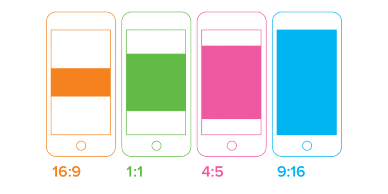
It’s all about understanding where and how your videos will be viewed and the optimal aspect ratios for each platform – from the many aspect ratios of Facebook and Instagram feeds, stories and IGTV, to Snapchat, YouTube, Vimeo, Twitter and your all-important mobile optimised websites.
And if you don’t think the audience experience is important, consider this: a recent study showed that 72% of ‘millennials’ no longer turn their phone (from 9:16) to watch videos in widescreen (16:9), making a solid argument for filmmakers to create videos with vertical aspect ratios in mind.
Where’s the canvas?
It’s a creative challenge that any filmmaker should be keen to meet. Just like painters, filmmakers now have flexible canvases to land their brush, and just about any gallery to house their works.
To fill a TV, computer or smartphone, filmmakers have to consider shot composition, video quality and framing guidelines on their cameras while filming, for the most tailored outcomes.
Changing aspect ratio is not only a question of post-production cropping, but pre-production planning to avoid image quality loss when footage shot without ratios in mind has to be cropped and stretched beyond consent.
Specs aside, it’s also important to consider the video platform (and its ideal aspect ratio) when making creative decisions about the kinds of pictures we should be painting for each platform, and each audience.
What’s in the box?
Just like video length vs attention span, and sound vs closed caption, are things we need to think about when producing video content for different platforms and audiences, aspect ratio should also be considered. The ratio not only impacts the visibility of content, it also dictates style, time period, intensity and subject matter.
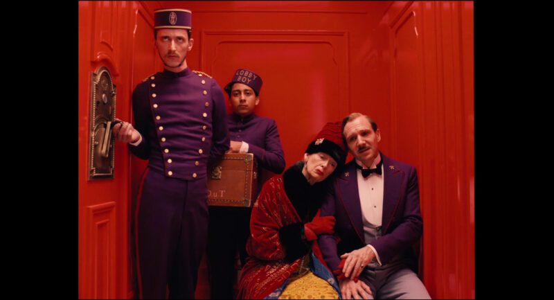
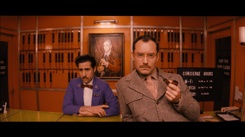
Think Wes Anderson using 4:3 for flashbacks in The Grand Budapest Hotel (2014); the fish flying outside of the letterbox in The Life of Pi (2012); or music videos continually changing aspect ratio and camera type to create a style.
Vertical videos that fit snuggly in your hand, as they now do on IGTV, have proven to be great for vlogger or point of view (POV) content, fashion videos, info-graphics and, well, anything vertical (people, trees, buildings, etc). Content creators are now also dreaming up more ways to pair video transitions and animations with Instagram’s ever-accumulating engagement features, such as the way users swipe and tap between videos in feeds and stories, use polls and questions – it’s all about choosing your own video adventure!
While it’s not likely we’ll see a full switch from horizontal to vertical video, it’s important to recognise that there is an ever-changing canvas for our creativity and communication.
Never stop thinking outside the box, just remember there is one.