Hopeless romantic? Free spirit? Narcissist?!
Just like dating archetypes, your brand’s type says a lot about who your organisation is, and what it stands for.
In branding, ‘typeface’ refers to the design of lettering (not one’s preference for long eyelashes or dimples).
It can include variations in things like size, weight, slope and width, and can broadly be sorted into four categories, including serif, sans serif, scripts, and decorative.
While the word ‘typeface’ is often used interchangeably with ‘font’, there is a nuanced difference, with font referring to a particular size, weight and style of a typeface.
For example, Helvetica is a typeface, and 14pt Arial Bold is a font.
Choosing a typeface — or even better, commissioning a custom typeface — is an opportunity for your brand to put its best foot forward by showing personality, being memorable and differentiating itself from competition.
Why typeface matters
Your brand can’t be the whole package without thoughtful consideration to its typeface.
For emotional connection
Font psychology is a thing — and it’s used to describe the ideas and emotions we experience when we’re exposed to different typography.
Fonts that provoke a psychological reaction can be used to make a brand feel more trustworthy, friendly, or aspirational.
For example, a bank that wants to be perceived as stable, reputable and well-established could choose a traditional serif-style font, whereas an IT company who wants to be perceived as innovative, intelligent and forward-thinking is more likely to opt for a modern sans serif font.
For digital connection
In a digital-first world, typography has never been more important.
Today, two billion people access the internet from their smartphone, where the available space for imagery and graphics is reduced.
Besides colour, all that remains of your branding is text — and there is almost no website, app or digital product that exists without text.
For inclusive connection
Today’s typography is the most inclusive it’s ever been. Beyond setting the tone for your brand messaging, typeface choice can increase legibility and readability for low vision readers.
It’s not all good though. Twitter’s recent typeface ‘Chirp’ has been accused of giving people headaches.
Getting personal
When typography is figuratively the ‘clothes’ your brand’s words wear, a bespoke typeface can often become your most recognisable brand asset.
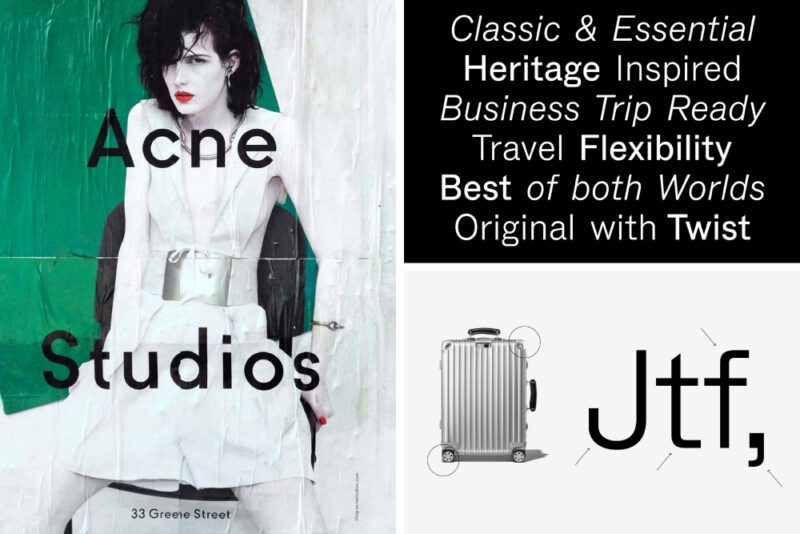
Luxury brands have known this for a long time, with trendsetting brands such as Acne, Rimowa, Vigil Abloh, and SSENSE making their custom typefaces a large part of their visual identity.
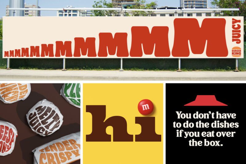
Brands built on nostalgia and fun, like M&Ms, Burger King, and Pizza Hut, have all paid homage to their heritage by expanding the original logos into fully formed typefaces.
This trend hasn’t been lost in the tech industry either, with Instagram, Pinterest, PayPal, Tumblr and WeTransfer all commissioning custom typefaces.
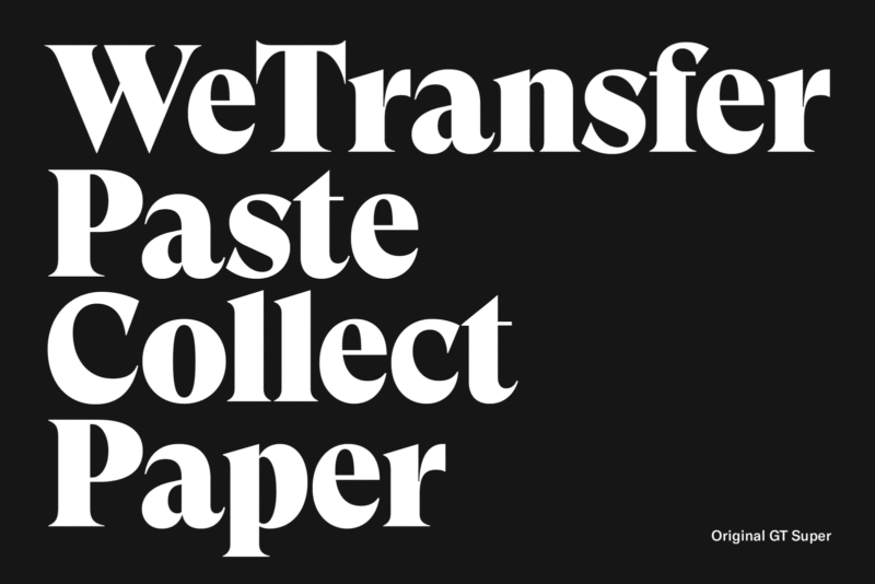
Bespoke typography need not be in the realm of brands with big-tech budgets.
Recent apps like Glyphs remove the steep learning curve of traditional font editing software and have given graphic designers the ability to create their own fonts.
This development has disrupted the traditional font purchasing model.
Type foundries like Dinamo recently announced its Font Customiser, which allows brands to customise and name their own font at no extra cost.
“We believe that customising fonts should not be an exclusive thing that people need to pay lots of money for,” they state on their website.
“We’re no longer casting fonts into expensive metal; software lets us make fonts with as many alternates as we like baked inside.
“For us, having this flexibility in mind feels like a modern way of working.”
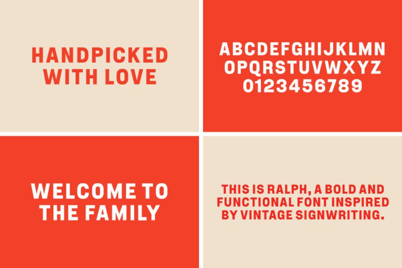
Here at Fuller, we’ve recently developed bespoke typefaces for Ceravolo Orchards and Sawyer Wine Co.
Ralph Titling, named after Ceravolo’s founder, Ralph, references the vintage hand-painted signage found around the orchards.
Featuring condensed, easily reproducible letter forms with minimal optical correction and a lack of stylistic details, Ralph is a no-nonsense, ‘tell-it-how-it-is’ typeface that visually communicates just like the Ceravolo family does: efficient and concise!
Rhône Modern is a custom typeface developed for Sawyer Wine Co.
Named after the wine region in France where the winemaker, Michael Sawyer, previously worked, Rhône takes inspiration from early European gothics, such as Futura or Erbar, which are built on a foundation of geometric proportions and a generous, low X-height.
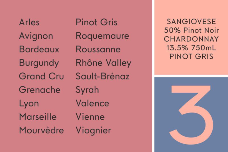
This classic formula is juxtaposed by modern details like exaggerated ink traps and minimal contrast between the horizontal and vertical letter strokes.
This resulting typeface has an effortless charm and perfectly represents ‘the Sawyer approach to wine’ — thoughtfully crafted with a bright energy and individuality.
Time to upgrade?
If your brand’s existing type just isn’t doing it for you anymore, it might be time to upgrade.
Here are five considerations that can help a designer find or customise a typeface that captures your brand’s identity:
- Brand personality: is your brand welcoming, professional, sophisticated or trailblazing? Are you intending to stand out, or blend in? Are you celebrating your brand’s history, or looking ahead to the future?
- Brand content: is your written content intended to be informative or expressive? A bold display typeface will work for short, simple headlines but will not be flexible for editorial style copy where different widths, weights and open type features are required.
- Application: will your brand mostly be seen on packaging with beautiful type finishes, where fine details matter? Or on low resolution, mobile devices, where details become visual noise and fine lines disappear?
- Accessibility: how inclusive and accessible does your typeface need to be, based on your brand’s audience? Keep in mind that people read 11 per cent slower for every 20 years they age, and research shows that simpler, sans serif typefaces are better for poor readers, whereas traditional serifs are better for strong readers. Do non-english languages need to be supported?
- Budget: Is a bespoke typeface going to add value to your brand, or is an open-source typeface going to be a more practical solution?
Need help finding your brand’s type? Fuller’s team of match-making designers can help. Give us a call or slide into our emails today.