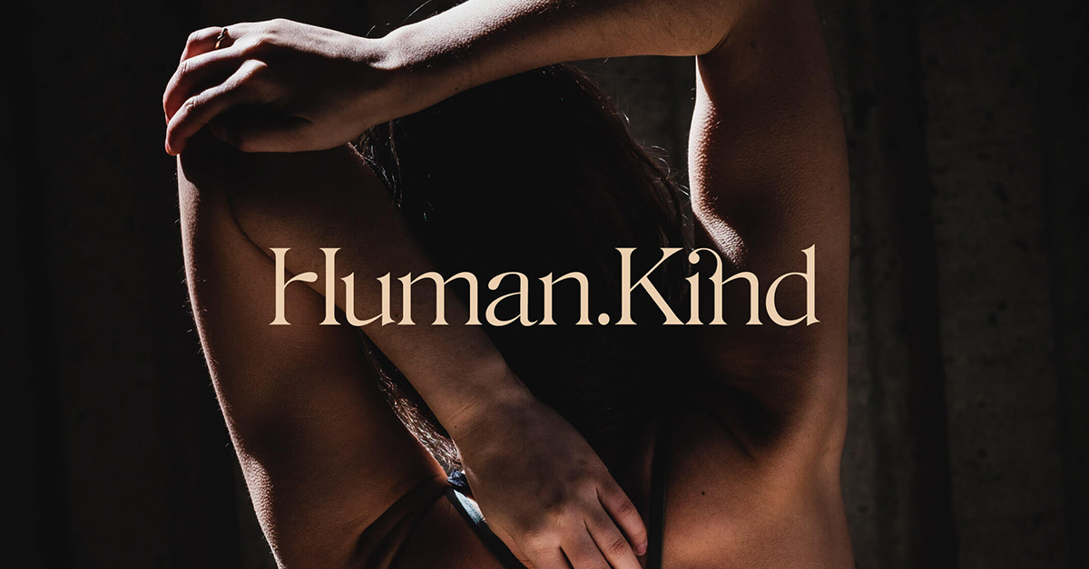
Human.Kind Studios
An evolutionary new brand identity for a socially conscious yoga studio.
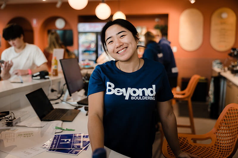
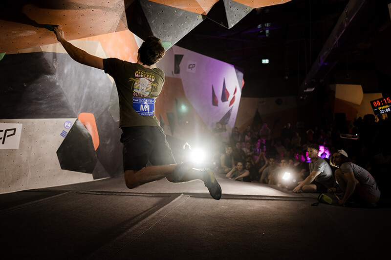
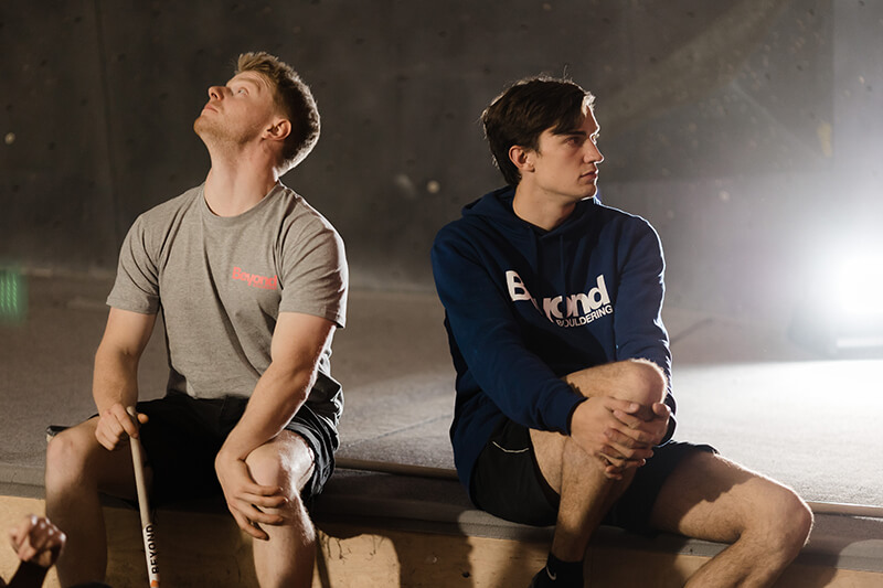
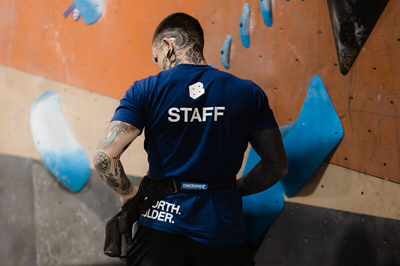
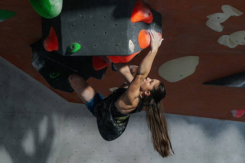
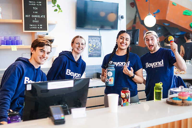
Rebranding a South Australian climbing icon into something ... bolder.
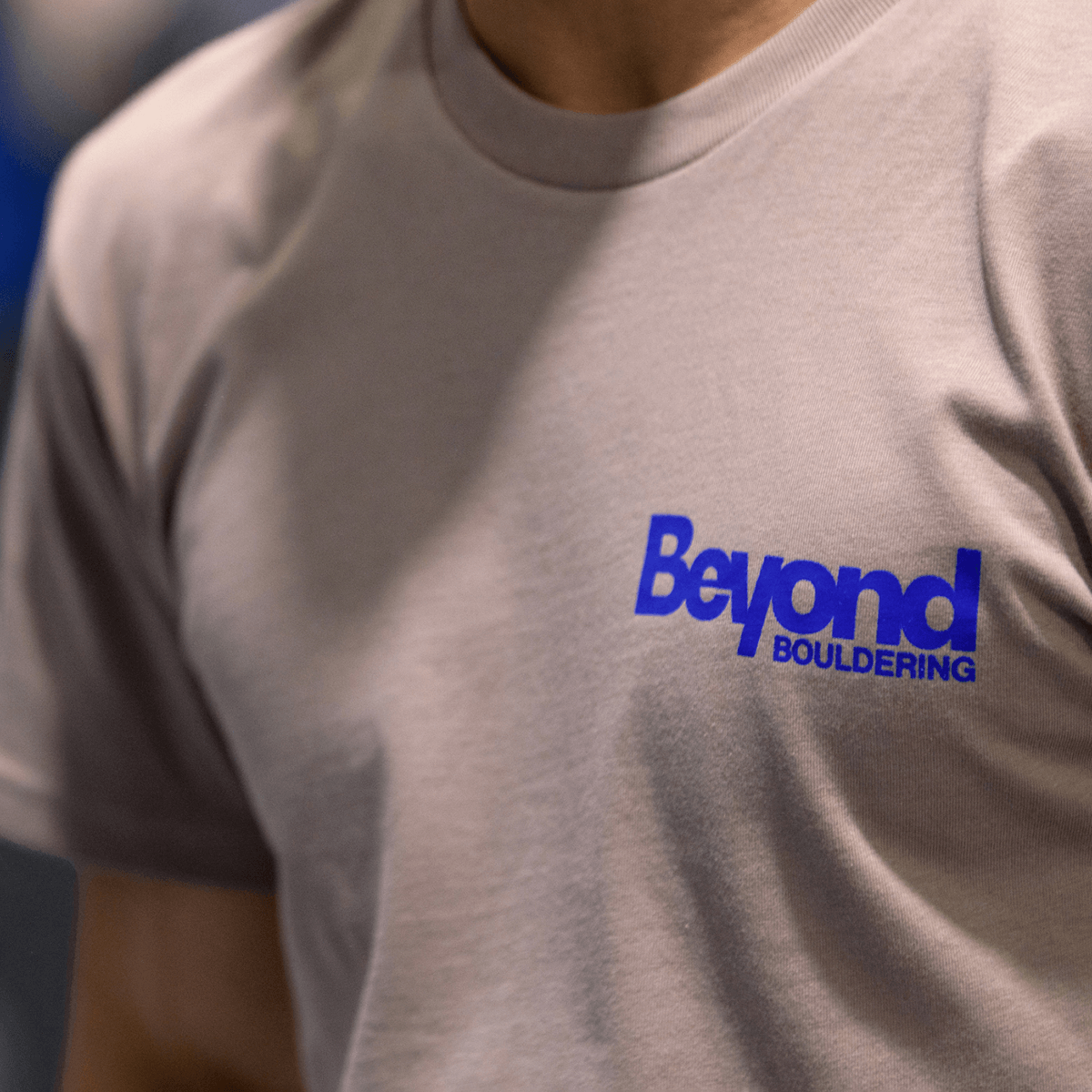
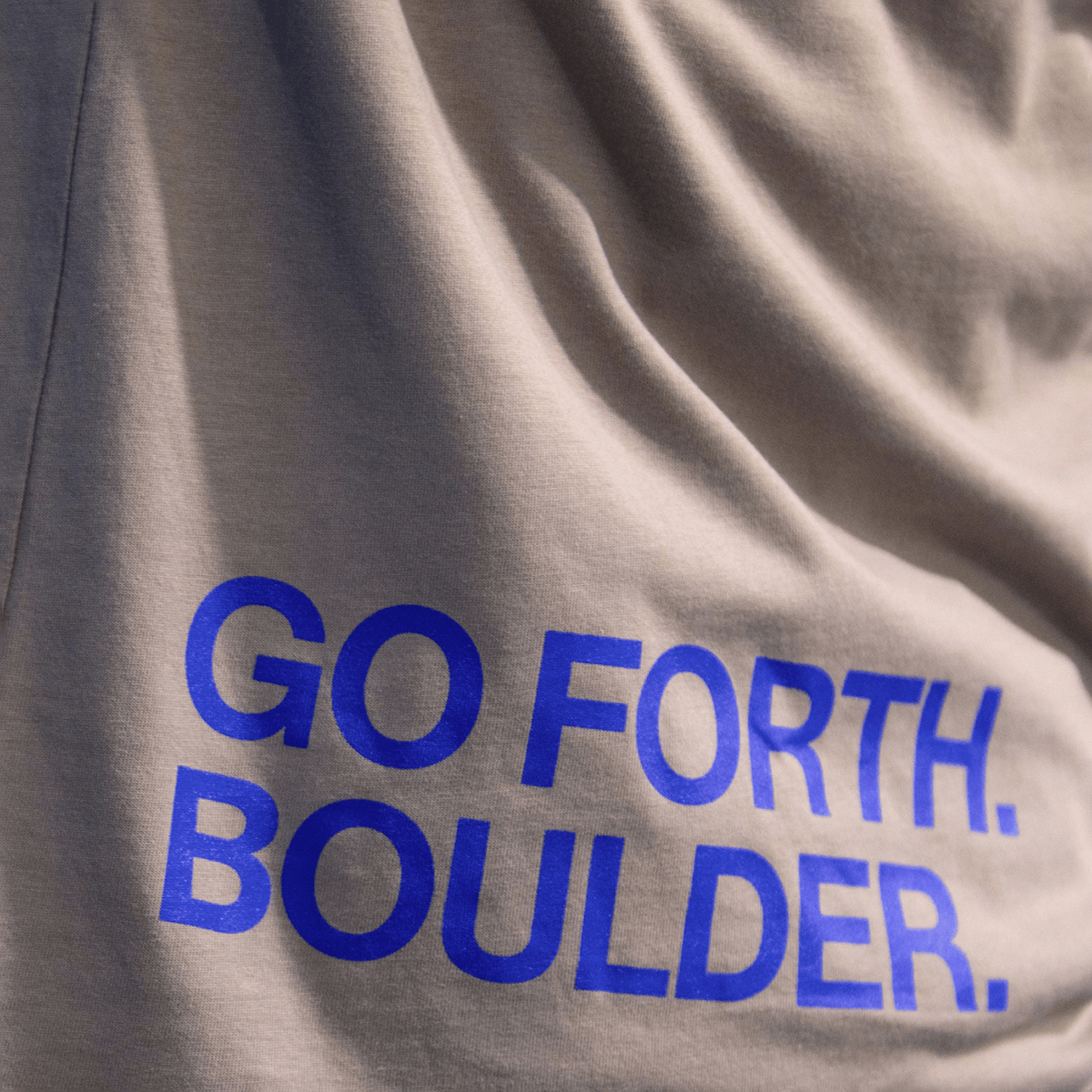
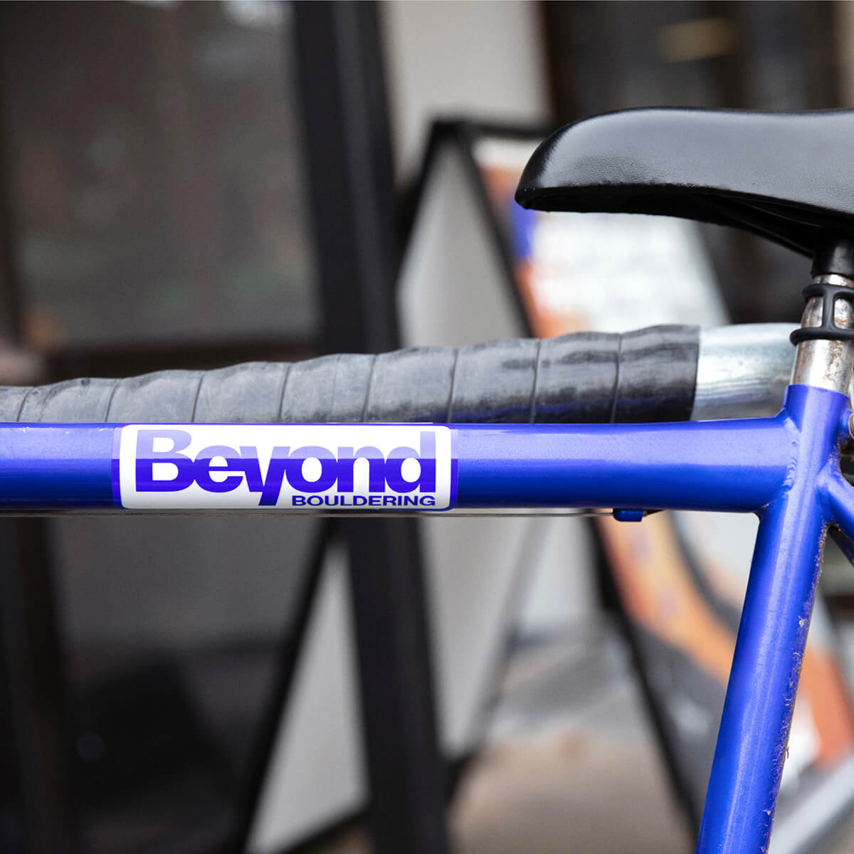
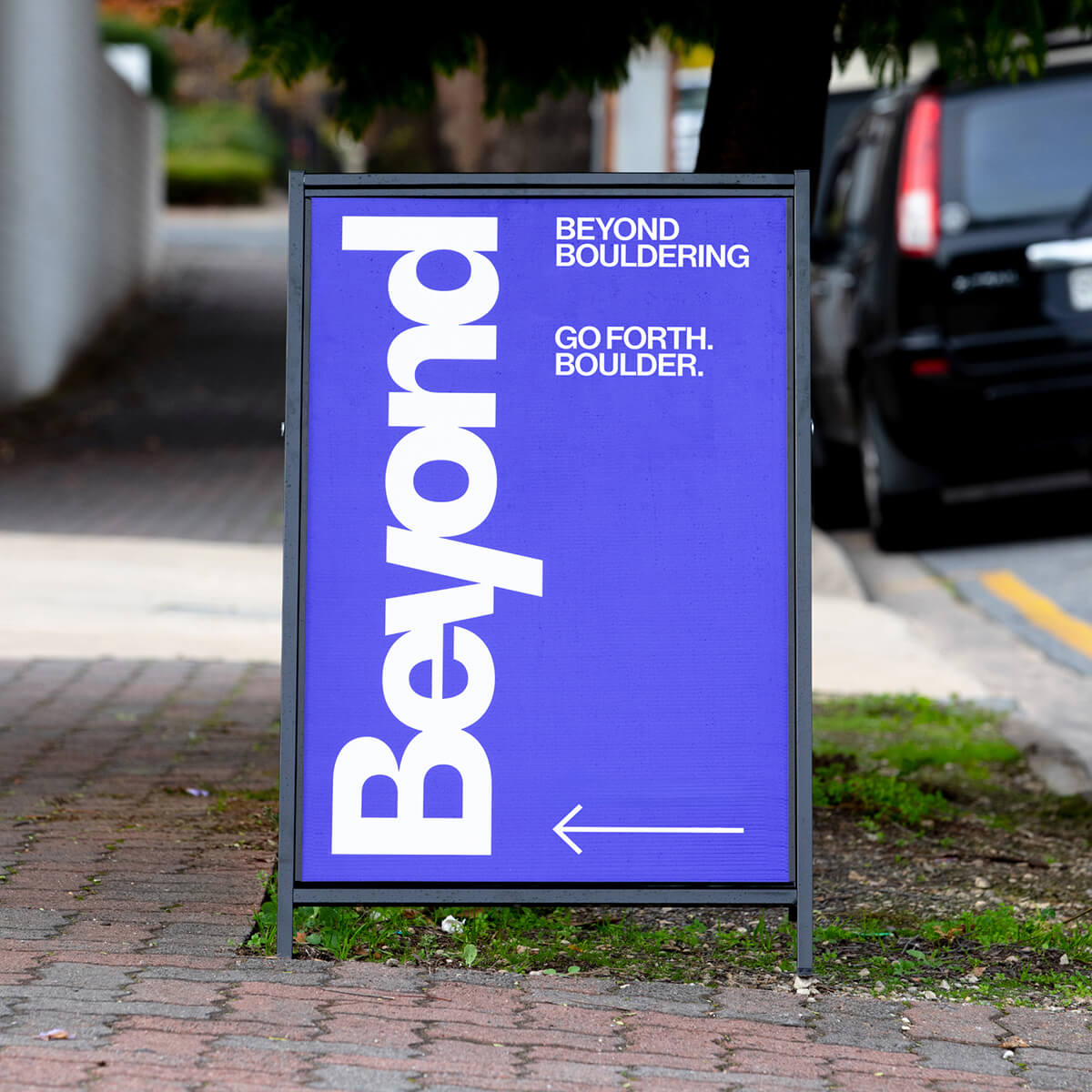
We transformed Beyond Bouldering’s past logo into a new graphic device by extruding two B’s and adding bouldering bolt holes. It became a repeatable symbol used on stickers, gear, clothing and climbing tags — a representation of flexibility and ascent.
We also restructured a fragmented colour palette that varied from location to location. Ultramarine blue became the hero colour, supported by a palette of secondary neons which added excitement atop timeless, neutral tones and materials.
An evolutionary new brand identity for a socially conscious yoga studio.
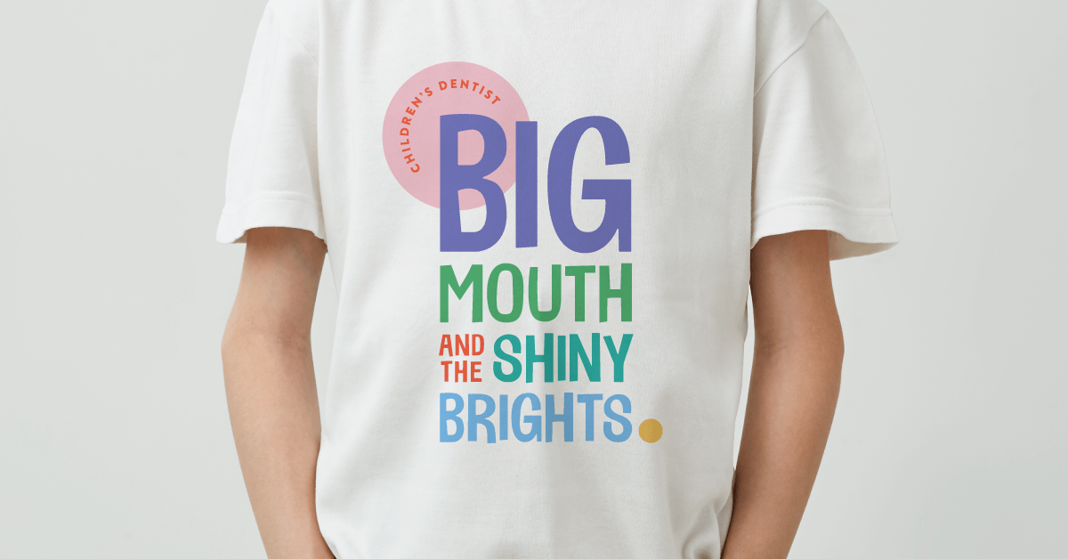
New brand gives teeth to a fun-loving children’s dentist.
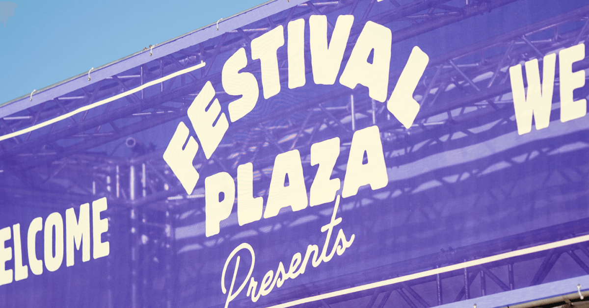
Creating a new heart of entertainment for Adelaide.
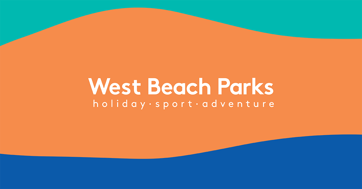
Branding a world-class holiday, sport and recreation precinct.
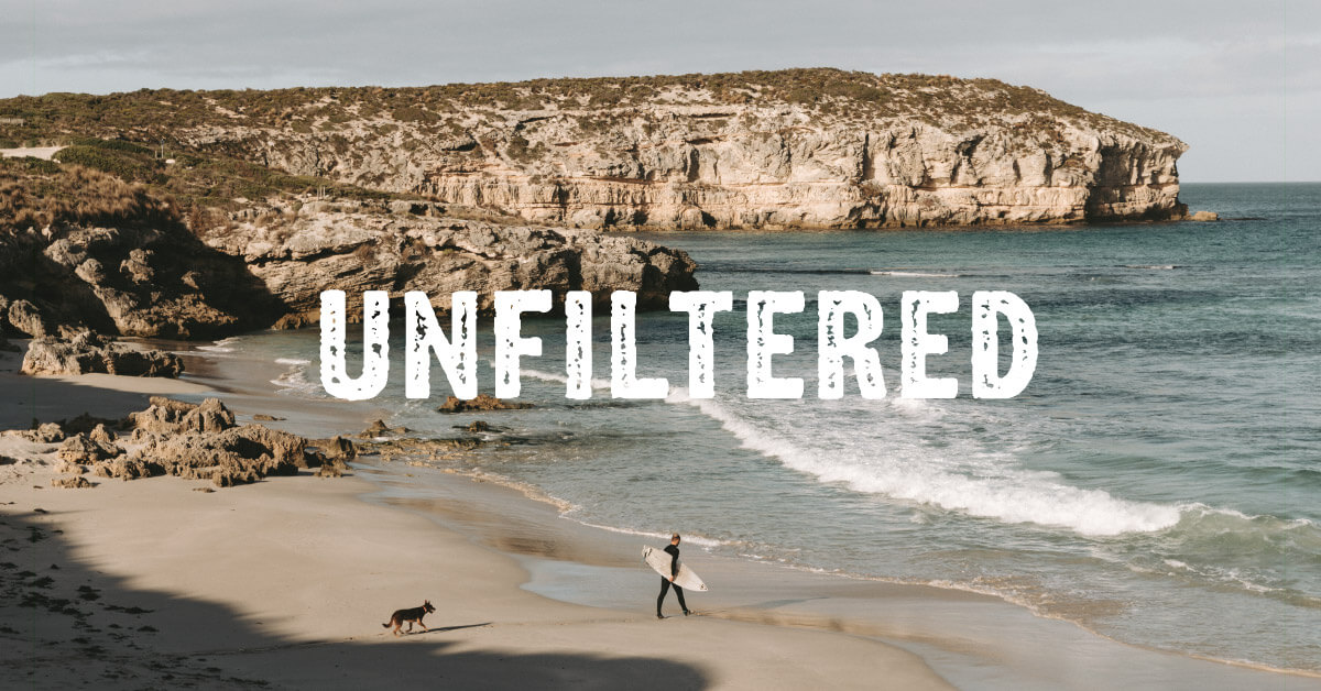
Untamed. Unadulterated. Unpretentious.
And quite simply, unfiltered.