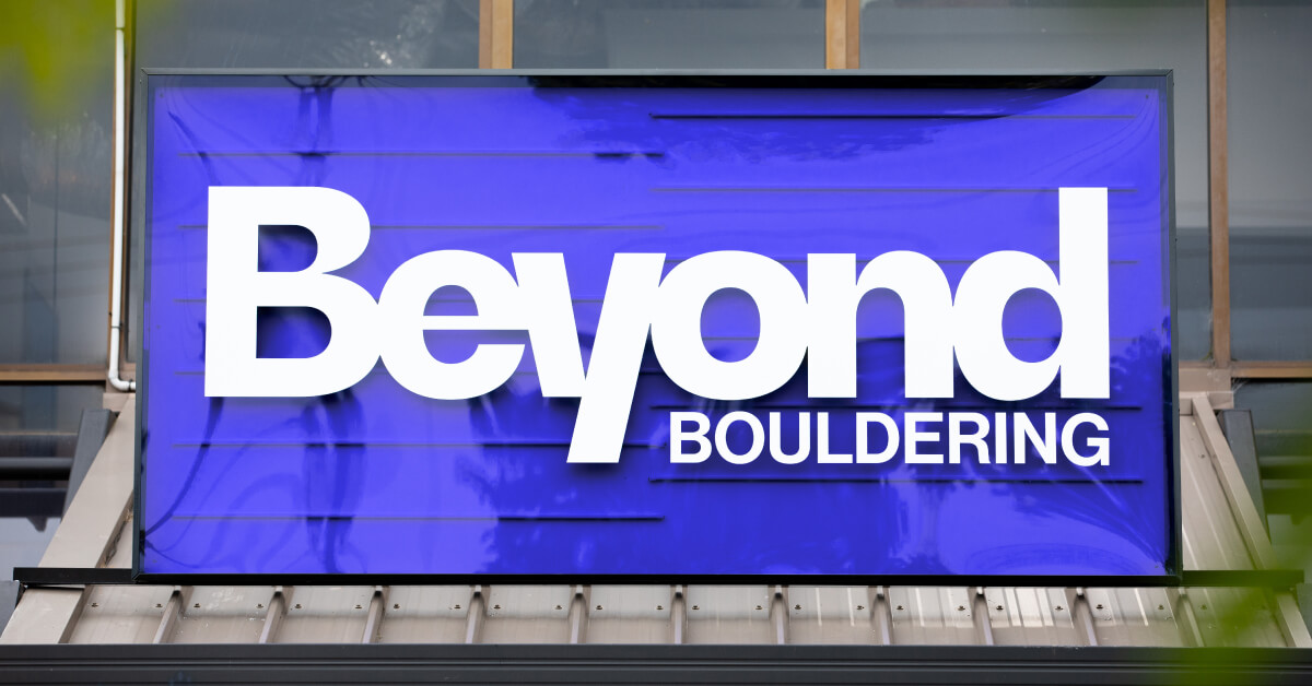
Morphettville

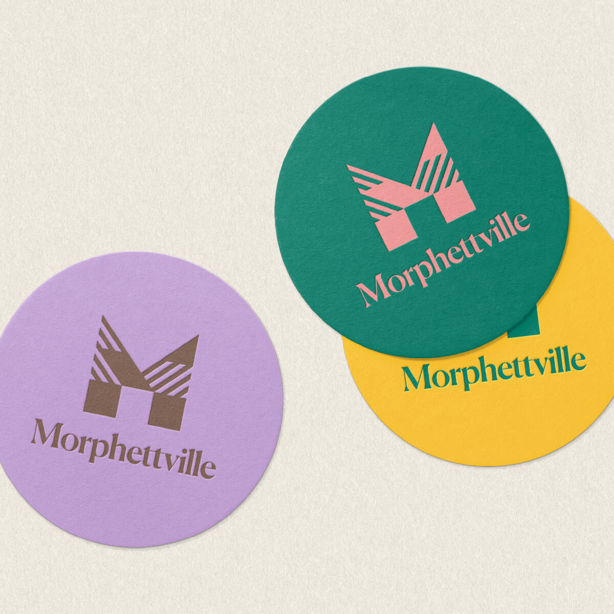
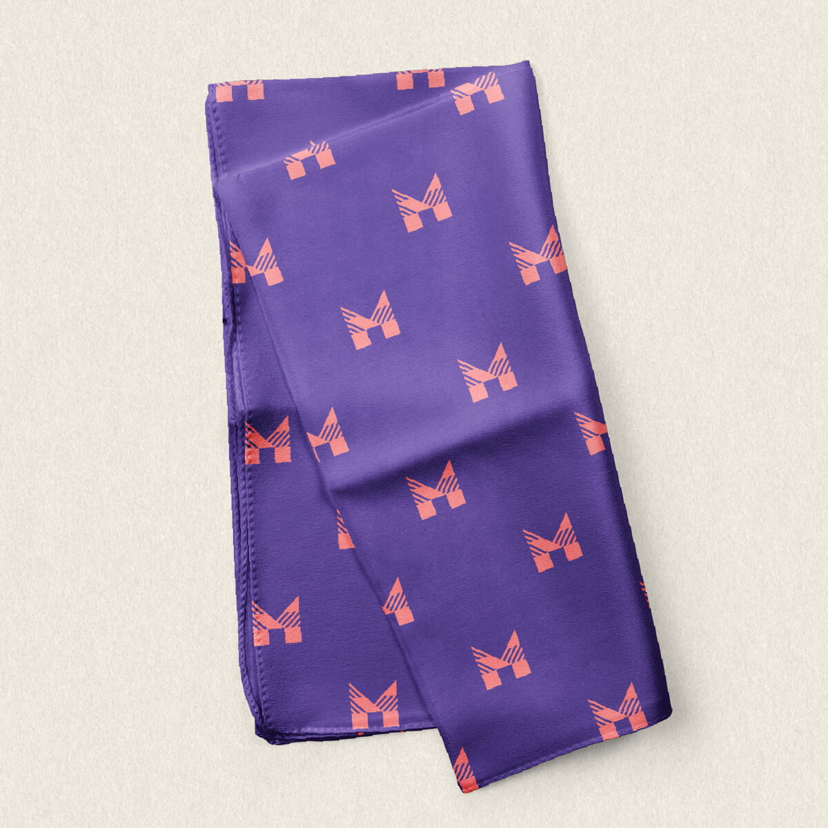
New brand gives Morphettville the winning edge

The Brief

Develop a new brand for Morphettville ahead of its $350M redevelopment featuring residential, retail and recreational facilities.

Morphettville is a South Australian icon. For more than 140 years, it has been a place where South Australians have congregated to dress-up, play-up and celebrate.

From cheering the legendary Black Caviar down the home straight or dancing under the setting sun trackside after the Adelaide Cup, Morphettville has long-been home to the majesty and magic of the sport of kings.

With Morphettville set to undergo a visionary $350 million development, Fuller was tasked with creating a new brand and launch strategy for the precinct that paid homage to the tradition and heritage of its past, while capturing the energy and excitement of its future.

While Morphettville has long been the beating heart of South Australian horse racing, it will soon be so much more. A residential address, an entertainment and event venue and a destination.


STRATEGY

As the home of the South Australian Jockey Club (SAJC)- a century old sporting club – it was vital that we understood the rich history of Morphettville, as well as the views of current stakeholders, including members of the SAJC and staff.

As the home of the South Australian Jockey Club (SAJC)- a century old sporting club – it was vital that we understood the rich history of Morphettville, as well as the views of current stakeholders, including members of the SAJC and staff.

We undertook an extensive Discovery phase, reviewing similar projects from across the globe, researching the rich history of horse racing in South Australia and of the racecourse, and holding workshops with a diverse range of groups including members and staff.

MORE THAN RACING

The precinct will carry the spirit of racing, but offer more than racing.

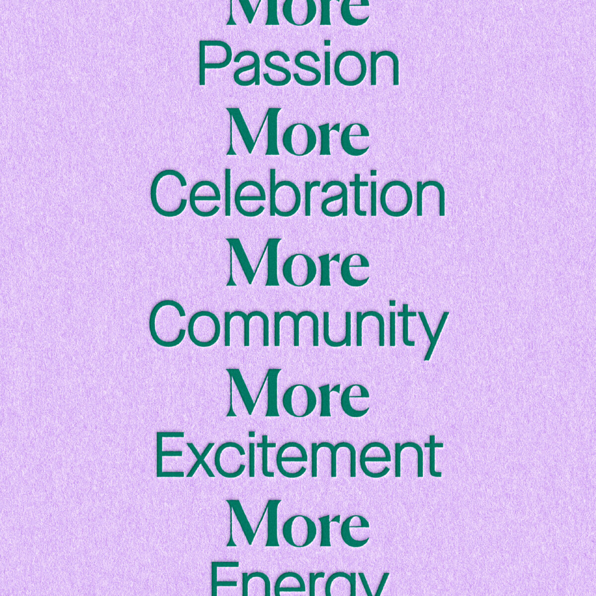
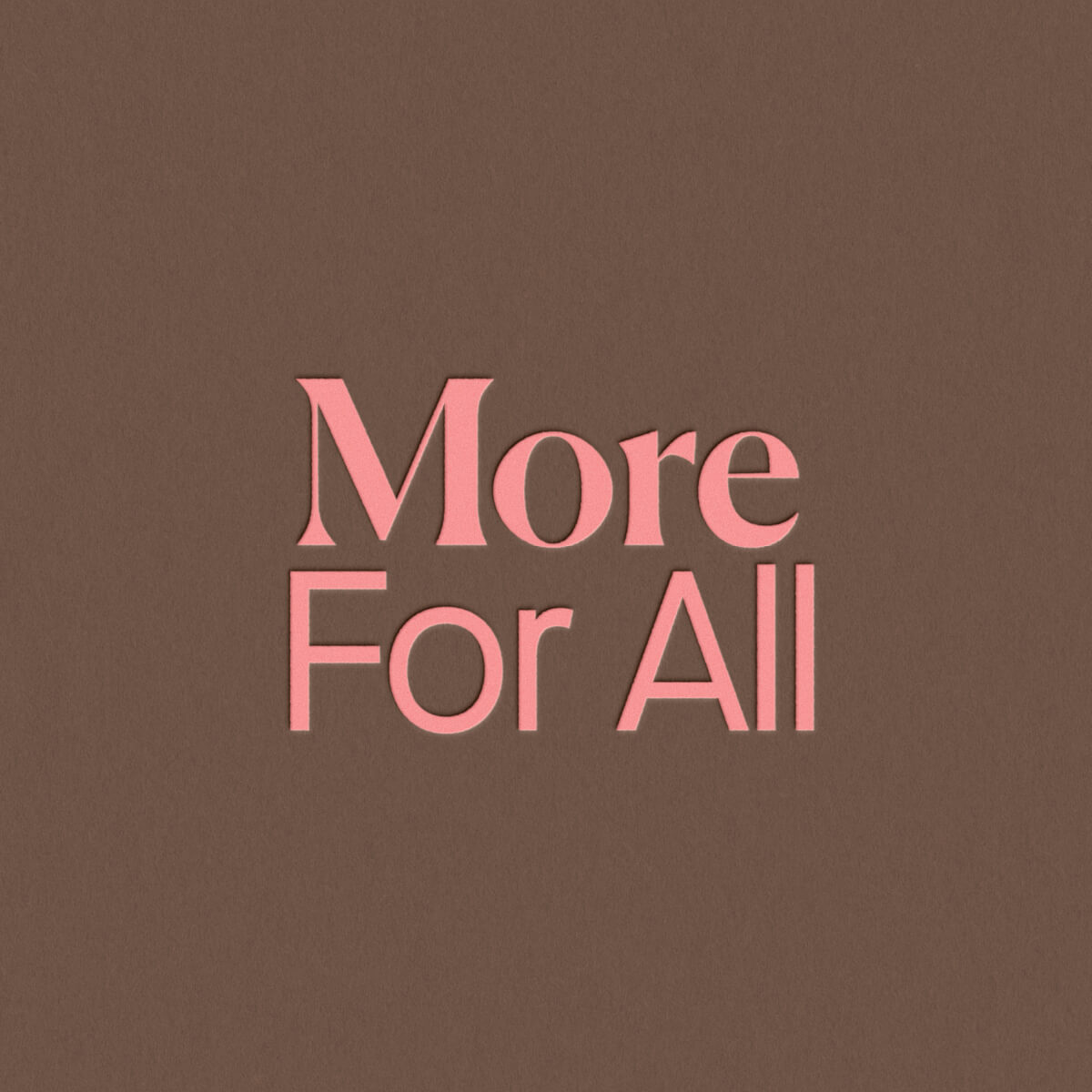
A key idea that emerged from the strategic process was the precinct would carry the spirit, energy and excitement of racing, but offer far more, and for more people.

This idea became crucial as we formed the messaging and visuals for the new brand.

MORE FOR ALL

We developed a messaging system based around the statement ‘More For All’, which closely aligned to Morphettville’s name, but spoke to the diverse future offering of the racecourse.

A DISTINCTIVE CENTREPIECE

The centrepiece of the visual identity is a distinctive ‘M’ logo, which captures the mood and energy of horse racing in an abstract way while being memorable and unique.

A TWO-SPEED APPROACH

The visual brand carries two speeds – one that leans into the history, elegance, style and tradition of horse racing, and the second that captures the energy, excitement, fun and diversity of the new Morphettville.

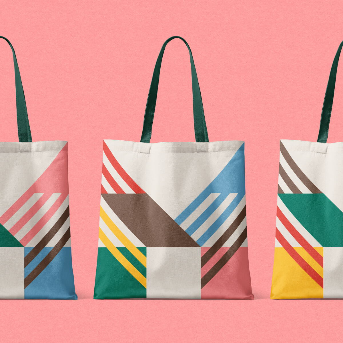
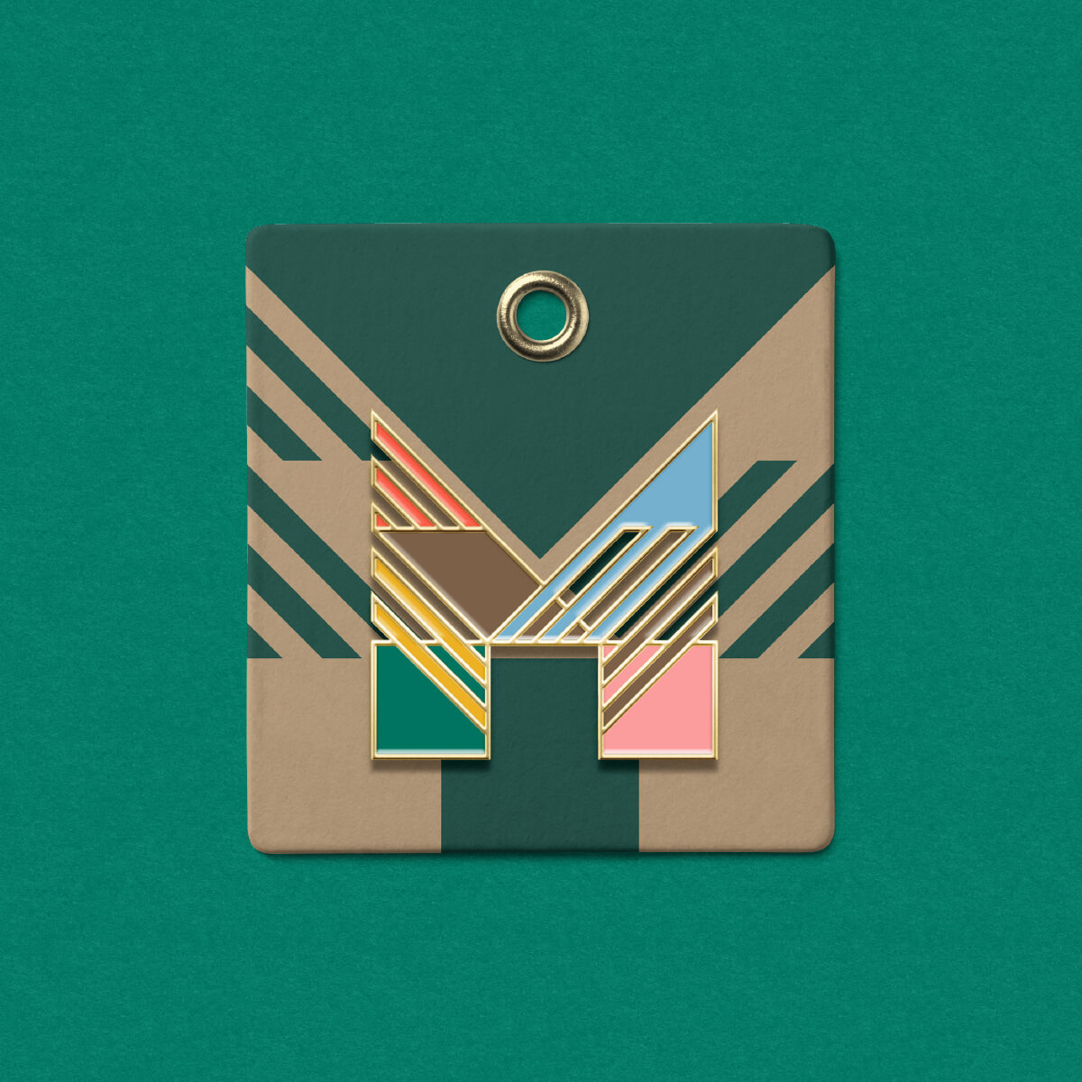
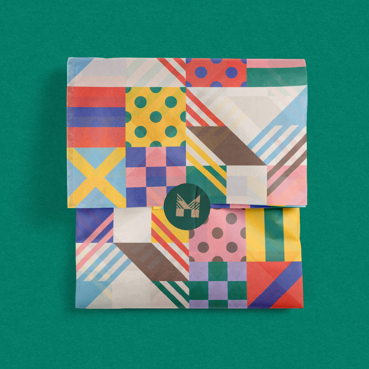
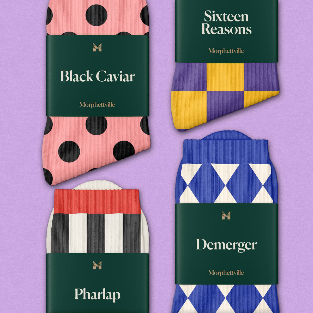
The refined palette, led by racing green, reflects Morphettville Racecourse’s lush landscape and offers a sense of nostalgia for the history of racing, complemented by an antique gold that adds a luxurious touch.

When a more playful tone is required, the secondary palette, inspired by the flair of jockey colours associated with Morphettville, comes into play. These vibrant, diverse, and colourful hues are ideal for creating a more energetic and exciting brand when things need to be ‘turned up’.

Pattern tiles inspired by trainers, jockeys, and horses with historical or current ties to Morphettville bring an extra level of fun and extravagance to the visual identity.

BRINGING THE BRAND TO LIFE

Fuller was also tasked with developing a launch strategy for the new Morphettville brand.

While elements of this strategy will roll-out over the coming twelve months, the centrepiece of the launch was a brand film which poetically spoke to the history and tradition of the Morphettville of old, while introducing its exciting new future.

One of the limitations of the brand film was the lack of new facilities to feature given the development will come to life over the next decade.

In light of this, our creative team came up with an idea that beautifully spoke to the spirit and energy of new Morphettville, while championing the many different elements of the brand.

The film utilises a 3D version of the ‘M’ logo, and uses animation to playfully introduce the many different faces of the new Morphettville.