Believe Housing
A new brand to Believe in, a new website to call home.
Evolving an iconic South Australian real estate brand.
The iconic black and white palate and brand name were kept, as research indicated that there was significant brand equity in these assets.
A ‘+’ symbol, which stands for ‘more’ replaced the ampersand, while at the same time acting as a new graphic device that visually represents the Toop and Toop difference.
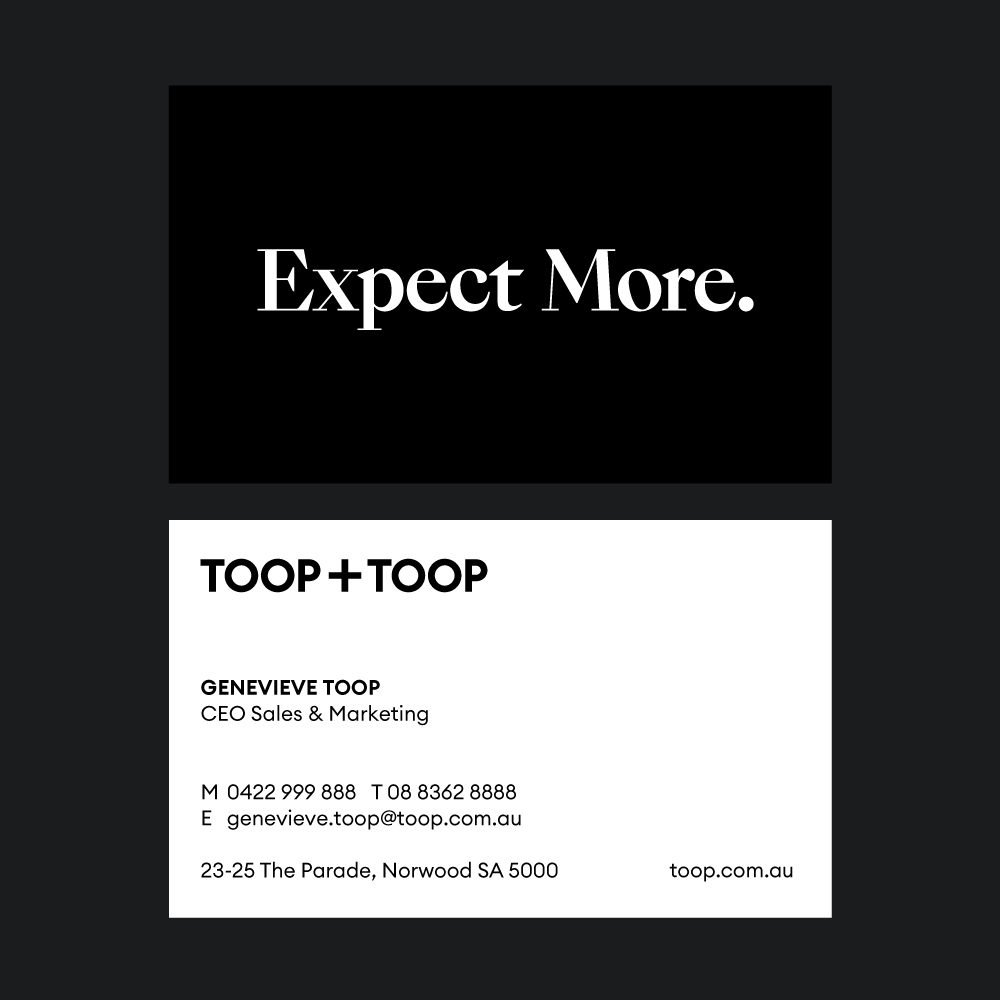
The primary font is a new modern Swiss typeface, where the ‘O’ letterforms are perfectly circular, resulting in a beautiful balance with the new plus symbol. The secondary font is reserved for the tagline and hero headlines, and has a dramatic ‘thick and thin’ delicacy and pairs well with the primary sans-serif font.
When you present a brand, it’s a nerve wracking experience. It’s like being entrusted with someone’s baby. In the room we had the original founders, and the people whose livelihoods rely on the strength of the brand. It was satisfying to present the brand and witness such an immediate emotional connection.
A new brand to Believe in, a new website to call home.
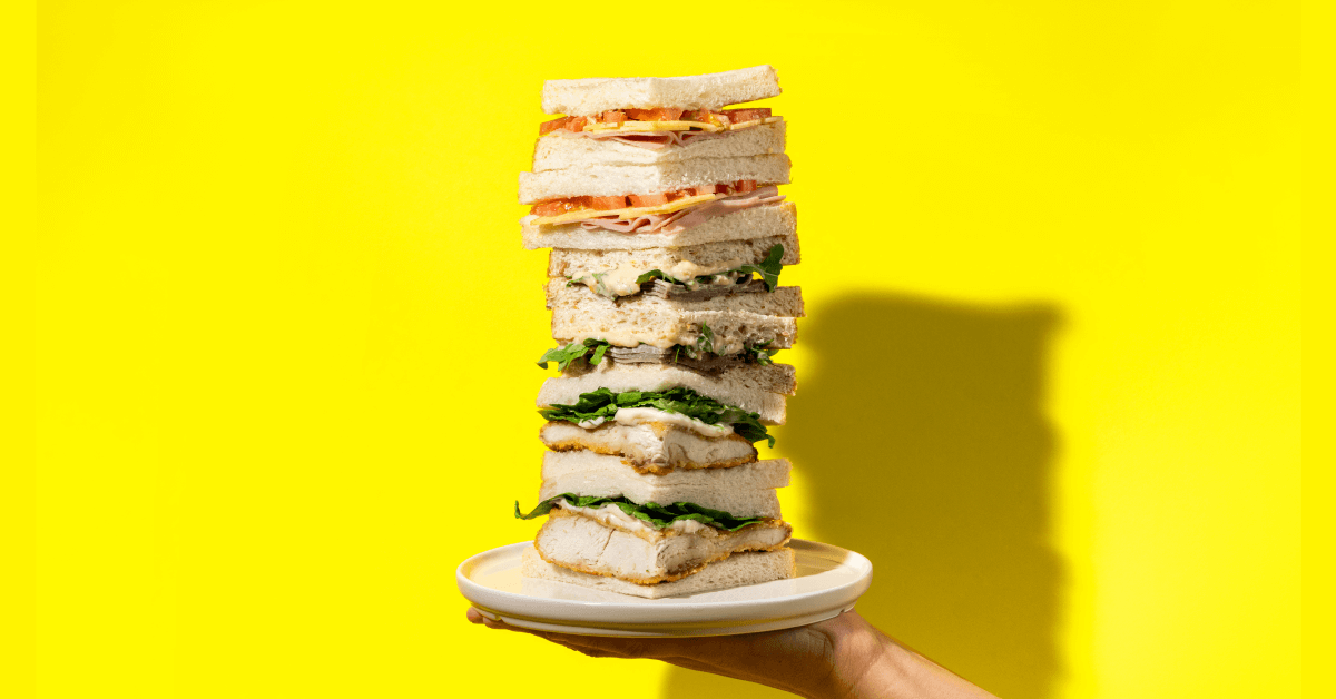
Feeding South Aussie appetites for convenience
An evolutionary new brand identity for a socially conscious yoga studio.
Strategic integrated marketing campaign to attract new clients for Maxima.
Rebranding an iconic outback tourism destination.