Australian businesses are right in the middle of the biggest transfer of wealth in at least 60 years.
Between 2011 and 2028, the Post WWII Baby Boomer generation will retire and for more than 400,000 small business owners, that means handing over the keys to the next generation – family, equity partners or new owners.
A significant proportion of this estimated $3.5 trillion in business value will be brand equity, the “premium that a company generates from a product with a recognisable name when compared to a generic equivalent.”
The founders of companies create brand equity through their hard work, their commitment to service, their reliability, the quality of their products and their unique personality. We call this essential point of difference their brand story.
But it is also reflected in their visual identity — colours, logos and typography — and how that has been marketed over many years.
Maintaining that brand equity while putting their own stamp on a business is a significant challenge — and risk — for new owners.
During the last 12 months we’ve helped three iconic South Australian businesses – Toop + Toop, DBH Lawyers and The Prairie Hotel – retain their hard earned brand equity while refreshing their offer for a new generation of clients.
These are their stories.
Toop + Toop
South Australia’s most awarded real estate agency, Toop + Toop, engaged Fuller to undertake a brand refresh at a critical stage in the agency’s growth and development.
After a strategic process of succession planning, Toop + Toop was in the process of transitioning from its founders, Anthony and Sylvia Toop, to the next generation: Bronte Manuel, Genevieve Toop and Suzannah Toop.
While the new owners wanted a rebrand that would communicate a ‘changing of the guard’ they also wanted to retain the brand equity in the business – in particular, its leadership within the highly competitive and rapidly evolving South Australian real estate industry.
Before starting on the brand refresh, Fuller undertook extensive research with agents and clients to inform the Toop + Toop brand strategy.
The brand story that emerged was the commitment the agency had to going the extra yard – the concept of ‘more’. More experience. More time. More effort. More trust. More insights. More data. More results. More care.
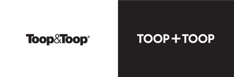
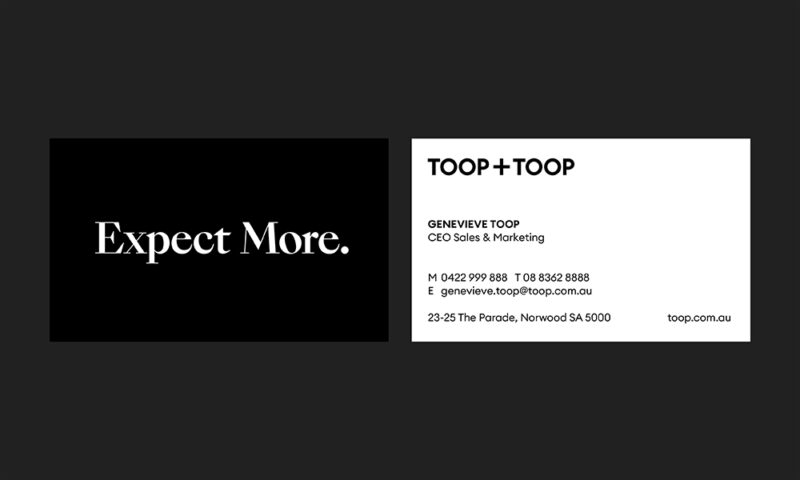
This concept was developed into the ‘Expect More’ brand tagline, inviting their potential and current customers to ask for a higher level of service from Toop + Toop than their competitors.
Fuller’s design team then created a contemporary rendition of the original brand, retaining the brand equity in the iconic name and black and white colour palette while creating a new graphic device ‘+’ symbol, celebrating ‘more’.
When the brand was presented to 100 Toop + Toop staff and key stakeholders, it was greeted with rapturous applause…even some tears.
With Anthony and Sylvia in the room and the people whose livelihoods rely on the strength of the brand, it was a satisfying moment to see such an emotional connection, a reminder that as a branding agency we have a serious responsibility – like being entrusted with someone’s baby.
“We felt very connected with Fuller from our first meeting. Will and his team were extremely thorough and communicated with us constantly through the entire process,” said Genevieve Toop, CEO Sales & Marketing.
“They also did a huge amount of research before making recommendations and that ultimately helped us feel fully informed before making some critical decisions.
“It was particularly important to us that Fuller were very supportive of working with our in-house marketing studio, allowing us to share our knowledge to achieve an incredible result.
“We were thrilled by the end product and the initial feedback, both from our team and our clients, has been overwhelmingly positive.”
DBH Lawyers
In 2020, DBH Lawyers undertook a significant transition, with a new generation of equity partners taking over the reins of the 50-year-old South Australian firm.
The new leadership team wanted to adopt a more modern way of working with their clients, with a greater emphasis on personal relationships, and they wanted their brand to reflect that.
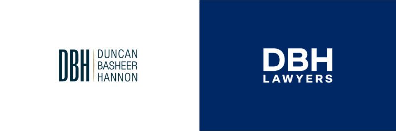
DBH Lawyers engaged Fuller to undertake the rebrand and repositioning of the firm – from their brand story, through to their visual logo, ID, website and application to their advertising assets.
“Our old branding didn’t accurately reflect who we were as a firm, or as a team of lawyers,” newly appointed Managing Partner of DBH Lawyers, Amy Nikolovski said.
“From the first meeting with Fuller they understood what we were moving toward and the direction our brand should take, even if we couldn’t quite articulate it at the time.”
After significant internal and external research and consultation with the DBH team, the direction we chose was to re-establish who a lawyer is, why they’re not to be feared, but should be trusted as partners when life throws you a curveball.
The brand equity was that DBH Lawyers are ‘human’. Over 50 years they cared so much more than people imagine about their client’s welfare, their mental health and their ability to recover from a life changing scenario.
The brand message that evolved was ‘We’re with you, we’re for you’ a singular statement that changes the perception of lawyers from unapproachable to friendly.
The accompanying visual identity development provided a fresh, contemporary look with a simple, clean and geometric logo and lock up and a new colour palette that was brighter and more memorable but with a softer edge highlighting care and trust. The connection with the past was the retention of the deep blue.
Following a full rebrand and repositioning undertaken by Fuller in 2020, we launched an integrated campaign spanning outdoor, television, radio and digital channels.
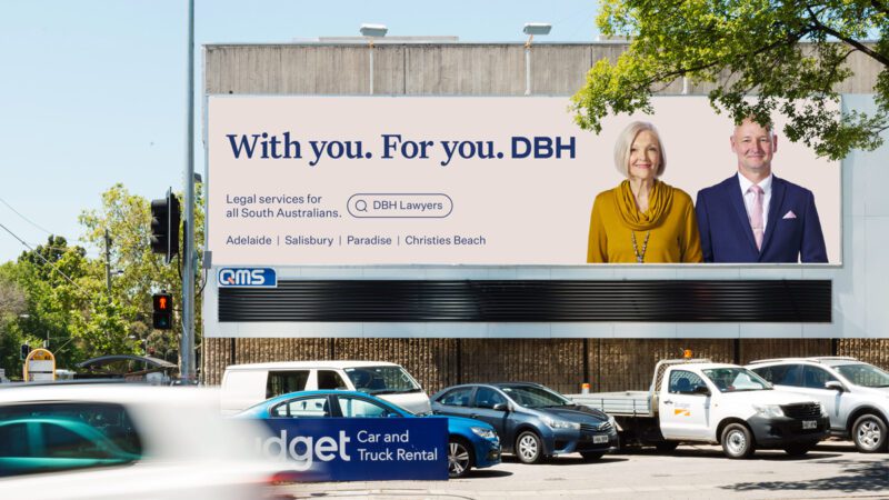
This brand activation campaign tells the story of the relationship between the DBH team and their clients, and how they help people and find the right way to move on from the curveballs in life.
The TVC depicts an ‘alternate world’ created for DBH, that’s gentle and soft – reflective of the fact that when you reach out to a DBH lawyer, you’re able to find comfort and space away from a tough situation, and your lawyer is someone you can talk to, someone who will support you, and help you get through.
“Fuller has been a pleasure to work with — not only have Will and the team taken our feedback on board, but most of all, the passion that they have had for our brand and wanting to ensure that we get the best outcomes has been a real highlight,” said Amy.
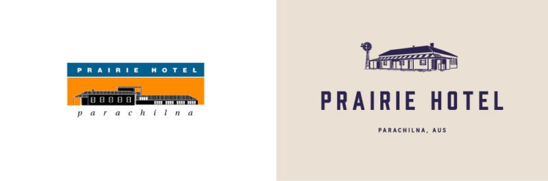
The Prairie Hotel
The Prairie Hotel started in 1876 as a railway siding for the Blinman copper mines. Three decades later, in 1905, the current stone hotel and outbuildings were constructed, and for most of the 20th century it became a legendary destination for everyone from local jackeroos to cross country truckies to enjoy its cold schooners of ale and its rustic hospitality.
Fourth generation Flinders Ranges pastoralist and cattleman Ross Fargher and wife Jane, bought their ‘local’ in 1991, and created the quintessential Australian outback hotel. Widely travelled in Australia and overseas, they believed outback hotels should offer more than a can of VB, a schnitzel and a lumpy mattress.
Radiating a welcoming, quirky, yet elegant country style, it has become Australia’s most awarded outback hotel and an international landmark and destination.
Jane and Ross, who now run the business with their sons Lachy and Eddie, approached Fuller to refresh the Prairie Hotel brand reflecting its premium point of difference over other outback pubs. COVID had allowed them to undertake contemporary renovations and build a new brewhouse to complement the quality of the existing lodge accommodation.
Our goal was to maintain the ‘love brand’ that has been built on affection, loyalty, friendliness and country hospitality, while developing a unique regional and remote contemporary proposition that would attract new travellers, looking for a different outback experience.
Through a brand storytelling process, we peeled back the true story of the Prairie Hotel and moved it away from the stereotype associated with remote outback pubs.
The brand message ‘Beyond expectation’ encapsulated both the unique remoteness of the offer and the ‘surprise and delight’ that visitors experience when they arrive.
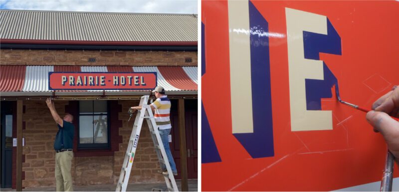
Our design team carefully retained the brand equity in the iconic eyelash verandah and the colonial signage while introducing new colours that reflected the outback landscape and this was carried through to a range of new icons and illustrative treatments.
“Fuller have been a perfect fit for us,” said Jane.
“Their team engaged with our family and really took the time to get to know us and understand us.
“The evolution of our brand has been pivotal in the creation of a refreshed and contemporary yet recognisable Prairie Hotel for the future.”

The pub has launched the new brand and its premium offer to a very positive response from guests and the tourism industry.
Fuller Brand Communication
Fuller’s understanding of our client’s branding needs comes from our own generational change.
Our succession plan started in 2018 when the first generation started the handover to the second generation.
After a period of strategic research and consultation we acknowledged our brand equity lay in our family independence compared to the many large holding companies in the industry; and in our integrated brand communication offer which provides value to our clients and secure employment to our staff.
We retired the “Fuller fluro” orange, blue and green and adopted a more contemporary colour palette to reflect the digital future, while still acknowledging the strength of the past in our own unique typography.
We know how confronting, challenging and very personal a rebrand can be – which is why it is so important to work through a strategic brand communication process.
Whether you’re a corporate business like Toop + Toop or DBH, or operate in the hospitality and tourism space like the Prairie Hotel the principles are the same: evolution not revolution.
The key to undertaking a generational brand change is understanding the story – where the company has been, its highs and lows, its essential purpose and its values.
That’s the DNA that will continue on, regardless of ownership.