In an increasingly digital world, the concept of digital accessibility is becoming more and more familiar. From subtitles, to speech recognition, features once developed to accommodate the needs of people with disabilities have in many ways come to benefit us all. This approach to accessibility is known as universal design.
When it comes to web accessibility, it’s easy to feel overwhelmed by the tangle of technical terms and complex compliance processes that can make understanding accessibility feel, well, not very accessible.
Meeting compliance standards can feel like a significant investment of time and budget, as well as the loss of some creative freedom. But with roughly 18% of Aussies having a disability, it’s important to consider the different barriers that may be preventing up to a fifth of your audience from engaging with your business via your website.
In our experience, it’s more than possible to create websites that are aesthetically beautiful, accessible, and user friendly, and we have 8 tips for improving the accessibility of your website. But first..
What is web accessibility?
Usability vs Accessibility Compliance
Whilst sometimes used interchangeably, there is a difference between usability and accessibility compliance.
Usability relates to the quality of your target users’ experience. It tends to be measured via methods like usability testing, which involves assessing how intuitively and efficiently research participants can perform key tasks using an existing digital product or prototype.
Accessibility compliance on the other hand involves assessing a digital product against set criteria detailed in the Web Content Accessibility Guidelines, or WCAG.
Together, good usability and accessibility compliance work to create intuitive and inclusive digital experiences that meet the cognitive, sensory, and emotional needs of diverse users.
Understanding WCAG
WCAG was created as a means for assessing digital products and determining how well that product accommodates the needs of users with disabilities, ensuring your website is..
- Perceivable: Can the content be perceived via different sensory channels such as sight, hearing, and/or touch?
- Operable: Can users navigate the site using a range of methods and assistive technologies such as keyboard navigation?
- Understandable: Can users understand content and features via clear terms, instructions and labels?
- Robust: Can the website reliably support and integrate with third-party technologies such as screen readers and be accessed via a variety of browsers and devices?
The specifics of meeting compliance are organised into different levels of agreement.
- Level A: Requires the most basic level of accessibility features
- Level AA: Addresses the most prevalent barriers for disabled users
- Level AAA: Thoroughly addresses barriers to the highest level
WCAG can act as guidelines for unofficial compliance, or be used as part of a rigorous certification assessment process, which is often required by policy for organisations operating in the government and disability support sectors. However most industries can cater for users with disabilities by simply designing and developing website features that comply with AA WCAG criteria.
8 Tips for Achieving Accessibility
1. Get Clever with Colour Contrast
With colour blindness affecting 1 in 12 men and 1 in 200 women, it’s important that the colour choices we’re making for text and backgrounds are perceivable for colour blind users. To find out if a colour combination is accessible or not, you can use a free online contrast checker.
Level AA requires a contrast ratio of at least 4:51 for small to medium text, whilst AAA requires 7:1 contrast. In best UX practice, we adhere to a level AA contrast ratio for all web projects.
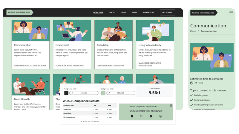
When creating the brand ID for The Autistics’ Guide to Adulthood, we utilised pastel and charcoal tones to create a palette that is both effective in creating an aesthetically pleasing look and feel, and compliant with AAA standards. Along with more colour options for illustrations and graphic devices, this brand ID was able to inform the design of a WCAG certified micro-site and LMS experience.
2. Add Alternative Text
When uploading images to the backend of a website, you’ll see a text field labelled ‘alt text’. With the exception of purely decorative images, adding a succinct description of what images and graphics depict will enable users with vision impairments to be able to navigate and perceive your website content using screen reading technology.
As an added bonus, Google also loves alt text. Making sure you’re adding brief alt text for all the images you upload to your website is not only good for accessibility, but can improve your website’s SEO too, which means your website will be easier to find via Google search. Win win!
When it comes to graphics like tables and infographics, you can adapt this content so that text is entered as page body content. That way, accessibility tools are easily able to navigate and interact with that text.
3. Add Alternative Media
When it comes to perceiving and understanding content on the web, there are more barriers than just vision impairments. Some users may have difficulty processing written language, and addressing colour contrast doesn’t account for the fact that different colours can convey meaning, like traffic lights.
It’s important to make sure that a combination of media types are used to convey meaning. For example, when a user has made a mistake filling out an online form, it’s not enough to communicate that error via a red outline around the form field. Nor is it enough to display an error message below the field. Or just an icon. The best case scenario here is to display all three. It’s also just good comms practice to provide a combination of video, text, image, and audio content that cater to different needs. Some users will prefer to read content at their pace, and others prefer to follow along a video.
Take care when adding motion to your website. Videos that autoplay with sound can be distressing, and animation that is too fast or flashy can be harmful for users with conditions like epilepsy. Users should have a way to pause any videos or animation if they so choose.
It’s also important to make sure accurate subtitles are uploaded for videos with speech audio, and that closed captions and playback controls can be accessed and used easily.
4. Create Clear Links & Labels
Helping your users understand what different features are for, where they are in the site, and where a link will take them are important for understanding and operating a website.
Ambiguous links like ‘More’ and ‘Click here’ can be unclear for users, as can icon buttons or form fields without labels. However, there are contexts where ‘Learn More’ or an icon button make the most sense visually, and in this case developers can add hidden labels that are not visible but still accessible for screen readers.
Features like breadcrumbs and local navigation can also help a user understand where they are in a website, and clear instructions and error messages help them understand how to navigate and resolve issues. External links such as PDFs should also be set to open in a new tab, so the user is not taken away from the website unexpectedly.
5. Accommodate Keyboards
Some users will find it easier to navigate the web via their keyboard rather than a mouse. This means using the TAB, ENTER, SPACEBAR, and arrow keys to navigate and operate the website.
Structuring page content to follow a logical order is helpful for supporting keyboard navigation. When it comes to implementing a UI design system, we always include focus states as well as hover states for clickable items, so it is obvious which item is in ‘focus’ when navigating via keyboard.

6. Follow a Logical Page Structure
Whilst also improving SEO, using correct heading styles throughout your content can help with accessibility. Descriptive headings not only effective for skim reading and visual processing, but also helps screen readers make sense of page content. Here are some examples of good html structure for pages and articles.
7. Integrate with Plugins
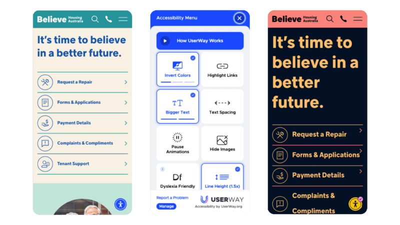
Third party plugins can integrate with your website to make it more operable, and a robust build is important for supporting these plugins. One plugin we’ve used is userway, an accessibility widget that allows users to adjust the user interface to suit their individual needs. These plugins aren’t a band-aid solution for accessibility issues, but as a supplementary tool to provide another level of control and customisation.
When building the Believe Housing website, the use of colours, icons, minimalist layout and logical information architecture informed a website experience that was fast to load, easy to process, and intuitive to navigate in various ways. The UserWay widget then extends on this by allowing users to change the colour contrast and saturation, increase text size and spacing, and more.
8. Test and Iterate
Whilst WCAG compliance is a great way to align your website with universal standards and consider barriers, it is at the end of the day, a guide.
There are certain aspects of user experience, like page layout, wording, and visual prompts like icons and imagery, that cannot be properly tested via a set of strict, objective criteria. That’s why adequate user research and usability testing with your target audience are crucial. Recruiting users with disabilities to test your current, functional website can be a great way to uncover fixable points of friction and make it easier for more people to engage with your business online.
Ready to build an accessible digital experience? Or explore ways to optimise your existing website? Our team of developers, designers, researchers and producers can help you do it. Get in touch today.